 Subscribe
 Follow Us
jQuery Pretty checkboxes
 13 years ago
 13253
13253 2835
2835
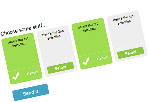
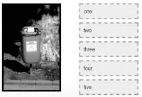
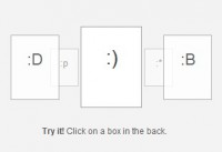
The checkboxes are still there, but we won’t be clicking them. The checking/unchecking will handled by the “Select” and “Cancel” links within each list item.
Each list item has a selected (green) and deselected (grey) state. This is most easily taken care of by using one background image, and shifting the position when needed.
The list items will be 105 pixels wide and 150 pixels tall, so checkboxbg.gif should be 210 pixels wide (double the width). When it is selected, the background will shift to the left by 105 pixels to expose the green side. We’ll get to the CSS for this shortly.
Sendit.gif and select.gif will serve as backgrounds for the submit button and select link, respectively.
CSS
legend {
 font-size: 17px;
}

fieldset {
 border: 0;
}

.checklist {
 list-style: none;
 margin: 0;
 padding: 0;
}

.checklist li {
 float: left;
 margin-right: 10px;
 background: url(i/checkboxbg.gif) no-repeat 0 0;
 width: 105px;
 height: 150px;
 position: relative;
 font: normal 11px/1.3 "Lucida Grande","Lucida","Arial",Sans-serif;
}

.checklist li.selected {
 background-position: -105px 0;
}

.checklist li.selected .checkbox-select {
 display: none;
}

.checkbox-select {
 display: block;
 float: left;
 position: absolute;
 top: 118px;
 left: 10px;
 width: 85px;
 height: 23px;
 background: url(i/select.gif) no-repeat 0 0;
 text-indent: -9999px;
}

.checklist li input {
 display: none;
}

a.checkbox-deselect {
 display: none;
 color: white;
 font-weight: bold;
 text-decoration: none;
 position: absolute;
 top: 120px;
 right: 10px;
}

.checklist li.selected a.checkbox-deselect {
 display: block;
}

.checklist li label {
 display: block;
 text-align: center;
 padding: 8px;
}

.sendit {
 display: block;
 float: left;
 top: 118px;
 left: 10px;
 width: 115px;
 height: 34px;
 border: 0;
 cursor: pointer;
 background: url(i/sendit.gif) no-repeat 0 0;
 text-indent: -9999px;
 margin: 20px 0;
}
As I mentioned above, the effect of adding a class of “selected” to the list item shifts the background image, hides the “Select” link and shows the “Cancel” link. The checkbox itself is also hidden entirely (but it needs to be present in the markup).
jQuery
Here’s where we weave this together.
$(document).ready(function() {

 /* see if anything is previously checked and reflect that in the view*/
 $(".checklist input:checked").parent().addClass("selected");

 /* handle the user selections */
 $(".checklist .checkbox-select").click(
  function(event) {
   event.preventDefault();
   $(this).parent().addClass("selected");
   $(this).parent().find(":checkbox").attr("checked","checked");

  }
 );

 $(".checklist .checkbox-deselect").click(
  function(event) {
   event.preventDefault();
   $(this).parent().removeClass("selected");
   $(this).parent().find(":checkbox").removeAttr("checked");

  }
 );

});
});
Line 4
Looks to see if there are any pre-checked checkboxes, and assigns the appropriate class if there are any.
Line 7
This selector grabs all those green “Select” buttons and assigns a script to the click event.
Lines 9, 10, 11
We want to prevent the link from invoking its default behavior of reloading the page, and continue with our instructions. The $(this) object refers to the “Select” button itself:
Select
So $(this).parent() refers its parent in the DOM, which is the <li> element. This is the element we want to add a class of “selected” to. Finally, line 11 makes sure that the checkbox is actually selected by setting its “checked” attribute.
Line 16
This selector catches all the “Cancel” links (which become visible when the list item’s class is set to “selected”).
Lines 18, 19, 20
This essentially undoes everything we did in lines 9, 10 and 11 above.
Anything you want. You can keep things simple and familiar by creating custom designed checkboxes, or take a more innovative approach and employ a more creative multiple selection UI. You could even create a toggle switch like those found in the iPhone settings.This example is more of a starting point.
You might also like
Tags
accordion accordion menu animation navigation animation navigation menu carousel checkbox inputs css3 css3 menu css3 navigation date picker dialog drag drop drop down menu drop down navigation menu elastic navigation form form validation gallery glide navigation horizontal navigation menu hover effect image gallery image hover image lightbox image scroller image slideshow multi-level navigation menus rating select dependent select list slide image slider menu stylish form table tabs text effect text scroller tooltips tree menu vertical navigation menu