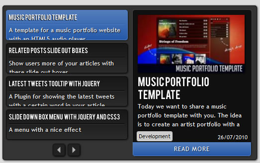
jQuery scroll News Previewer

we will create a news previewer that let’s you show your latest articles or news in a compact way. The news previewer will show some list of articles on the left side and the preview of the article with a longer description on the right. Once a news on the left is clicked, the preview will slide in.
The Markup
We will have a main container “cn_wrapper” that will contain a right element with the class “cn_preview” and a left one with the class “cn_list”. The preview div will contain content elements. Each one of them contains a preview image, a title and description along with some spans and a link to the real article.
In the list on the left side we will have the according short description items. We will also add a navigation for stepping through the pages in the end of that container:
<div class="cn_wrapper">
 <div id="cn_preview" class="cn_preview">
  <div class="cn_content" style="top:5px;">
   <img src="images/polaroidphotobar.jpg" alt=""/>
   <h1>Polaroid Photobar Gallery with jQuery</h1>
   <span class="cn_date">28/09/2010</span>
   <span class="cn_category">Tutorials</span>
   <p>In this tutorial we are going to create an...</p>
   <a href="#" target="_blank" class="cn_more">Read more</a>
  </div>
  <div class="cn_content">
   <img src="images/fullpageimagegallery.jpg" alt=""/>
   <h1>Full Page Image Gallery with jQuery</h1>
   <span class="cn_date">08/09/2010</span>
   <span class="cn_category">Tutorials</span>
   <p>In this tutorial we are going to create a stunning...
    </p>
   <a href="#" target="_blank" class="cn_more">Read more</a>
  </div>
  ...
 </div>
 <div id="cn_list" class="cn_list">
  <div class="cn_page" style="display:block;">
   <div class="cn_item selected">
    <h2>Polaroid Photobar Gallery with jQuery</h2>
    <p>Tutorial on how to create a gallery in polaroid style</p>
   </div>
   <div class="cn_item">
    <h2>Full Page Image Gallery with jQuery</h2>
    <p>Another tutorial on how to make a full gallery</p>
   </div>
   ...
  </div>
  <div class="cn_page">
   ...
  </div>
  <div class="cn_page">
   ...
  </div>
  <div class="cn_nav">
   <a id="cn_prev" class="cn_prev disabled"></a>
   <a id="cn_next" class="cn_next"></a>
  </div>
 </div>
</div>
The first content item in the preview container will have already the style of being slided in, namely the position of top 5 pixels. All the other previews are “hidden” because they will have a top of 310 pixels.
The items list will be divided into pages where each page contains at most 5 item.
Let’s take a look at the style.
The CSS
We will use a lot of CSS3 properties to create some neat effects. We will use shadows, rounded borders and gradients with both RGB and hexadecimal values.
Let’s start with the main container. We will set it relative so that we can then use some absolute positioning inside of it:
.cn_wrapper{
 margin:90px auto 0px auto;
 width:500px;
 height:300px;
 position:relative;
 color:#fff;
 overflow:hidden;
 padding:5px;
 text-shadow:1px 1px 1px #000;
 border:1px solid #111;
 background-color:#333;
 -moz-box-shadow:1px 1px 4px #222;
 -webkit-box-shadow:1px 1px 4px #222;
 box-shadow:1px 1px 4px #222;
 -moz-border-radius:5px;
 -webkit-border-radius:5px;
 border-radius:5px;
}
The headings inside of our viewer will have the following style:
.cn_wrapper h1{
 font-size:20px;
 text-transform:uppercase;
}
.cn_wrapper h2{
 font-size:12px;
 border-bottom:1px solid #000;
 padding-bottom:4px;
 text-transform:uppercase;
}
The h2 is used in the preview list and we give it a bottom border to create a nice engraved line under it. This will work because we will give the p that follows it a top border with a lighter color.
The preview and the list will both be positioned absolute, so we will first define the common style and then we overwrite the left for the preview:
.cn_preview, .cn_list{
 width:250px;
 height:300px;
 position:absolute;
 top:2px;
 left:6px;
}
.cn_preview{
 left:255px;
}
Inside of the preview we will have several content elements that will be styled as follows:
.cn_content{
 border:1px solid #444;
 top:310px;/*5*/
 left:5px;
 width:219px;
 padding:10px;
 position:absolute;
 background-color:#101010;
 height:275px;
 -moz-border-radius:5px;
 -webkit-border-radius:5px;
 border-radius:5px;
}
These elements will be animated in the JavaScript. Initially, we want to hide them, so we set a top that is bigger than the whole wrapper itself. This is why we set the overflow of the wrapper as hidden, so that we will not see anything that moves out of the boundaries of the wrapper.
Now we will style the elements inside of the content div.
The image will always have the maximum width of 215 pixels in our case. Note that if you have differently sized images, you will have to adapt all the elements under it as well. In this case the image will have the height of 119 pixels. That’s the value we will base all the following elements’ heights on.
.cn_content img{
 width:215px;
 -moz-box-shadow:1px 1px 4px #000;
 -webkit-box-shadow:1px 1px 4px #000;
 box-shadow:1px 1px 4px #000;
}
The date and the category will be positioned absolutely at the bottom of the content div:
.cn_date{
 position:absolute;
 bottom:30px;
 right:8px;
 font-size:11px;
}
.cn_category{
 position:absolute;
 bottom:30px;
 left:8px;
 font-size:11px;
 padding:1px 3px;
 background:#ccc;
 border:1px solid #ddd;
 color:#000;
 text-shadow:-1px 0px 1px #fff;
 -moz-border-radius: 3px;
 -webkit-border-radius: 3px;
 border-radius: 3px;
}
The description, which is a p element will have a fixed height and if it is longer, it will be cut off:
.cn_content p{
 height:57px;
 margin-top:2px;
 overflow:hidden;
}
The more button which will be the link to the original article will be spiced up with some gradient, a box shadow and rounded borders at the bottom left and right to fit the content:
a.cn_more{
 position:absolute;
 padding: 4px 0px;
 left:0px;
 bottom:0px;
 width:236px;
 color:#fff;
 text-align:center;
 font-size:12px;
 letter-spacing:1px;
 text-shadow:1px 1px 1px #011c44;
 text-transform:uppercase;
 text-decoration: none;
 border:1px solid #4c7ecb;
 outline:none;
 cursor:pointer;
 background-color: #1951A5;
 background-image:
  -moz-linear-gradient(
   top,
   rgba(255,255,255,0.25),
   rgba(255,255,255,0.05)
  );
 background-image:
  -webkit-gradient(
   linear,
   left top,
   left bottom,
   color-stop(0, rgba(255,255,255,0.25)),
   color-stop(1, rgba(255,255,255,0.05))
  );
 -moz-border-radius: 0px 0px 5px 5px;
 -webkit-border-bottom-left-radius: 5px;
 -webkit-border-bottom-right-radius: 5px;
 -border-bottom-left-radius: 5px;
 -border-bottom-right-radius: 5px;
 -moz-box-shadow:1px 1px 3px #111;
 -webkit-box-shadow:1px 1px 3px #111;
 box-shadow:1px 1px 3px #111;
}
Changing the color of the font on hover will create a nice engraved effect:
a.cn_more:hover{
 color: #011c44;
 text-shadow: 1px 1px 1px #ccdffc;
}
Now we will style the items in the list. They will have a gradient as background which will change on hover. We will also apply the hover effect on the selected item.
.cn_item{
 border:1px solid #090909;
 cursor:pointer;
 position:relative;
 overflow:hidden;
 height:49px;
 color:#fff;
 padding:5px;
 margin:6px 5px 0px 0px;
 text-shadow:1px 1px 1px #000;
 background:#2b2b2b;
 background:
  -webkit-gradient(
   linear,
   left top,
   left bottom,
   from(#171717),
   to(#2b2b2b)
  );
 background:
  -moz-linear-gradient(
   top,
   #171717,
   #2b2b2b
  );
 -moz-box-shadow:1px 1px 3px #111;
 -webkit-box-shadow:1px 1px 3px #111;
 box-shadow:1px 1px 3px #111;
 -moz-border-radius:5px;
 -webkit-border-radius:5px;
 border-radius:5px;
}
.cn_item:hover, .selected{
 border-color:#4c7ecb;
 background-color: #1951A5;
 background-image:
  -moz-linear-gradient(
   top,
   rgba(255,255,255,0.25),
   rgba(255,255,255,0.05)
  );
 background-image:
  -webkit-gradient(
   linear,
   left top,
   left bottom,
   color-stop(0, rgba(255,255,255,0.25)),
   color-stop(1, rgba(255,255,255,0.05))
  );
}
The engraved line under the heading will also change color:
.cn_item:hover h2,
.cn_list .selected h2,
.cn_item:active h2{
 border-color:#2C5FAC;
}
.cn_item:hover p,
.cn_list .selected p,
.cn_item:active p{
 border-color:#527CBB;
}
The active pseudo class, i.e. when we click on an item will have an engraved text effect by using the following style:
.cn_item:active {
 color: #011c44;
 text-shadow: 1px 1px 1px #ccdffc;
}
The short description in a list item will have a fixed height and a top border which, together with the bottom border of the h2 will create an engraved looking line:
.cn_list p{
 height:29px;
 padding-top:2px;
 overflow:hidden;
 border-top:1px solid #333;
}
Let’s style the navigation now. We will set it absolutely at the bottom of our list container:
.cn_nav{
 width:55px;
 height:24px;
 position:absolute;
 bottom:0px;
 left:94px;
}
The next and previous elements will have the following common style:
a.cn_next, a.cn_prev{
 float:left;
 height:23px;
 width:23px;
 background-color:#212121;
 background-repeat:no-repeat;
 background-position:center center;
 cursor:pointer;
 outline:none;
 border:1px solid #111;
 -moz-border-radius: 5px;
 -webkit-border-radius: 5px;
 border-radius: 5px;
 -moz-box-shadow: 1px 1px 3px #000;
 -webkit-box-shadow: 1px 1px 3px #000;
 box-shadow: 1px 1px 3px #000;
}
Now we just set the individual styles which are the background images:
a.cn_next{
 background-image:url(../images/next.png);
}
a.cn_prev{
 margin-right:5px;
 background-image:url(../images/prev.png);
}
On hover we just change the background color:
.cn_nav a:hover{
 background-color:#101010;
}
When we click on a navigation item, we will move it down 1 pixel, so that it looks pressed. That we can do by setting the margin top to 1 pixel:
.cn_nav a:active{
 margin-top:1px;
 background-color:#000;
}
An inactive navigation element will have an opacity of 0.5:
.cn_nav a.disabled{
 opacity:0.5;
}
The last thing that we need to define is that the pages of the list are not visible. We will then make them visible in the [removed]
.cn_page{
 display:none;
}
That was the style. Now, let’s add the effects with jQuery!
The JavaScript
For the effects we will be using some easing so don’t forget to include the the jQuery easing plugin.
In our jQuery function we will start by defining some variables:
//caching
//next and prev buttons
var $cn_next = $('#cn_next');
var $cn_prev = $('#cn_prev');
//wrapper of the left items
var $cn_list  = $('#cn_list');
var $pages  = $cn_list.find('.cn_page');
//how many pages
var cnt_pages = $pages.length;
//the default page is the first one
var page  = 1;
//list of news (left items)
var $items   = $cn_list.find('.cn_item');
//the current item being viewed (right side)
var $cn_preview = $('#cn_preview');
//index of the item being viewed.
//the default is the first one
var current  = 1;
For each item we store its index relative to all the document. We bind a click event that slides the current or clicked item up or down. Depending on the current item (if it comes before or after the newly clicked one), the clicked one will be moving from up or down:
$items.each(function(i){
 var $item = $(this);
 $item.data('idx',i+1);

 $item.bind('click',function(){
  var $this   = $(this);
  $cn_list.find('.selected').removeClass('selected');
  $this.addClass('selected');
  var idx   = $(this).data('idx');
  var $current  = $cn_preview.find('.cn_content:nth-child('+current+')');
  var $next  = $cn_preview.find('.cn_content:nth-child('+idx+')');

  if(idx > current){
   $current.stop()
     .animate({
      'top':'-300px'
     },600,'easeOutBack',function(){
      $(this).css({'top':'310px'});
     });
   $next.css({
    'top':'310px'
   }).stop()
     .animate({
    'top':'5px'
     },600,'easeOutBack');
  }
  else if(idx < current){
   $current.stop()
     .animate({
      'top':'310px'
     },600,'easeOutBack',function(){
      $(this).css({'top':'310px'});
     });
   $next.css({
    'top':'-300px'
   }).stop()
     .animate({
    'top':'5px'
     },600,'easeOutBack');
  }
  current = idx;
 });
});
Now we will define what happens when we click on the next in the navigation. The next page should fade in if it exists and the button needs to get disabled if there is no next page:
$cn_next.bind('click',function(e){
 var $this = $(this);
 $cn_prev.removeClass('disabled');
 ++page;
 if(page == cnt_pages)
  $this.addClass('disabled');
 if(page > cnt_pages){
  page = cnt_pages;
  return;
 }
 $pages.hide();
 $cn_list.find('.cn_page:nth-child('+page+')').fadeIn();
 e.preventDefault();
});
The same holds for the previous page:
$cn_prev.bind('click',function(e){
 var $this = $(this);
 $cn_next.removeClass('disabled');
 --page;
 if(page == 1)
  $this.addClass('disabled');
 if(page < 1){
  page = 1;
  return;
 }
 $pages.hide();
 $cn_list.find('.cn_page:nth-child('+page+')').fadeIn();
 e.preventDefault();
});
To give the whole thing an even nicer look, we will cufonize the headings, by adding the following lines to the header of the HTML:
<script src="js/cufon-yui.js" type="text/javascript"></script>
<script src="js/Bebas_400.font.js" type="text/javascript"></script>
<script type="text/javascript">
 Cufon('.cn_wrapper h1,h2', {
  textShadow: '-1px 1px black'
 });
</script>
And that’s it
You might also like
Tags
accordion accordion menu animation navigation animation navigation menu carousel checkbox inputs css3 css3 menu css3 navigation date picker dialog drag drop drop down menu drop down navigation menu elastic navigation form form validation gallery glide navigation horizontal navigation menu hover effect image gallery image hover image lightbox image scroller image slideshow multi-level navigation menus rating select dependent select list slide image slider menu stylish form table tabs text effect text scroller tooltips tree menu vertical navigation menu

 Subscribe
 Follow Us
 13 years ago
 14722
14722 2999
2999


