jQuery cool hover Slide Effect

Setting up our files
Ok let’s start by opening our text editor and creating a new html document, save this to your desktop as “index.html”. Now create a new css file and save this as “style.css” in a new folder named “css”.
Include our files
Getting back to our index file, we now need to include our newly created css file and the jQuery library into the head of our document.
<link href="style.css" rel="stylesheet" type="text/css" />
In this tutorial we are going to link to the google api version of jQuery as the chances are your user has come across this file at some point so it was already be cached on their system.
<script type="text/javascript" src="http://ajax.googleapis.com/ajax/libs/jquery/1.4.2/jquery.min.js"></script>
The mark up
Now we’ve included our necessary files for this effect to work let’s get dow to adding some html to our document. Include this html inside the <body> tag of the index file.
<div id="container">
      <div id="overlay">

      </div>
      <div id="hover">

      </div>
 </div>
Style the body
Open up the css file we created earlier named “style” and let’s add some style to the page just to make it a little less bland. You can mess around with these colours as much as you like, it’s all down to preference really.
body {
 background-color:#1e1e1e;
 padding-top:150px;
 font-size:11px;
 font-family:Arial, Helvetica, sans-serif;
 }
h1 {
 font-size:12px;
 font-weight:bold;
 color:#4de2e0;
 }
a {
 color:#4de2e0;
 text-decoration:none;
 }
Container style
Now the page has a little colour we can add the style to our divs, we’re going to start with the #container div this way we can talk through the reason for having certain styles.
#container {
 width:450px;
 height:150px;
 position:relative;
 overflow:hidden;
 z-index:0;
 padding:0;
 margin:0 auto;
 background-image:url(http://www.htmldrive.net/edit_media/2010/201010/20101013/image_slide/images/nemo.jpg);
 border:10px solid #414141;
 }
#container:hover {
 border-color:#303030;
 }
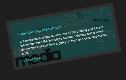
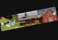
The container is the div that displays our image, which the two other divs (#hover and #overlay) will slide over.
Position
We set this to relative because we need to set the child divs as absolute so that we position them our of view – this is an important style.
Overflow
This style basically hides the two child dives which gives the effect of them sliding across the image.
z-index
Places the div at the bottom of the pile which gives us the transparent look from the div above.
Overlay style
This is the div which ill give us the semi-transparent black effect that fades in over our image, let’s add the styles again to our css file and go through some of the important styles.
#overlay {
 background-color:#000;
 display:block;
 position:absolute;
 top:0;
 left:0;
 width:450px;
 height:150px;
 z-index:1;
 }
background-colour
We can change this colour to what ever we would like the effect to be, for example #fff for white.
display
As the div is an empty one we need to display it as block.
position
We set this as absolute so that we can position it anywhere we like in our container that’s positioned as relative.
top and left
This will place are div at the very top and very left of our container div, we will change the left position using jQuery later.
z-index
We’ve set this as 1 so that it sits on top of our image.
Hover style
Now let’s add the styles for our final div #hover, which contains the content in our sliding effect.
#hover {
 width:400px;
 display:block;
 height:100px;
 position:absolute;
 z-index:3;
 padding:25px;
 }
#hover p {
 color:#fff;
 font-weight:normal;
 }
- Width and height, you may have noticed we’ve reduced our width and height here – reasons being we want to use padding so that our content isn’t squashed in.
- position, we’ve positioned this div as absolute again so that we can control where we place in in our container div.
Dummy content
You can place whatever you like in your div but for now I’m just going to place in some dummy content.
<h1>Cool hovering slide effect!</h1>

 <p>Lorem Ipsum is simply dummy text of the printing and typesetting industry. Lorem Ipsum has been the industry’s standard dummy text ever since the 1500s, when an unknown printer took a galley of type and scrambled it to make a type specimen book.</p>

 <p><a href="#"> Read more</a></p>
This goes inside the #hover div.
Let’s get down to the jQuery
Now for the fun stuff, we can start to animate our content using a little bit of jQuery. To do so we need to insert an opening and closing script tag in the head section of our document.
<script type="text/javascript">

 $(document).ready(function () {

 });

 </script>
What is document ready?
Basically, what we’re doing here is telling our code not to run unless the document has fully loaded and ready to do so. Alternatively we can put our jQuery in our the just above our closing body tag in the footer which will automatically let the page load before running our script, which means we can remove our document.ready function all together.
Set the variables
The reason for setting variables in our code here is really just to save repeating code, which in this case is very useful.
<script type="text/javascript">

 $(document).ready(function () {

 var colour = $("#overlay");

 var content = $("#hover");

 });

 </script>
Hiding our divs
If you’ve previewed the code we have written so far you will have noticed that the divs just all sit on top of each other hiding our image which is not good. To get around this we will need to hide these elements using jQuery, let’s put those variables to use.
<script type=”text/javascript”>
   $(document).ready(function () {
 var colour = $("#overlay");
 var content = $("#hover");
 content.hide();
 colour.hide();
 });
 </script>
You will now notice that all we see is our image which is great.
Hover in some colour
Now we’re going to put our #overlay div to some use and fade in it and then back out again. Add the following code directly above the </script> tag.
$("#container").hover(function() {
 colour.stop().fadeTo(500, .7)
 }
 ,function() {
 colour.stop().fadeTo(500, 0)
 });
Time for a little explanation, the “500″ in the code represents how fast the div will fade in – in this case it will fade in at 500 milliseconds. We can change the opacity of the div to be stronger or weaker by adjusting the “.7″ currently this means the div will fade in to 70% opacity.
Slide in the content
To give our animation the full effect we’re going to need to get that div containing our content to start sliding in and out, take a look at this code and copy in lines and copy in lines 2 and 6.
$("#container").hover(function() {
 content.show().css({ "left” : “-450px" }).animate({left : 0}, 300);
 colour.stop().fadeTo(500, .7)
 }
 ,function() {
 content.animate({left : 450}, 300);
 colour.stop().fadeTo(500, 0)
 });
.css() explanation
You can see here we’ve added some css to the #hover div, where we positioned the div as absolute earlier in our stylesheet we can now play around with this in our jQuery. Notice that the position left is minus (-) the full width of our div which will make place the this element just out of the visible portion of our container div, if you’re going to make you divs a different size to the one’s we have used in this tutorial you will need to adjust this part of the jQuery to match your new widths.
Stop our slider going mad
If your move the mouse frantically over the image you will notice that the content just keeps on sliding back and forth uncontrollably, to get over this we need to call in .stop() which will basically stop our code from over running. You may have noticed we already have this in place in the line controlling the colour fade, we’re basically going to do the same thing here.
$("#container").hover(function() {
 content.stop().show().css({ "left" : "-450px" }).animate({left : 0}, 300);
 colour.stop().fadeTo(500, .7)
 }
 ,function() {
 content.stop().animate({left : 450}, 300);
 colour.stop().fadeTo(500, 0)
 });
That's it all!
You might also like
Tags
accordion accordion menu animation navigation animation navigation menu carousel checkbox inputs css3 css3 menu css3 navigation date picker dialog drag drop drop down menu drop down navigation menu elastic navigation form form validation gallery glide navigation horizontal navigation menu hover effect image gallery image hover image lightbox image scroller image slideshow multi-level navigation menus rating select dependent select list slide image slider menu stylish form table tabs text effect text scroller tooltips tree menu vertical navigation menu

 Subscribe
 Follow Us
 13 years ago
 36046
36046 4593
4593


