simplism tooltip powered by jQuery

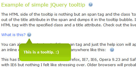
A tooltip is help text that appears when you hover your cursor over something. The title attribute of a hyperlink or alt attribute of an image tag will be displayed as a tooltip by a browser when you hover your cursor over them.
These are useful attributes. They should be added to every image and hyperlink. At least for the sake of adding some meaningful metadata.
Why Simple?
Tooltips should be simple and focused on their purpose. Adding extra functionality like a close button or draggability is not necessary. When you hover over a tooltip indicator it should quickly appear, display its message, then quickly disappear when you move your cursor away.
Most people would agree that the ad bubbles that pop up when you accidentally hover over certain keywords are incredibly annoying. This is because they take a while to load, are completely overloaded with information and require you to find the close button to get rid of the damn thing. Good example of bad UI design.
The HTML
The HTML required on the front end for this tooltip is extremely simple. Simply add an span tag (however, almost any inline HTML element will work) with a descriptive title attribute. Then, add the class ‘toolTip’. This will act as a hook for the jQuery code we are about to write.
<span title="This is the tooltip text"> </span>
The span tag should look something like this.
<div class="toolTipWrapper">
        <div class="toolTipTop"></div>
        <div class="toolTipMid">
        </div>
        <div class="toolTipBtm"></div>
</div>
The tooltip will be structured like this.
There are four div containers, each with an individual class. The first is a wrapper that holds everything together. Then the top, middle and bottom sections of the tooltip. This will all be dynamically inserted into the element with the toolTip class by jQuery
The CSS
Here is all the CSS that is needed.
.toolTip {

        padding-right: 20px;

        background: url(images/help.gif) no-repeat right;

        color: #3366FF;

        cursor: help;

        position: relative;

}

.toolTipWrapper {

        width: 175px;

        position: absolute;

        top: 20px;

        display: none;

        color: #FFF;

        font-weight: bold;

        font-size: 9pt;

}

.toolTipTop {

        width: 175px;

        height: 30px;

        background: url(images/bubbleTop.gif) no-repeat;

}

.toolTipMid {

        padding: 8px 15px;

        background: #A1D40A url(images/bubbleMid.gif) repeat-x top;

}

.toolTipBtm {

        height: 13px;

        background: url(images/bubbleBtm.gif) no-repeat;

}
In the toolTip class, the help icon is placed in the background and positioned to the right. Right padding is added to assure that the icon is always visible.
I set the cursor to ‘help’ because it acts as a good visual cue and defines the tooltip as help text.
The tooltip will be generated inside of the HTML element with this class. It needs to be positioned relative so that it will contain the absolutely positioned toolTipWrapper class.
The toolTipWrapper class needs a width to hold the pieces inside together. It needs an absolute position so that it will hover on top of the page content. It’s left coordinates will be dynamically set with jQuery.
Display none is needed in order for the fade-in and fade-out effects to work.
A font size is set so that it stays consistent regardless of what HTML element it is placed in.
The rest of the classes are used to build the tooltip itself.
The jQuery
This is the jQuery script that makes the magic happen:
$(document).ready(function() {

  $(‘.toolTip’).hover(

    function() {

    this.tip = this.title;

    $(this).append(

     ‘<div class="toolTipWrapper">’

        +‘<div class="toolTipTop"></div>’

        +‘<div class="toolTipMid">’

          +this.tip

        +‘</div>’

        +‘<div class="toolTipBtm"></div>’

      +‘</div>’

    );

    this.title = "";

    this.width = $(this).width();

    $(this).find(‘.toolTipWrapper’).css({left:this.width-22})

    $(‘.toolTipWrapper’).fadeIn(300);

  },

    function() {

      $(‘.toolTipWrapper’).fadeOut(100);

      $(this).children().remove();

        this.title = this.tip;

      }

  );

});
If you are not already familiar with jQuery, I would strongly encourage you to take the time to learn it.
$(‘.toolTip’).hover(
The script uses jQuery’s hover() function. There are two individual functions inside of it that make up the mouse-over and mouse-out.
this.tip = this.title;
In the first half of the hover() function, the script grabs the content inside of the title attribute and makes a variable out of it.
$(this).append(
It then uses append() to insert the HTML that makes up the tooltip and places the title contents into it.
this.title = "";
The title is set to an empty string so that the browser default tooltip doesn’t appear as well.
this.width = $(this).width();
$(this).find(‘.toolTipWrapper’).css({left:this.width-22})
Then, the width of the element with the toolTip class is taken and the toolTipWrapper is given left coordinates so that it is always positioned directly beneath the help icon.
$(‘.toolTipWrapper’).fadeIn(300);
The function fadein() is used to gradually bring in the tooltip. It also acts as a safeguard to keep it from popping up if someone accidentally hovers over it.
function() {
        $(‘.toolTipWrapper’).fadeOut(100);
        $(this).children().remove();
        this.title = this.tip;
}
The second half of the hover() function resets everything and puts things back to normal. The fadeout() function is used to hide it.
You might also like
Recommend Items
Tags
accordion accordion menu animation navigation animation navigation menu carousel checkbox inputs css3 css3 menu css3 navigation date picker dialog drag drop drop down menu drop down navigation menu elastic navigation form form validation gallery glide navigation horizontal navigation menu hover effect image gallery image hover image lightbox image scroller image slideshow multi-level navigation menus rating select dependent select list slide image slider menu stylish form table tabs text effect text scroller tooltips tree menu vertical navigation menu

 Subscribe
 Follow Us
 13 years ago
 8780
8780 2132
2132


