 Subscribe
 Follow Us
Interactive Picture with jQuery(Image Tips)
 14 years ago
 20943
20943 4149
4149
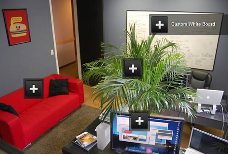
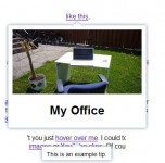
In this tutorial I will be showing you how to piece together an interactive picture – aka an image that contains tooltips and popup boxes. This can be useful for showing off a particular aspect of a photo (ie items or people).
Set Up Your Picture
Before we can place any buttons, we first have to get the image ready (I’ve chosen a picture of our office) . Let’s make the div #picture, which will act as our canvas.
#picture{ position:relative; top:20px; width:700px; height:466px; margin:0px auto; background:#FFF url('office.jpg'); overflow:hidden; }
You will want to customize your dimensions and background image to match your selected image. Everything we will be doing will take place inside of this div tag.
Positioning Info Buttons
If you’ve taken the time to check out the live demo, you’ve probably also noticed the large “+” buttons scattered throughout the picture. These buttons are going to be the foundation of what we do, acting as markers within the image.
That being said, here is the HTML structure of a sample button, complete with comments to explain it.
<div class="more" id="couch"> <!-- id refers to specific item -->
<a href="#"><img src="more.png"/></a> <!--defines button image, don't change link -->
<span>IKEA Klippan Couch</span> <!-- The caption for the button -->
</div>
Each button pulls from a few CSS styles, the first is the general button styles, which you probably won’t have to customize much/at all.
/* General More Button */<span style="white-space: pre;"> </span>
.more{ position:absolute; width:50px; height:50px; background:url('dim.png'); border:1px solid #444; padding:5px; text-align:left; overflow:hidden; }
.more span{ position:absolute; left:60px; width:160px; padding:15px 0 0 5px; color:#FFF; font:bold 13px Lucida Grande, Arial, sans-serif; text-shadow:#000 1px 1px 0px; }
The second bit that affects a button is the unique CSS that positions the button over the corresponding area of the image.
/* Item Specific More Button */
#couch{ top:240px; left:75px;}
Using this structure you can make as many buttons as you need for your image. We will be revisiting the buttons again in the jQuery section, where we will make the captions appear on hover.
The Info Box
When a visitor clicks any of the buttons, we want an info box to pop up from the bottom with the additional information inside. When this box pops up, the background should dim to call attention to the info box (I have done this before in my Lights Out tutorial).
The HTML for this goes as follows:
<!-- Info Boxes -->
<div id="infobox">
<span class="close"><a href="#"><img src="close.png"/></a></span>
<br/>
<div id="couch_info">
<img src="klippan.jpg"/><br/>
<a href="http://www.ikea.com/us/en/catalog/products/10138530">IKEA Klippan Couch</a>
</div>
</div>
<!-- Dimmed Background -->
<div id="fade_bg"> </div>
The CSS for this positions the info box in the dead center of the image, slaps a close button in the upper right, and covers the background in the semi-transparent png which dims the background. (Note: This will all be triggered by jQuery, so it will not show up yet)
/* General Info Box */
#infobox{ position:absolute; bottom:-200px; left: 350px; height:200px; width:300px; z-index:20; margin:0 0 -100px -150px; background:#FFF; -webkit-border-radius:5px; -moz-border-radius:5px; border-radius:5px; }
#infobox a, #infobox a:visited{ font:italic 16px Georgia, serif; color:#555; text-decoration:none; }
#infobox a:hover{ text-decoration:underline; }
span.close{position:absolute; right:5px; top:5px;}
#fade_bg{ position:absolute; z-index:15; width:100%; height:100%; background:url('dim.png'); display:none;}
Bringing It Together with jQuery
There is a bit a jQuery involved, so here’s the breakdown – ready, set, go.
This removes the dotted blue lines in all browsers when links are clicked.
//Blur Links (Prevents Outline)
$('a').click(function() {
this.blur();
});
In order to trim down the amount of markup, we are using the same info box for all the descriptions, and hiding the ones not in current use. This line runs through and hides all of the divs contained #infobox by default when the page loads.
//Hide all item descriptions in the info box
$("#infobox > div").css("display", "none");
When a button is clicked, the info box gets triggered and slides in from the bottom. The dimmed background also fades in to view and we end the function by returning false so the link is not actually executed.
//Call in the info box
$(".more a").click(function(){
$("#infobox").animate({bottom: '233px' }, 300);
$("#fade_bg").fadeIn();
return false;
});
The info button expands to show it’s caption when the visitor hovers over it. Here you can customize the exact width it expands/retracts to. To prevent overlap between buttons, the button that is hovered over gets a high z-index temporarily.
//Expand more info button on hover
$(".more").hover(function(){
$(this).stop().animate({width: '225px' }, 200).css({'z-index' : '10'});
}, function () {
$(this).stop().animate({width: '50px' }, 200).css({'z-index' : '1'});
});
An example of a item description display function – you will need to duplicate this function for each button you have. This displays the correct item description in the info box when it slides into view.
//Show description for selected item
$("#couch a").click(function(){
$("#couch_info").show();
});
When the dimmed background or close button gets clicked, the info box and background disappear and the descriptions are again all hidden.
//Remove background, info box and hide all descriptions
$("#fade_bg, .close").click(function(){
$("#fade_bg").fadeOut();
$("#infobox").animate({bottom: '-200px' }, 300, function() {
$("#infobox > div").css("display", "none");
});
return false;
});
You might also like

Tags
accordion accordion menu animation navigation animation navigation menu carousel checkbox inputs css3 css3 menu css3 navigation date picker dialog drag drop drop down menu drop down navigation menu elastic navigation form form validation gallery glide navigation horizontal navigation menu hover effect image gallery image hover image lightbox image scroller image slideshow multi-level navigation menus rating select dependent select list slide image slider menu stylish form table tabs text effect text scroller tooltips tree menu vertical navigation menu