 Subscribe
 Follow Us
SlideItMoo v1.1 –multiple image slider
 13 years ago
 23557
23557 3523
3523
SlideItMoo v1.1 comes with some new stuff implemented in it. Those of you familiar with version 1.0, skip to download read on. Updates have been made for more extensive usage of SlideItMoo. For the rest, some explaining. Also, the 1.0 version is available here and I’ll try to provide support for it if any needed.
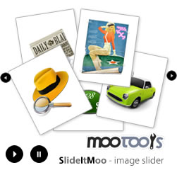
SlideItMoo is a banner rotator, article spinner and image slider ( carousel ) developed with MooTools 1.2. Differences from the first version are the fact that the image slider now supports continuous sliding when navigating, offers the possibility to set how the slider will slide ( from left or from right ) when used with the auto slide feature on, offers the possibility to give it the item width ( width of the slider’s items ) and let it display the elements according to that width and the visible items parameter.
Basically, you can use the script without the item width parameter, by default is null and the width of the elements is calculated by the script. For better control though, it’s recommended that you provide this value. Same goes for height, for vertical sliding carousels. The item_width value is the width of a single item from the slider that includes any padding, margin or borders the element might have ( similar for height ).
To make a better idea about the parameters, it’s best to show them:
- overallContainer: this is the main container id
- elementScrolled: this container has overflow hidden; it works as a mask for his content
- thumbsContainer: the slider elements container; this is the element that actually slides
- itemsSelector: CSS class for your slider items
- itemsVisible: number of items visible
- elemsSlide: number of items to slide at once. For example, if you set this 3, when you click forward/back button or on autoSlide, it will go to the 4th element if the first in the active one.
- itemWidth: width of a single element (since they all have the same width) specified for the itemsSelector parameter
- itemHeight: height of a single element (since they all have the same width) specified for the itemsSelector parameter. This is useful when using the vertical carousel settings
- navs: navigation buttons ( forward/back button ) are no longer added from script. This enables you to style the whole slider/article spinner/carousel/… exactly the way you want and SlideItMoo will only implement functionality. navs param is divided in 2 more params: fwd and bk where fwd is the CSS selector for the forward button ( as .css_class ) and bk for the back button
- slideVertical: if this is set to true, the slider will be vertical. Remember that you need your HTML to display accordingly.
- showControls: displays or hides the navigation links (forward and back)
- transition: the transition you want to use (see this for more details)
- duration: transition duration
- direction: direction to slide (-1: back; 1: forward)
- autoSlide: give it a number in milliseconds and voila! it slides by itself
- mouseWheelNav: mouse wheel navigation is by default disabled. It’s up to you to use it or not.
- onChange: event that triggers every time the current slide changes. This is useful for extending SlideItMoo with extra functionality ( see fancy_slider.html in download archive )
As a comparison with the previous version, this one uses the same HTML markup excepting the fact that the itemsSelector parameter ( CSS class for the slider’s items ) MUST be provided. Also, the CSS is similar to the 1.0 version. One major difference is the fact that the navigation links ( back/forward buttons ) are now added manually by you in HTML and provided to the script as CSS selectors.
For best results, when instantiating the plugin, try give it a itemWidth/itemHeight ( depending on what type on slider you use – vertical or horizontal ) value so that the display will look like you planned. Remember, the itemWidth must include the actual element width plus any margins, padding or borders the element might have.
Returning to the differences between versions, the previous version used Fx.Scroll to make the slide effect; this one uses Fx.Morph. The continuous sliding of the images is obtained by moving the elements before/after the current element reached.
Tested on:
- IE 7
- Firefox 2, Firefox 3
- Google Chrome
- Opera 9.5
Changes:
- added continuous navigation
- elements are selected based on CSS selector
- for banners (but not only if you use autoslide for thumbnails display) added direction control (-1: enter from left; 1: enter from right)
- mouse wheel navigation is optional (default disabled)
- added effect duration as parameter ( when autoslide is enabled, the duration between slides is the sum of the effect duration and the slide duration )
You might also like

Tags
accordion accordion menu animation navigation animation navigation menu carousel checkbox inputs css3 css3 menu css3 navigation date picker dialog drag drop drop down menu drop down navigation menu elastic navigation form form validation gallery glide navigation horizontal navigation menu hover effect image gallery image hover image lightbox image scroller image slideshow multi-level navigation menus rating select dependent select list slide image slider menu stylish form table tabs text effect text scroller tooltips tree menu vertical navigation menu