Nice pure CSS3 Typography

we’ll look at how to take basic markup and transform it into an attractive and beautiful typographical design through pure CSS3. There are no images or other external resources, just pure CSS magic. We’ll also touch on some general typographical concepts along the way.
It has been suggested that beautiful and usable websites are created on a foundation of beautiful and usable typography. I’ve even read an article that suggests that the web is actually comprised of 95% typography. I’m not convinced that there is any empirical evidence for this figure, but I think that the point is a good one. And, that makes typography a pretty important element that you will want to look at very carefully.
Fortunately, CSS offers a variety of styling options that allow you a great deal of control over how your present your content to your viewers and users.
I’ve actually been meaning to prepare an article about typography for a while now, and I’ve finally gotten around to it in the form of this tutorial. Today we’re going to take a detailed look at how to create a beautiful and attractive typographic design using a variety of awesome CSS3 rules (many of which were also available in CSS2).
Starting with Mark-Up
Before we can get started with any kind of styling, we need to begin by creating some content, all nicely marked up as HTML. No need to waste a lot of time on this. Here is the basic markup that we will be using:
<h1>
  Web Typography
  <span>A Demo For Beautiful Typography on the Web</span>
</h1>
<div class="meta">An <span>Article</span> by <span>Matt Ward</span></div>
<div class="body">
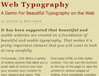
<p>It has been suggested that beautiful and usable websites are created on a foundation of beautiful and usable typography. That makes it a pretty important element that you will want to look at very carefully.</p>
<p>Fortunately, CSS offers a variety of styling options that allow you a great deal of control over how your present your content to your viewers and users. This demo - which is entirely driven by CSS - is built to demonstrate the step by step development of attractive typography, moving from basic HTML to fully styled content. You can use the buttons at the top of the page to view the content in various stages of styling, from completely unstyled to the completed design. Please feel free to have a bit of fun by working through the various stages.</p>
<date>Created: May 13, 2010</date>
</div>
Basically, we have a heading (and sub-heading, as distinguished by a <span> tag), followed by some meta information about the author, some paragraphs and a creation date.
Aside from the coloured background, this is basically just the way that the browser renders the content without any styles. It doesn’t look horrible, but, with a bit of love, we can make it a whole lot better.
Step 1
The first thing that we want to handle is the title itself. We’re going to change the colour, the typeface, the size and the tracking. Here’s the full style rule.
h1{
  font-size: 2.5em;
  font-family: Georgia;
  letter-spacing: 0.1em;
  color: rgb(142,11,0);
  text-shadow: 1px 1px 1px rgba(255,255,255,0.6);
}
After applying these styles, we now have a nice bold heading, as shown in this screenshot:
Now, let’s take a look at some of what we did in the CSS. First, we increased the font size up to a full 2.5em, and mixed a nice dark red colour using the rgb() colour definition.
Next, we changed the typeface of the entire title to Georgia, which is a web-safe serif font that looks really nice. Of course, with wide support for @font-face these days, we don’t really need to restrict ourselves to web-safe fonts anymore, but Georiga still works really nicely, so I’ll just stick with it.
Personally, however, I find that the default tracking on the Georgia font is a little tight, so I open it up just a little, using the letter-spacing property. Because I am using the proportional em unit, we want to keep the number relatively low. Otherwise, the tracking will become overdone.
Lastly, we applied a subtle letterpress effect by using a thin, white drop shadow, which actually ends up looking more like a highlight.
Step 2
The title looks good now. However, we also want to break out the main title and the subtitle. This is why we marked up the subtitle into a <span> tag, which will allow us to apply these different styles:
h1 span{
  display: block;
  margin-top: 0.5em;
  font-family: Verdana;
  font-size: 0.6em;
  font-weight: normal;
  letter-spacing: 0em;
  text-shadow: none;
}
We create a logical break between the heading and the sub heading by converting the inline <span> into a block level element, and established visual differentiation by lowering the text size, reducing the weight (removing the bold) and changing the typeface from Georgia to the sans serif Verdana. Notice, however, that we do nothing with the colour. Because of CSS inheritance, the original colour rules for the heading are maintained by the sub heading.
This works nicely to maintain a level of continuity within the title. Even though we want some differentiation between the title and the subtitle, we don’t want to separate them too much.
We also want to remove the letterpress effect by eliminating the drop shadow, and reset the tracking by reducing the letter spacing back down to 0.
Step 3
The next two steps involve working on the meta data line. For this one, I want to create a very strong differentiation from the title, without changing the typography completely. So, here is the CSS that we’re going to use:
.meta{
  font-family: Georgia;
  color: rgba(69,54,37,0.6);
  font-size: 0.85em;
  font-style: italic;
  letter-spacing: 0.25em;
  border-bottom: 1px solid rgba(69,54,37,0.2);
  padding-bottom: 0.5em;
}
Keeping with the Georgia font helps to maintain some nice typographical unity within the design. Changing to either another serif or sans serif font would likely just cause typographical confusion, and changing all of the other properties helps to create enough of a difference between the meta information line and the title.
You may also notice that I use the rgba() colour definition rather that just the regular rgb(). This is definitely one of my absolute favourite parts of CSS3, since it adds a fourth dimension to the definition: an alpha channel that allows us to control opacity. When using rgba(), the fourth property (a number between 0 and 1) actually defines the level of transparency to be applied to that particular colour! It may not seem like much, but it’s an incredibly powerful tool. It’s not fully supported in IE yet, but it’s pretty easy to build in some graceful degradation.
Step 4
Next, we want to make one more quick change to the meta line. You may notice that I surrounded both the term “articles” and my name in <span> tags in the markup. This is because I want to add in a very slight typographical variation on these bits of text. I can accomplish it with just a few lines of code:
.meta span{
  text-transform: capitalize;
  font-style: normal;
  color: rgba(69,54,37,0.8);
}
The text-transform property is an awesome way of dealing with case in your designs. In this instance, I made everything uppercase, but sometimes it’s also useful to reduce everything to lowercase too.
I also removed the italic styling and reduced the overall transparency (making the text more opaque), in order to establish further contrast between these snippets of text and the rest of the line.
Step 5
Historically, creating columns in CSS has been something of an arduous process, involving a division of the content into different block level containers, along with floats or other positioning magic. It was certainly better than using tables, but still not necessarily ideal. Fortunately, with the new typographic elements introduced in CSS3, creating columns has become simpler than ever.
We’re going to use some of this new typographical goodness in our next step, by creating two columned paragraphs.
.body p{
  font-family: Verdana;
  -moz-column-count: 2;
  -moz-column-gap: 1em;
  -webkit-column-count: 2;
  -webkit-column-gap: 1em;
  column-count: 2;
  column-gap: 1em;
  line-height: 1.5em;
  color: rgb(69,54,37);
}
The rule is a little long and just a tiny bit redundant, since we need to use Mozilla and Webkit specific properties to make sure that the styling is actually applied across as many browsers as possible. Eventually, I’m sure that they will both accept the standard property, but for now it’s best to keep all the declarations, just to make sure that it renders like this:
With these properties, you can set the number of columns that you want to use, and the space gap between the columns, which is great because it can allow you to keep a design tightly aligned to an underlying grid.
Also, while in this case I simply applied the column properties to the paragraph, you can also apply them to a higher, container-level element such as a <div> and have all the child paragraphs flow nicely into the proper structure.
The other thing we want to note about this styling rule is that we changed the main paragraph text to Verdana, matching it typographically to the sub title. Again, the rest of the properties are different enough to maintain a strong visual difference, but the use of the same font helps keep everything tied together.
Step 6
We are going to maintain this continuity in the sixth step too. We actually have two paragraphs in our markup, and based on the way we applied the columns, the order of the copy is actually somewhat disjointed. I did this on purpose, though, as I want to add a some different styling to the first paragraph.
.body p:first-child{
  font-size: 1.25em;
  font-family: Georgia;
  font-style: italic;
  -moz-column-count: 1;
  -webkit-column-count: 1;
  column-count: 1;
  letter-spacing: 0.1em;
}
.body p:first-child:first-line{
  font-weight: bold;
}
There are a couple of things that you should notice about this code. First, we are using the first-child pseudo-class to target any paragraph that is the first child of an element with the class of “body”. This is a handy little selector that allows you to build in some nice visual variation to the beginning of a block of text.
In this case, I want to add extra emphasis to this first paragraph, thereby giving more weight and significance to its content. I also want to stretch it across the two columns and change the font back to Georgia, again for emphasis.
Getting rid of the columns is actually pretty easy. All I have to do is replicate the column-count properties, and reduce it back down to 1.
Next, I can change the font family, and again I increase the letter spacing just a tad to help everything breath a bit better in Georgia. Then, for just an little bit of extra emphasis, I set the whole font style to italic.
You’ll also notice that this is the only step in this tutorial that actually includes two CSS rules. The second one is just a short little snippet that combines both the first-child pseudo-class and the first-line pseudo-class, allowing me to actually bold the first line of the first paragraph!
Step 7
Our typographic styling is pretty much complete. The only thing left to do now is add some styles to the date.
date{
  font-family: Georgia;
  color: rgba(69,54,37,0.6);
  font-size: 0.75em;
  font-style: italic;
  letter-spacing: 0.25em;
  border-top: 1px solid rgba(69,54,37,0.2);
  display: block;
  padding-top: 0.5em;
  margin-top: 2em;
}
The rule here is pretty similar to the rule for the line of meta information. The only real difference is that I reduced the font size a little bit, to help establish a better visual hierarchy. I also flipped the border-based rule from the bottom to the top.
Because the <date> tag creates an inline element by default, I changed the display mode to block. Finally I extended the top margin to improve the overall balance.
Typographical Summary
So there you have it: we’ve created what I think is an attractive typographical design using nothing by HTML and CSS. No images are used at all. To wrap this article up, I would just like to make a few quick notes about the typography itself.
- Despite only using two fonts in the entire design, I was able to create a wide range of styles, simply by altering the size, weight, colour and other properties of the type. This is a great way to generate typographical interest without having to rely on a lot of fonts. As I’ve already mentioned a couple times, it also helps to maintain unity within the design.
- Tracking (letter spacing) and leading (line spacing) are two elements of typography that are often overlooked when working with type on the web. However, while it may not have all the precession control of InDesign or Quark, CSS does provide some basic tools that allow use to make adjustments in these areas, resulting in more beautiful type.
- The art of typography is not just about picking fonts, colours and sizes. It’s not even just about leading, tracking and kerning. These are all just concepts used to describe and modify type. The real purpose of typography, however, is to help create and convey meaning through words. One of the ways to do this is through visual hierarchy – making typographical choices that reflect the relative importance of each and every element.
- Lastly, every element matters. Good typography takes nothing for granted. Instead, it makes a careful consideration of each and every element, no matter how insignificant it may seem. Ultimately, an element may be allowed to inherit a default value, but that should always be a conscious choice rather than an oversight.
Of course, there is always more that could be said about typography. Still, while I am no master of the craft, these are some of the things that I’ve learned through the process of my own work. I hope you find them, and this tutorial to be of some use!
You might also like
Tags
accordion accordion menu animation navigation animation navigation menu carousel checkbox inputs css3 css3 menu css3 navigation date picker dialog drag drop drop down menu drop down navigation menu elastic navigation form form validation gallery glide navigation horizontal navigation menu hover effect image gallery image hover image lightbox image scroller image slideshow multi-level navigation menus rating select dependent select list slide image slider menu stylish form table tabs text effect text scroller tooltips tree menu vertical navigation menu

 Subscribe
 Follow Us
 13 years ago
 8089
8089 2070
2070


