 Subscribe
 Follow Us
jQuery Beautiful Background Images Navigation
 13 years ago
 22108
22108 3638
3638
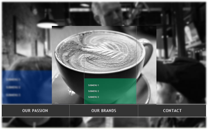
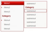
We are going to create a beautiful navigation that has a background image slide effect. The main idea is to have three list items that contain the same background image but with a different position. The background image for each item will be animated to slide into place in different times, creating a really nice effect. The background image sliding direction from the list item in the middle will depend on which item the user was before: coming from the right, it will slide from the left and vice versa.
The Markup
The HTML will consist of a wrapper div and an unordered list with three list items. We will initially set some “bg” classes that will have the respective background images. The “menuWrapper” will always have the “bg” class of the current list item so that we have the background image of the current list item.
<div id="menuWrapper" class="menuWrapper bg1">
 <ul class="menu" id="menu">
  <li class="bg1" style="background-position:0 0;">
   <a id="bg1" href="#">Our Passion</a>
   <ul class="sub1" style="background-position:0 0;">
    <li><a href="#">Submenu 1</a></li>
    <li><a href="#">Submenu 2</a></li>
    <li><a href="#">Submenu 3</a></li>
   </ul>
  </li>
  <li class="bg1" style="background-position:-266px 0px;">
   <a id="bg2" href="#">Our Brands</a>
   <ul class="sub2" style="background-position:-266px 0;">
    <li><a href="#">Submenu 1</a></li>
    <li><a href="#">Submenu 2</a></li>
    <li><a href="#">Submenu 3</a></li>
   </ul>
  </li>
  <li class="last bg1" style="background-position:-532px 0px;">
   <a id="bg3" href="#">Contact</a>
   <ul class="sub3" style="background-position:-266px 0;">
    <li><a href="#">Submenu 1</a></li>
    <li><a href="#">Submenu 2</a></li>
    <li><a href="#">Submenu 3</a></li>
   </ul>
  </li>
 </ul>
</div>
For the background animation plugin to work correctly we need to set the position of the background image as inline styles initially. We already set the right position for each background image, for example, the third item will have the background image positioned to the outer right.
As you can see, every list item has another sub-list with three more items. The background image position of these sublists is set to a value that hides the image. When we animate the background then, we will create the effect of sliding it in from the left or the right.
The CSS
Let’s start by the general style of the the “menuWrapper” which will contain the font styles and the size of the whole element:
.menuWrapper{
    font-family: "Trebuchet MS", Arial, sans-serif;;
    font-size: 15px;
    font-style: normal;
    font-weight: normal;
    text-transform:uppercase;
    letter-spacing: normal;
    line-height: 1.45em;
    position:relative;
    margin:20px auto;
    height:542px;
    width:797px;
    background-position:0 0;
    background-repeat:no-repeat;
    background-color:transparent;
}
The list and the list items of the first layer will have the following style:
ul.menu{
    list-style:none;
    width:797px;
}
ul.menu > li{
    float:left;
    width:265px;
    height:542px;
    border-right:1px solid #777;
    background-repeat:no-repeat;
    background-color:transparent;
}
ul.menu > li.last{
    border:none;
}
The selector “>” addresses only the li elements of the first layer and will not be applied to the ones of the sub-menus. We will give the last li the class “last” in order to remove the right border.
The following three classes define the background images. We will give these classes to all the li elements depending on which one we hover. So, if we hover the second li, we will give the “bg2″ class to all the first layer list items:
.bg1{
    background-image: url(../images/1.jpg);
}
.bg2{
    background-image: url(../images/2.jpg);
}
.bg3{
    background-image: url(../images/3.jpg);
}
Let’s define the look of the link elements in the first layer list. Since the li elements have a big height, we need to push the link elements down. We do that by setting a high top margin:
ul.menu > li > a{
    float:left;
    width:265px;
    height:50px;
    margin-top:450px;
    text-align:center;
    line-height:50px;
    color:#ddd;
    background-color:#333;
    letter-spacing:1px;
    cursor:pointer;
    text-decoration:none;
    text-shadow:0px 0px 1px #fff;
}
To center the text of a link element vertically, you can give a line-height value equal to the height of the element. (I don’t know why, but when I started with learning CSS, I automatically always used paddings to adapt the height of the element and to center it. Using line-height was a real delight because you can control sizes much better like that.)
The second layer lists would naturally appear after the first layer list, so we use a negative top margin to “pull” them up:
ul.menu > li ul{
    list-style:none;
    float:left;
    margin-top:-180px;
    width:100%;
    height:110px;
    padding-top:20px;
    background-repeat:no-repeat;
    background-color:transparent;
}
The li elements of the sub-menu will be initially hidden. In the script we will fade them in when we hover over their parent list item link:
ul.menu > li ul li{
    display:none;
}
Now we define the classes for the background images of the sub-menus:
ul.menu > li ul.sub1{
    background-image:url(../images/bg1sub.png);
}
ul.menu > li ul.sub2{
    background-image:url(../images/bg2sub.png);
}
ul.menu > li ul.sub3{
    background-image:url(../images/bg3sub.png);
}
The link elements of the li elements will have the following style:
ul.menu > li ul li a{
    color:#fff;
    text-decoration:none;
    line-height:30px;
    margin-left:20px;
    text-shadow:1px 1px 1px #444;
    font-size:11px;
}

ul.menu > li ul li a:hover{
    border-bottom:1px dotted #fff;
}
The first sub-list will be shown in the beginning:
ul.menu > li ul.sub1 li{
    display:block;
}
And that’s all the style. Take a look at the ZIP file for the IE6 style sheet.
Now let’s take a look at the JavaScript.
The JavaScript
What we do in the script is the following: we first check where we are coming from and then we animate the background positions of the list elements in the first level and the backgrounds of the sub-menus accordingly:
$(function() {
 /* position of the <li> that is currently shown */
 var current = 0;

 $('#bg1,#bg2,#bg3').mouseover(function(e){

  var $this = $(this);
  /* if we hover the current one, then don't do anything */
  if($this.parent().index() == current)
   return;

  /* item is bg1 or bg2 or bg3, depending where we are hovering */
  var item = e.target.id;

  /*
  this is the sub menu overlay. Let's hide the current one
  if we hover the first <li> or if we come from the last one,
  then the overlay should move left -> right,
  otherwise right->left
   */
  if(item == 'bg1' || current == 2)
   $('#menu .sub'+parseInt(current+1))
       .stop()
    .animate({backgroundPosition:"(-266px 0)"},300,function(){
     $(this).find('li').hide();
    });
  else
   $('#menu .sub'+parseInt(current+1))
    .stop()
    .animate({backgroundPosition:"(266px 0)"},300,function(){
     $(this).find('li').hide();
    });

  if(item == 'bg1' || current == 2){
   /*
   if we hover the first <li> or if we come from
   the last one, then the images should move left -> right
   */
   $('#menu > li')
    .animate({backgroundPosition:"(-800px 0)"},0)
    .removeClass('bg1 bg2 bg3')
    .addClass(item);
   move(1,item);
  }
  else{
   /*
   if we hover the first <li> or if we come
   from the last one, then the images should move
   right -> left
   */
   $('#menu > li')
    .animate({backgroundPosition:"(800px 0)"},0)
    .removeClass('bg1 bg2 bg3')
    .addClass(item);
   move(0,item);
  }

  /*
  We want that if we go from the first one to the last one
  (without hovering the middle one), or from the last one
  to the first one, the middle menu's overlay should also
  slide, either from left to right or right to left.
   */
  if(current == 2 && item == 'bg1'){
   $('#menu .sub'+parseInt(current))
   .stop()
   .animate({backgroundPosition:"(-266px 0)"},300);
  }
  if(current == 0 && item == 'bg3'){
   $('#menu .sub'+parseInt(current+2))
   .stop()
   .animate({backgroundPosition:"(266px 0)"},300);
  }

  /* change the current element */
  current = $this.parent().index();

  /* let's make the overlay of the current one appear */

  $('#menu .sub'+parseInt(current+1))
   .stop().animate({backgroundPosition:"(0 0)"},300,function(){
    $(this).find('li').fadeIn();
   });
 });
 /*
 dir:1 - move left->right
 dir:0 - move right->left
  */
 function move(dir,item){
  if(dir){
   $('#bg1').parent()
      .stop()
      .animate({backgroundPosition:"(0 0)"},200);
   $('#bg2').parent()
      .stop()
      .animate({backgroundPosition:"(-266px 0)"},300);
   $('#bg3').parent()
      .stop()
      .animate({backgroundPosition:"(-532px 0)"},400,function(){
      $('#menuWrapper').removeClass('bg1 bg2 bg3')
           .addClass(item);
      });
  }
  else{
   $('#bg1').parent()
      .stop()
      .animate({backgroundPosition:"(0 0)"},400,function(){
      $('#menuWrapper').removeClass('bg1 bg2 bg3')
           .addClass(item);
      });
   $('#bg2').parent()
      .stop()
      .animate({backgroundPosition:"(-266px 0)"},300);
   $('#bg3').parent()
      .stop()
      .animate({backgroundPosition:"(-532px 0)"},200);
  }
 }
});
And that’s it! A beautiful cross-browser capable effect!
You might also like

Tags
accordion accordion menu animation navigation animation navigation menu carousel checkbox inputs css3 css3 menu css3 navigation date picker dialog drag drop drop down menu drop down navigation menu elastic navigation form form validation gallery glide navigation horizontal navigation menu hover effect image gallery image hover image lightbox image scroller image slideshow multi-level navigation menus rating select dependent select list slide image slider menu stylish form table tabs text effect text scroller tooltips tree menu vertical navigation menu