 Subscribe
 Follow Us
Hover effect Drop-Down menu with CSS3 & jQuery
 13 years ago
 29430
29430 5335
5335
This is a really awesome menu in the browser. So I hope you'll enjoy learning some CSS3, but also how to create the base HTML for a drop-down menu and how to make it magical with jQuery.
The HTML
Lets start by building up the basic HTML necessary for any working menu:
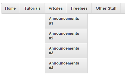
<ul id="dropdown_nav">
     <li><a href="#">Home</a></li>
     <li><a href="#">Tutorials</a>
          <ul class="sub_nav">
               <li><a href="#">Photoshop #1</a></li>
               <li><a href="#">Photoshop #2</a></li>
               <li><a href="#">Photoshop #3</a></li>
               <li><a href="#">Photoshop #4</a></li>
          </ul>
     </li>
     <li><a href="#">Artciles</a>
          <ul class="sub_nav">
               <li><a href="#">Announcements #1</a></li>
               <li><a href="#">Announcements #2</a></li>
               <li><a href="#">Announcements #3</a></li>
               <li><a href="#">Announcements #4</a></li>
          </ul>
     </li>
     <li><a href="#">Freebies</a>
     </li>
     <li><a href="#">Other Stuff</a>
          <ul class="sub_nav">
               <li><a href="#">Other Stuff #1</a></li>
               <li><a href="#">Other Stuff #2</a></li>
               <li><a href="#">Other Stuff #3</a></li>
               <li><a href="#">Other Stuff #4</a></li>
          </ul>
     </li>
</ul>
So lets go through the code at slower pace and build it up. First off we have a master UL named #dropdown_nav, this will ultimately be responsible for the entire menu.
Inside that we have some LI tags with some child a href="" tags. As I’m sure you can guess these will be the main navigation links. So far it’ll look like this:
<ul id="dropdown_nav">
     <li><a href="#">Home</a></li>
     <li><a href="#">Tutorials</a></li>
     <li><a href="#">Artciles</a></li>
     <li><a href="#">Freebies</a></li>
     <li><a href="#">Other Stuff</a></li>
</ul>
Just a simple nav with a couple of links. Now onto the UL leveling.
<ul id="dropdown_nav">
     <li><a href="#">Home</a></li>
     <li><a href="#">Tutorials</a>
          <ul class="sub_nav">
               <li><a href="#">Photoshop #1</a></li>
               <li><a href="#">Photoshop #2</a></li>
               <li><a href="#">Photoshop #3</a></li>
               <li><a href="#">Photoshop #4</a></li>
          </ul>
     </li>
     <li><a href="#">Artciles</a></li>
     <li><a href="#">Freebies</a>
     </li>
     <li><a href="#">Other Stuff</a></li>
</ul>
Hopefully you won’t be to baffled by the seemingly large amount of random HTML in the block above. Look closer and you’ll see that it’s just an LI with a UL for a child. I know that if you’re not that experienced with HTML or lists then it may seem a bit daunting at first having such a strange parent/child relationship; but don’t worry, once you’ve made a few drop-down menus or used it in the sidebar of blog layout then it’s all just code you understand at the end of the day, nothing too easy but nothing to hard to get to grips with either.
I’ve then just added the same UL with a class of .sub_nav, (yes you’d better make it a class since using an object with an ID that has already been used will result in a HTML error), to a few other LI‘s.
The normal CSS, with no CSS3
First off, with the CSS we need to approach it without the CSS3, this will just make it easier later on when we have a lot of CSS and so the CSS3 doesn’t get in the way. Here’s the real basic CSS:
/* The Main UL */
#dropdown_nav {
     width:960px;
     padding:0px;
     display:inline-block;
     list-style:none;
     border:1px solid #ccc;
     background:#e2e2e2;
}

     #dropdown_nav li {
          padding:10px 0px 10px 0px;
          float:left;
          position:relative;
          display:inline-block;
     }

          #dropdown_nav li a {
               padding:10px 15px 10px 15px;
               border-right:1px solid #ccc;
          }
          #dropdown_nav li a:hover {
               background:#f9f9f9;
          }
          #dropdown_nav li a:active {
               background:#ccc;
          }

          /* Sub-Nav styling */
          #dropdown_nav .sub_nav {
               width:160px;
               padding:0px;
               position:absolute;
               top:38px;
               left:0px;
               border:1px solid #ccc;
               background:#e2e2e2;
          }

               #dropdown_nav .sub_nav li {
                    width:160px;
                    padding:0px;
               }

                    #dropdown_nav .sub_nav li a {
                         display:block;
                         border-bottom:1px solid #ccc;
                    }
                    #dropdown_nav .sub_nav li a:hover {
                         background:#f9f9f9;
                    }
                    #dropdown_nav .sub_nav li a:active {
                         background:#ccc;
                    }
OK then, so lets make it clear to all the advanced coders out there who think that I should of used a class in every LI to shorten the code, or used a different CSS hierarchy.
The reason I took this approach is so that the code is nice and usable, if you’re a WordPress developer then you’ll probably know what I mean by “WordPress gives you freedom…most of the time.”. Anyone not familiar to WordPress or new to coding should probably go check it out because it’ll definitely be something you use in your future projects…probably quite far into the future though.
Now I don’t think I need to explain much about the CSS apart from a few things, so here we go:
The display:inline-block; Styling
I’ve gone for the option of displaying anything with a floated child to display:inline-block;. It’s a fix I always seem to use for Firefox where if not styled like so, then any div that floats for some reason makes the parent forget it’s there. You can read more on the problem in an article I wrote last year.
The Positioning: Relative & Absolute
You may have always wondered how to get the drop-down part of the menu to appear under the parent LI without messing up the rest of the nav. Well then look no further because using positioning is the perfect way to achieve this. Just remember that anything with a position:absolute; will need a parent with position:relative; to contain it.
Also, the top:38px; and the left:0px; are used in cooperation with the absolute value.
The CSS3
It’s time for the fun stuff to start with some CSS3! You’ll also notice if you happen to actually be reading this tutorial and you aren’t just copying and pasting the code, then wondering why it isn’t working or doesn’t look right, that there are some padding changes and a few new classes in the CSS3.
So first off with the CSS3 you’ll need to add this to the first and last LI‘s anchor tag, like so:
<li><a class="first" href="#">Home</a></li>
<li><a class="last" href="#">Other Stuff</a>
If you notice in the CSS3 below that there is a selector class that’s got some CSS3 which is rounding off the top and bottom left corners of the first nav link, that’ll be so we don’t get any overlap which covers up the lovely rounded corners of the main UL. You’ll also see the same thing done for the .last selector but it’s commented out. Well that’s because it looks a bit stupid when the last link is rounded but it’s only half way across the menu.
Also remember that padding I said about? Well that’s because of the inset box-shadow, (the thin light line on the inside of the border), which adds 1 or 2 pixels of space.
Here’s the code, (finally):
#dropdown_nav {
     width:960px;
     padding:0px;
     display:inline-block;
     list-style:none;
     -moz-box-shadow:inset 0px 0px 1px #fff;
     -webkit-box-shadow:inset 0px 0px 1px #fff;
     border:1px solid #ccc;
     -moz-border-radius:5px;
     -webkit-border-radius:5px;
     background:#e2e2e2;
     background:-moz-linear-gradient(#f3f3f3, #e2e2e2);
     background:-webkit-gradient(linear, 0 0, 0 100%, from(#f3f3f3), to(#e2e2e2));
}

     #dropdown_nav li {
          padding:10px 0px 10px 0px;
          float:left;
          position:relative;
          display:inline-block;
     }

          #dropdown_nav li a {
               padding:10px 15px 10px 15px;
               text-shadow:-1px 1px 0px #f6f6f6;
               -moz-box-shadow:inset 0px 0px 1px #fff;
               -webkit-box-shadow:inset 0px 0px 1px #fff;
               border-right:1px solid #ccc;
          }
          #dropdown_nav li a:hover {
               background:#f9f9f9;
               background:-moz-linear-gradient(#f9f9f9, #e8e8e8);
               background:-webkit-gradient(linear, 0 0, 0 100%, from(#f9f9f9), to(#e8e8e8));
          }
          #dropdown_nav li a:active {
               background:#e2e2e2;
               background:-moz-linear-gradient(#e2e2e2, #f3f3f3);
               background:-webkit-gradient(linear, 0 0, 0 100%, from(#e2e2e2), to(#f3f3f3));
          }

          #dropdown_nav li a.first {
               -moz-border-radius:5px 0px 0px 5px;
               -webkit-border-radius:5px 0px 0px 5px;
          }
          /*#dropdown_nav li a.last {
               -moz-border-radius:0px 5px 5px 0px;
               -webkit-border-radius:0px 5px 5px 0px;
          }*/

          /* Sub-Nav styling */
          #dropdown_nav .sub_nav {
               width:160px;
               padding:0px;
               position:absolute;
               top:38px;
               left:0px;
               border:1px solid #ccc;
               background:#e2e2e2;
          }

               #dropdown_nav .sub_nav li {
                    width:160px;
                    padding:0px;
               }

                    #dropdown_nav .sub_nav li a {
                         display:block;
                         border-bottom:1px solid #ccc;
                         background:-moz-linear-gradient(#f3f3f3, #e2e2e2);
                         background:-webkit-gradient(linear, 0 0, 0 100%, from(#f3f3f3), to(#e2e2e2));
                    }
                    #dropdown_nav .sub_nav li a:hover {
                         background:#f9f9f9;
                         background:-moz-linear-gradient(#f9f9f9, #e8e8e8);
                         background:-webkit-gradient(linear, 0 0, 0 100%, from(#f9f9f9), to(#e8e8e8));
                    }
                    #dropdown_nav .sub_nav li a:active {
                         background:#e2e2e2;
                         background:-moz-linear-gradient(#e2e2e2, #f3f3f3);
                         background:-webkit-gradient(linear, 0 0, 0 100%, from(#e2e2e2), to(#f3f3f3));
                    }
The jQuery
You weren’t expecting this little code were you?:
$(function() {
 //We initially hide the all dropdown menus
 $('#dropdown_nav li').find('.sub_nav').hide();

 //When hovering over the main nav link we find the dropdown menu to the corresponding link.
 $('#dropdown_nav li').hover(function() {
  //Find a child of 'this' with a class of .sub_nav and make the beauty fadeIn.
  $(this).find('.sub_nav').fadeIn(100);
 }, function() {
  //Do the same again, only fadeOut this time.
  $(this).find('.sub_nav').fadeOut(50);
 });
});
Anyway, to explain the code: We start by hiding the sub navigation where it exsists. Then we have each nav link being hovered over, when it’s hovered, if it has a child with a class of .sub_nav then show it. You may be wondering why it doesn’t work when you hover over #dropdown_nav li a. Well that’s because #dropdown_nav li a and #dropdown_nav li .sub_nav have a sibling relationship, not a parent/child one.
that's it。
You might also like


Tags
accordion accordion menu animation navigation animation navigation menu carousel checkbox inputs css3 css3 menu css3 navigation date picker dialog drag drop drop down menu drop down navigation menu elastic navigation form form validation gallery glide navigation horizontal navigation menu hover effect image gallery image hover image lightbox image scroller image slideshow multi-level navigation menus rating select dependent select list slide image slider menu stylish form table tabs text effect text scroller tooltips tree menu vertical navigation menu