 Subscribe
 Follow Us
simple Pure CSS3 Navigation Menu
 12 years ago
 19355
19355 3670
3670
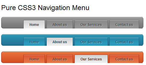
Menus driven purely by CSS have always been the ideal solution when it comes to navigation. However, we all know that we have been forced to use simplistic designs or images because of limited CSS and browser capabilities sometime or the other. You’ll be happy to know that with the advent of CSS3, it is easier than ever to create flexible, and simple yet creditably good looking navigation menus.
Please note that this will work only on modern browsers, but it does have a fall-back for IE and other older browsers.
The markup
Let’s start with the html markup for the navigation. We’ll keep it very simple and straightforward here.
<ul class="cssTabs">
	<li class="active">Home</li>
	<li>About us</li>
	<li>Our Services</li>
	<li>Contact us</li>
</ul>
Step 1 – The basic CSS
Now, let’s style the navigation with the basic parameters.
ul.cssTabs {
	background: #848383;
	border:solid 1px #606060;
	padding: 0 75px;
	width: 405px;
	margin:20px;
	font-size:12px;
	font-weight:bold;
}

ul.cssTabs > li {
	background:#989898;
	color:#3a3a3a;
	border:solid 1px #606060;
	border-bottom:0;
	display: inline-block;
	margin: 10px 1px -1px;
	padding: 8px 20px;
}

ul.cssTabs > li.active {
	background:#ededed;
}
This should be pretty self-explanatory. This is also what the fall-back will look like.
Step 2 – Gradients, box-shadows and rounded corners
We now get down to the main business of using CSS3 capabilities. Add the following code to the ul.cssTabs class:
        background:-moz-linear-gradient(0% 100% 90deg,#737373, #9a9a9a);
	background:-webkit-gradient(linear, 0% 0%, 0% 100%, from(#9a9a9a), to(#737373));

	box-shadow: inset 0 1px 0 0 #dfdfdf;
	-moz-box-shadow: inset 0 1px 0 0 #dfdfdf;
	-webkit-box-shadow: inset 0 1px 0 0 #dfdfdf;

	border-radius: 8px 8px;
	-moz-border-radius: 8px 8px;
	-webkit-border-radius: 8px 8px;
Step 3 – Styling the list items
Using the techniques described above, we add these styles to the list items (ul.cssTabs > li):
	background:-moz-linear-gradient(0% 100% 90deg,#9a9a9a, #888888);
	background:-webkit-gradient(linear, 0% 0%, 0% 100%, from(#888888), to(#9a9a9a));

	box-shadow: inset 0 1px 0 0 #dfdfdf;
	-moz-box-shadow: inset 0 1px 0 0 #dfdfdf;
	-webkit-box-shadow: inset 0 1px 0 0 #dfdfdf;

	text-shadow: 1px 1px 0 #d3d3d3;
The final step – Active list
And finally, let’s add a different style to the active list item (ul.cssTabs > li.active).
	background:-moz-linear-gradient(0% 100% 90deg,#f0f0f0, #d1d1d1) !important;
	background:-webkit-gradient(linear, 0% 0%, 0% 100%, from(#d1d1d1), to(#f0f0f0)) !important;

	box-shadow: inset 0 1px 0 0 #fff;
	-moz-box-shadow: inset 0 1px 0 0 #fff;
	-webkit-box-shadow: inset 0 1px 0 0 #fff;

	text-shadow: none;
Like what you see? Click on the download button to get the code. It also includes three different color schemes. And try out your own colors too!
The article source:http://praveenfrancis.com/tutorials/tutorial-pure-css3-navigation-menu/
You might also like


Tags
accordion accordion menu animation navigation animation navigation menu carousel checkbox inputs css3 css3 menu css3 navigation date picker dialog drag drop drop down menu drop down navigation menu elastic navigation form form validation gallery glide navigation horizontal navigation menu hover effect image gallery image hover image lightbox image scroller image slideshow multi-level navigation menus rating select dependent select list slide image slider menu stylish form table tabs text effect text scroller tooltips tree menu vertical navigation menu