 Subscribe
 Follow Us
jQuery Sliding hover Animated Menu
 13 years ago
 52852
52852 8195
8195

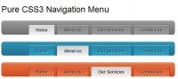
we’ll be building a cool Animated navigation list complete with a sliding hover effect.
We’ll build the design to work without jQuery first of all to ensure it’s widely accessible to users without Javascript enabled, then enhance the effect with jQuery for the majority of users.
the basic HTML structure
<!DOCTYPE html PUBLIC "-//W3C//DTD XHTML 1.0 Strict//EN" "http://www.w3.org/TR/xhtml1/DTD/xhtml1-strict.dtd">
<html xmlns="http://www.w3.org/1999/xhtml">
<head>
<meta http-equiv="Content-Type" content="text/html; charset=UTF-8" />
<title>Animated Label Navigation Menu</title>

<link href="style.css" rel="stylesheet" type="text/css" media="screen" />

<script src="http://ajax.googleapis.com/ajax/libs/jquery/1.4.1/jquery.min.js" type="text/javascript"></script>
<script src="js/animate-bg.js" type="text/javascript"></script>
<script src="js/scripts.js" type="text/javascript"></script>
</head>

<body>

<div id="container">
 <ul id="nav">
  <li><a href="#">Home</a></li>
  <li><a href="#">About</a></li>
  <li><a href="#">Work</a></li>
  <li><a href="#">Contact</a></li>
 </ul>
</div>

</body>
</html>
The basic menu system first needs to be laid out as a HTML skeleton. Begin the page with a Doctype, followed by page title and a link to the CSS stylesheet. Write out the menu itself as a good old Unordered List element, with each <li> item containing an anchor.
Style up the design with CSS
body, div, h1, h2, h3, h4, h5, h6, p, ul, ol, li, dl, dt, dd, img, form, fieldset, input, textarea, blockquote {
 margin: 0; padding: 0; border: 0;
}

body {
 background: #f5f0e0 url(images/noise.png);
}

#container {
 height: 800px;
 background: url(images/bg.jpg) center top no-repeat;
}

ul#nav {
 width: 700px; margin: 0 auto; text-align: center; overflow: hidden;
}
 ul#nav li {
  float: left; list-style: none;
 }
  ul#nav li a {
   display: block; width: 97px; height: 77px;
   padding: 72px 0 0 0; margin: 0 32px 0 32px;
   font: bold 16px Helvetica, Arial, Sans-Serif; text-transform: uppercase;
   color: #9c5959; text-shadow: 0 1px 3px #c4bda6; text-decoration: none;

   background: url(images/label.png) 0 -149px no-repeat;
  }
   ul#nav li a:hover {
    background: url(images/label.png) 0 0 no-repeat;
    color: #eee9d9; text-shadow: 0 2px 3px #4c2222;
   }

   ul#nav li a.js:hover {
    background: url(images/label.png) 0 -149px no-repeat;
   }
Next, the CSS brings the design to life. Begin the CSS file with a quick reset to remove any default browser styling, then set up the surrounding page design by adding the repeating noise background texture to the page body. Centre up the <ul> with margin: auto; and text-align: center; and clear the element using overflow: hidden;.
Float each <li> item to the left to place each nav item side by side. The rest of the styling can then go directly onto the anchors. Each anchor needs to have the exact dimensions of the label graphic, taking into consideration any padding used to position the text into place. Replicate the font styling from Photoshop using the same bold Helvetica styling, and use the CSS3 text-shadow property to recreate the Photoshop Drop Shadow. Finally, add the label graphic as a background image and set the position to -149px so it is hidden off screen until the mouse hovers the nav item.
Set up the styling for the :hover effects by moving the background back into position and alter the colour of the font and shadow to ensure they can still be seen when the background colour changes.
A preview of the HTML file so far will show a fully working menu design, albeit with basic CSS styling where the label immediately appears and disappears without any cool sliding effects. It’s important to first develop this basic fall back so users without Javascript enabled will still see a hover effect.
the effect with jQuery
In order to add some fancy Javascript effects we first need to head back to the HTML file and link up some JS files. We’ll require three files: The jQuery library, a handy plugin allowing background position animation, and finally our own blank scripts.js file where we’ll write our own code.
$(document).ready(function() {
 $("ul#nav li a").addClass("js");
 $("ul#nav li a").hover(
      function () {
        $(this).stop(true,true).animate({backgroundPosition:"(0 0)"}, 200);
        $(this).animate({backgroundPosition:"(0 -5px)"}, 150);
      },
      function () {
        $(this).animate({backgroundPosition:"(0 -149px)"}, 200);

      }
    );

});
The first thing to add to our jQuery code is a simple line to turn off the basic CSS effect. Adding a special ‘.js’ class to the anchor with Javascript allows us to add an extra line of CSS to overwrite the original styling. With this out of the way we can then style the actual sliding hover effect. Add a hover function to the anchors within the menu list. On hover, use .animate() to set the backgroundPosition to 0 0, then back off screen on hover-out. A speed of 200 keeps things nice and swift. One extra snippet to add is a .stop(true,true) to prevent the effect looping if the mouse passes over the menu quickly.
A preview of the effect in the browser will show the label sliding in and out on hover. We can add one extra line to really spruce up the effect. Adding an extra animation to move the label by just 5px creates a cool little bounce effect. Similar effects can also be achieved using easing plugins, but to save linking up extra files this little trick works nicely.
That's it.
You might also like


Tags
accordion accordion menu animation navigation animation navigation menu carousel checkbox inputs css3 css3 menu css3 navigation date picker dialog drag drop drop down menu drop down navigation menu elastic navigation form form validation gallery glide navigation horizontal navigation menu hover effect image gallery image hover image lightbox image scroller image slideshow multi-level navigation menus rating select dependent select list slide image slider menu stylish form table tabs text effect text scroller tooltips tree menu vertical navigation menu