 Subscribe
 Follow Us
Slick Login Form with CSS3
 13 years ago
 8620
8620 2385
2385
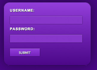
The goal of this post is to harness some new functionality provided by CSS3 and move away from images. We are going to create a CSS3 login form without images yet still have a visually pleasing result.
Writing the HTML
First lets begin with creating the HTML markup that makes up the login form. Start with the basic HTML page as I will not include that portion in the code.
<form>
        <label>Username:</label>
            <input type="text" name="username" />
        <label>Password:</label>
            <input type="password" name="password"  />
            <input type="submit" value="Submit" name="submit" class="submit" />
</form>
This is the basic markup with a few labels and Input elements. Now there are many different ways to markup the HTML you see above, but I tried to make it as simple as possible. Make sure you add the Class SUBMIT to your button because it will require different styling.
As you can see above we really need the power of CSS in order to give this login form some visual appeal. Enter CSS3!
Writing the CSS
It is now time to give this login form some life. CSS3 has some really powerful new features and we will be covering only a few of them. First lets get some of the basic layout styles down nothing having to do with CSS3
Styling the Form Element
We will begin writing our CSS targeting the form element as some of the other elements on the page will rely on the parent element. I’m going to go through the properties in logical order not in alphabetical order. We want to set the width to 250px with 20px of padding on all sides and a 1px border also.
form {
    width: 250px;
    padding: 20px;
    border: 1px solid #270644;
}
Adding CSS3 to the Form Element
Now lets add in the CSS3 magic to bring this form to life.
form {
    width: 250px;
    padding: 20px;
    border: 1px solid #270644;

    /*** Adding in CSS3 ***/

    /*** Rounded Corners ***/
    -moz-border-radius: 20px;
    -webkit-border-radius: 20px;

    /*** Background Gradient - 2 declarations one for Firefox and one for Webkit ***/
    background:  -moz-linear-gradient(19% 75% 90deg,#4E0085, #963AD6);
    background:-webkit-gradient(linear, 0% 0%, 0% 100%, from(#963AD6), to(#4E0085));

    /*** Shadow behind the box ***/
    -moz-box-shadow:0px -5px 300px #270644;
    -webkit-box-shadow:0px -5px 300px #270644;
}
Styling the Input Elements
Styling the input elements is pretty easy but it does have some complications that can frustrate. We will apply a background color, a top border, some padding, and a width.
input {
    width: 230px;
    background: #8a33c6;
    padding: 6px;
    margin-bottom: 10px;
    border-top: 1px solid #ad64e0;
    border-left: 0px;
    border-right: 0px;
    border-bottom: 0px;
}
Adding CSS3 to the Input Element
For the input element we will implement the new features of CSS3 called transitions. Unfortunately this only works in Webkit browsers such as Safari and Chrome.
input {
    width: 230px;
    background: #8a33c6;
    padding: 6px;
    margin-bottom: 10px;
    border-top: 1px solid #ad64e0;
    border-left: 0px;
    border-right: 0px;
    border-bottom: 0px;

    /*** Adding CSS3 ***/

    /*** Transition Selectors - What properties to animate and how long ***/
    -webkit-transition-property: -webkit-box-shadow, background;
    -webkit-transition-duration: 0.25s;

    /*** Adding a small shadow ***/
    -moz-box-shadow: 0px 0px 2px #000;
    -webkit-box-shadow: 0px 0px 2px #000;
}
Now that we have the styles for the inputs in place lets style the hover events for those same inputs.
input:hover {
    -webkit-box-shadow: 0px 0px 4px #000;
    background: #9d39e1;
}
Some of you may not have caught it but I increased the radius of the shadow on hover from 2px to 4px. That is why we used the transition effects on the inputs because it triggers that change on hover.
Styling the Button
Ok we’re almost done, on to the button! Since we gave our button the class SUBMIT we can use that selector in our CSS.
input.submit {
    width: 100px;
    color: #fff;
    text-transform: uppercase;
    text-shadow: #000 1px 1px;
    border-top: 1px solid #ad64e0;
    margin-top: 10px;
}
Adding CSS3 to the Submit Button
input.submit {
    width: 100px;
    color: #fff;
    text-transform: uppercase;
    text-shadow: #000 1px 1px;
    border-top: 1px solid #ad64e0;
    margin-top: 10px;

    /*** Adding CSS3 Gradients ***/
    background: -webkit-gradient(linear, 0% 0%, 0% 100%, from(#963AD6), to(#781bb9));
    background:  -moz-linear-gradient(19% 75% 90deg,#781bb9, #963AD6);
}
That’s it! Now you have an awesome login form styled strictly with CSS3 and no images. Of course it only works in webkit browsers currently which are Safari and Chrome, but CSS3 support will be coming to a browser near you soon.
The article source:http://www.threestyles.com/tutorials/css3-login-form-tutorial/
You might also like

Tags
accordion accordion menu animation navigation animation navigation menu carousel checkbox inputs css3 css3 menu css3 navigation date picker dialog drag drop drop down menu drop down navigation menu elastic navigation form form validation gallery glide navigation horizontal navigation menu hover effect image gallery image hover image lightbox image scroller image slideshow multi-level navigation menus rating select dependent select list slide image slider menu stylish form table tabs text effect text scroller tooltips tree menu vertical navigation menu