 Subscribe
 Follow Us
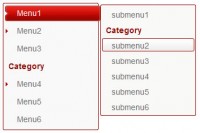
jQuery and CSS3 Round Out Borders Tabs
 12 years ago
 25144
25144 5190
5190

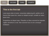
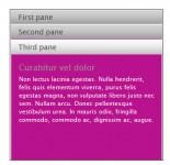
Rounded corners are now trivially easy to achieve via border-radius. But that only allows us to cut into the shape. What if we want to connect a shape to another with a rounded outward corner.
Clean HTML
Of course, on the web, just about anything visual is possible. Worst-case-scenario you can use images. Our goal here, as ever, is to use no images (quick! accessible! easy to update!) and use completely clean semantic HTML (quick! accessible! easy to update!). So here's the markup:
<ul class="tabs group">
  <li class="active"><a href="#one">One</a></li>
  <li><a href="#two">Two</a></li>
  <li><a href="#three">Three</a></li>
  <li><a href="#three">Four</a></li>
</ul>
A class of active indicates which tab reflects the current page.
CSS
This is a big ass block of CSS, but I've tried to comment it up so that each part makes sense.
.tabs li {
  /* Makes a horizontal row */
  float: left;

  /* So the psueudo elements can be
     abs. positioned inside */
  position: relative;
}
.tabs a {
  /* Make them block level
     and only as wide as they need */
  float: left;
  padding: 10px 40px;
  text-decoration: none;

  /* Default colors */
  color: black;
  background: #ddc385;

  /* Only round the top corners */
  -webkit-border-top-left-radius: 15px;
  -webkit-border-top-right-radius: 15px;
  -moz-border-radius-topleft: 15px;
  -moz-border-radius-topright: 15px;
  border-top-left-radius: 15px;
  border-top-right-radius: 15px;
}
.tabs .active {
  /* Highest, active tab is on top */
  z-index: 3;
}
.tabs .active a {
  /* Colors when tab is active */
  background: white;
  color: black;
}
.tabs li:before, .tabs li:after,
.tabs li a:before, .tabs li a:after {
  /* All pseudo elements are
     abs. positioned and on bottom */
  position: absolute;
  bottom: 0;
}
/* Only the first, last, and active
   tabs need pseudo elements at all */
.tabs li:last-child:after,   .tabs li:last-child a:after,
.tabs li:first-child:before, .tabs li:first-child a:before,
.tabs .active:after,   .tabs .active:before,
.tabs .active a:after, .tabs .active a:before {
  content: "";
}
.tabs .active:before, .tabs .active:after {
  background: white;

  /* Squares below circles */
  z-index: 1;
}
/* Squares */
.tabs li:before, .tabs li:after {
  background: #ddc385;
  width: 10px;
  height: 10px;
}
.tabs li:before {
  left: -10px;
}
.tabs li:after {
  right: -10px;
}
/* Circles */
.tabs li a:after, .tabs li a:before {
  width: 20px;
  height: 20px;
  /* Circles are circular */
  -webkit-border-radius: 10px;
  -moz-border-radius:    10px;
  border-radius:         10px;
  background: #222;

  /* Circles over squares */
  z-index: 2;
}
.tabs .active a:after, .tabs .active a:before {
  background: #ddc385;
}
/* First and last tabs have different
   outside color needs */
.tabs li:first-child.active a:before,
.tabs li:last-child.active a:after {
  background: #222;
}
.tabs li a:before {
  left: -20px;
}
.tabs li a:after {
  right: -20px;
}
The article source:http://css-tricks.com/14001-tabs-with-round-out-borders/
You might also like
Tags
accordion accordion menu animation navigation animation navigation menu carousel checkbox inputs css3 css3 menu css3 navigation date picker dialog drag drop drop down menu drop down navigation menu elastic navigation form form validation gallery glide navigation horizontal navigation menu hover effect image gallery image hover image lightbox image scroller image slideshow multi-level navigation menus rating select dependent select list slide image slider menu stylish form table tabs text effect text scroller tooltips tree menu vertical navigation menu