 Subscribe
 Follow Us
Jquery and CSS3 Google Plus Style delete Animations
 12 years ago
 8014
8014 1751
1751
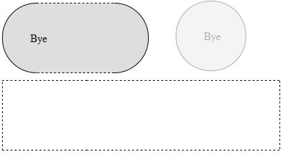
Google plus given an awesome kick to user experience, specially circles UI animations. I feel it’s great and new definition to have user experience design. I have tried circle rotation animation effect with Jquery and CSS3. Just few lines of code applying CSS styles using jQuery methods like .addClass() and .animation(). Take a look at these live demos with modern brewers.
Javascript Code
$(".square").click(function(){})- square is the class name of DIV tag. Using $(this).animation() and $(this).addClass() - applying animation and class styles.
<script type="text/javascript" src="http://ajax.googleapis.com/
ajax/libs/jquery/1.5/jquery.min.js"></script>
<script type="text/javascript" src="easing.min.js"></script>
<script type="text/javascript">
$(document).ready(function()
{
$(".square").click(function()
{
$(this).animate({width:'100px',height:'100px'}, 500, 'linear', function()
{
$(this).addClass('circle-label-rotate');
}).addClass('circle').html('<div class="innertext">Bye</div>').animate({"opacity":"0","margin-left":"510px"},1500);
$(this).slideUp({duration: 'slow',easing: 'easeOutBounce'}).hide();
});
});
</script>
//HTML Code blocks
<div class='square'> 1</div>
<div class='square'> 2</div>
<div class='square'> 3</div>
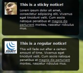
Circle
CSS3 circle diameter 50px
.circle
{
border-radius: 50px; // Chrome & IE9
-moz-border-radius: 50px; // Firefox
-webkit-border-radius: 50px; // Safari
height:100px;
width:100px;
background:#dedede;
}
Rotation
CSS3 rotating 0 - 360 degrees
@-webkit-keyframes rotateThis
{
from {-webkit-transform:scale(1) rotate(0deg);}
to {-webkit-transform:scale(1) rotate(360deg);}
}
.circle-label-rotate
{
-webkit-animation-name: rotateThis;
-webkit-animation-duration:2s;
-webkit-animation-iteration-count:infinite;
-webkit-animation-timing-function:linear;
}
Square
Contains CSS code.
.square
{
height:100px;
width:500px;
border:dashed 1px #000;
margin-top:10px;
}
The article source:http://www.9lessons.info/2011/07/google-plus-style-animations-with.html
You might also like

Tags
accordion accordion menu animation navigation animation navigation menu carousel checkbox inputs css3 css3 menu css3 navigation date picker dialog drag drop drop down menu drop down navigation menu elastic navigation form form validation gallery glide navigation horizontal navigation menu hover effect image gallery image hover image lightbox image scroller image slideshow multi-level navigation menus rating select dependent select list slide image slider menu stylish form table tabs text effect text scroller tooltips tree menu vertical navigation menu