 Subscribe
 Follow Us
Pure CSS3 Red Menu/Navigation
 12 years ago
 24847
24847 6368
6368
we’re gonna create a nice and slick navigation bar using CSS only. I need to warn you though, we’ll have to use some CSS3 features so it will not be cross-browser.
Another thing is that this tutorial is aimed for beginners, so I tried explaining everything thoroughly.
So, let’s start and hope that by the end of this tutorial you will learn something new.
HTML
We’ll start by adding the mark-up into our HTML file.
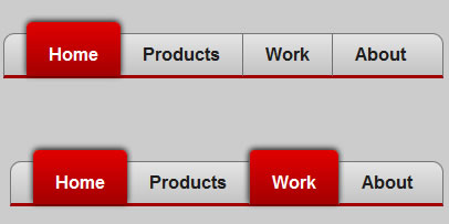
<ul id="nav-bar">
<li><a href="./index.html">Home</a></li>
<li><a href="#">Products</a></li>
<li><a href="#">Work</a></li>
<li><a href="#">About</a></li>
<li><a href="#">Contact</a></li>
</ul>
That’s it for the mark-up.
You can set the active class for each page. For example, when you’re implementing the navigation in the Products page, you will have to remove the class=”active” from Home and put it in the Products anchor.
In my example I have used a background color property and a container as well. So you don’t have to ask yourself why the background is looking different over here.
CSS
We’ll start simply, with each element explained.
ul#nav-bar {

background: #E5E5E5; /* old browsers */

background: -moz-linear-gradient(top, #E5E5E5 0%, #C4C4C4 100%); /* firefox */

background: -webkit-gradient(linear, left top, left bottom, color-stop(0%,#E5E5E5), color-stop(100%,#C4C4C4)); /* webkit */

filter: progid:DXImageTransform.Microsoft.gradient( startColorstr='#E5E5E5', endColorstr='#C4C4C4',GradientType=0 ); /* ie */

border:1px solid #757575;

border-bottom:3px solid #A30000;

-moz-border-radius:10px 10px 0 0;

-webkit-border-radius:10px 10px 0 0;

border-radius:10px 10px 0 0;

padding:10px 20px;

}
Now, we’re using CSS3 gradients to give the navigation bar a nice and smooth look.
For starters, you might notice that it has more background properties than one.
The answer is simple, the gradients are not cross-browser, so we need to add multiple properties so we can be sure that it will work on most browsers.
First of all, we have the first background property which contains only one color. We are using that in case the browser used does not support any of the other background properties.
Second background, as you can see, is starting with –moz, which let’s us know that it’s used for Mozilla Firefox.
Third one is a –webkit property, which tells us that it will only work on Webkit browsers, like Google Chrome or Safari.
Now, the fourth and weird one is the property for Internet Explorer.
As you might see, each of the background property holds two colors. Those are the colors from which the gradients are formed. The first one is the top color and the second one is the bottom color.
After the gradients, we have a dark-grey 1px border, which will make everything look better.
Next, we have set a 3px solid border at the bottom of the list… If you will look closely at the example below, you will see a red border at the bottom of the navigation bar. You might wonder what that is doing over there, but we’ll get to that soon enough.
You might wonder why there are 2 border properties. Well, I could have used 4 of them, for each side of the navigation bar, but defining an universal border first then changing one small part of it with just a line of code seems easier for me.
Next, we have the border-radius properties. This is one of my favorite features that came with CSS3. What does border-radius do? Well, we can have rounded corners without using images.
We have only 3 properties here. –moz-border-radius (Mozilla), -webkit-border-radius (Chrome and Safari) and border-radius (all other browsers that support border-radius).
For each one of them we have this rule: 10px 10px 0 0.
You might wonder what that means. A lot of you might have seen that many designers prefer defining the border radius as:
border-radius-top-left:10px;

border-radius-top-right:10px;

border-radius-bottom-left:0;

border-radius-bottom-right:0;
Well, I think that’s a waste of time. I prefer using the short-hand commands.
If you don’t know already, the short-hand command for border-radius goes in a clockwise way.
So if we want to control all four corners we can just define it as:
Border-radius: top-left top-right bottom-right bottom-left;
So that’s what I just did to save time and space.
Also I have set a padding so the text wouldn’t stick to the very side of the navigation bar, which would have made it look awkward
So, let’s get to the next step:
ul#nav-bar li {

display:inline;

margin-right:-4px;

list-style-type:none;

}
This property is directed only at the list items ( li ) of the unordered list ( ul ) which is our navigation bar.
The first function, “display:inline” makes the links display in a horizontal line instead of a vertical one.
The second one fixes a gap I got when I coded the menu. Don’t know why it was there but if you notice that something is wrong with the right part of any link, feel free to remove that or comment it by using /* contents of comment */
The third one removes the listing type. The default listing type is a square that appears before every link, but we don’t need that so it must go.
Ok, so let’s get to the next step…which is styling the anchors (links).
We’re going to start with the default links.
ul#nav-bar li a {

text-decoration:none;

font-weight:bold;

color:#1d1d1d;

border-left:1px solid #6f6f6f;

padding:10px 20px;

}
The first property tells the browser to remove the underline from each link.
The second one tells the browser that we want our text to be bold.
The color property sets the color of the text.
We also set a left border so we can have a nice separator for each link.
Also a padding ( 10px top and bottom | 20px left and right ) will be good as it will separate the links so they will have their own private space.
Next, we are going to take care of the borders from the first link and the second link by using some pseudo class selectors.
If you want to find out more about pseudo class selectors then read the following article: link.
So, let’s get to work.
First we are going to target the first link by using the :first-child pseudo class selector.
ul#nav-bar li:first-child a {

border-left:none;

}
By using that, we are telling the browser to remove the left border from the link contained in the first list item of the unordered list which has the #nav-bar ID.
After that, we are going to target the second link by using the :nth-child pseudo class selector.
ul#nav-bar li:nth-child(2) a {

border-left:none;

}
The (2) tells the browser that it should remove the left border from the link contained in the second list item of the unordered list which has the #nav-bar ID.
Next, we are going to add a little flavor to the navigation bar by using the :hover pseudo class selector.
So let’s start…
ul#nav-bar li a:hover {

background:rgba(0, 0, 0, 0.1);

}
Now, for this we have only changed the background of a link when hovered by using the new CSS3 background feature.
RGBA stands for: Red Green Blue Alpha. This property accepts RGB colors while giving us an option to set the opacity of the item as well with alpha. We all know how much trouble we can get by using the opacity CSS property, since the opacity applies to the children elements as well.
That’s why RGBA is the best way to work with transparency.
Now, to the code… 0, 0, 0, is the RGB code for black and 0.1 is the opacity of the element.
Next, we are going to add the final touch by adding a great look to the active class.
ul#nav-bar li a.active {

padding:20px 20px 10px 20px;

background: #E20000;

background: -moz-linear-gradient(top, #E20000 0%, #A30000 100%);

background: -webkit-gradient(linear, left top, left bottom, color-stop(0%,#E20000), color-stop(100%,#A30000));

filter: progid:DXImageTransform.Microsoft.gradient( startColorstr='#E20000', endColorstr='#A30000',GradientType=0 );

-moz-border-radius:5px 5px 0 0;

-webkit-border-radius:5px 5px 0 0;

border-radius:5px 5px 0 0;

-moz-box-shadow:0px -1px 5px #000000;

-webkit-box-shadow:0px -1px 5px #000000;

box-shadow:0px -1px 5px #000000;

filter: progid:DXImageTransform.Microsoft.Shadow(strength=0, direction=0, color='#000000');

-ms-filter: "progid:DXImageTransform.Microsoft.Shadow(strength=0, Direction=0, Color='#000000')";

color:#fff;

}
As you might see, this is a really long code, so we are going to skip the parts we already talked about like the gradients or border radius and we’ll skip directly to the box-shadow property.
Now, the box-shadow property is another great feature of CSS3 which gives us the ability to add shadows to our content without using images.
As you might have guessed already, they are also different for each browser.
The –moz-box-shadow adds a shadow for Firefox, -webkit-box-shadow adds a shadow for Chrome and Safari, the third for all the browsers that support box-shadow and the last two add the shadow for IE.
Now, I’m going to explain you the settings of the first 3 ones, since there is not much to explain about the IE ones.
The settings are as follows: box-shadow: horizontal-position vertical-position strength #color;
And this is it. After you will add this, you will have the following.
That’s all
The article source:http://dirtekdesigns.com/blog/tutorials/create-a-clean-css3-menu/
You might also like


Tags
accordion accordion menu animation navigation animation navigation menu carousel checkbox inputs css3 css3 menu css3 navigation date picker dialog drag drop drop down menu drop down navigation menu elastic navigation form form validation gallery glide navigation horizontal navigation menu hover effect image gallery image hover image lightbox image scroller image slideshow multi-level navigation menus rating select dependent select list slide image slider menu stylish form table tabs text effect text scroller tooltips tree menu vertical navigation menu