 Subscribe
 Follow Us
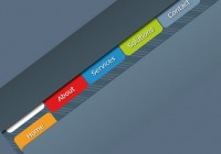
a Bubble Coda Style with CSS3 menu tootips
 13 years ago
  7405
7405  2197
2197
 n/a
n/a

we are going to create a tooltip using the famous coda style, which allows for an animated pop-up window that makes for a great effect.
HTML
First, we create our HTML file and inside the body tag we add the following code. It is an unordered list which is going to have inside a text and next to it a “div” tag that is going to be the tooltip or bubble to display with the hover action to the “li” tag.
<ul id="bubblemenu">
        <li>
            Penn Jillett
            <div>
               My favorite thing about the Internet is that you get to go into the private world of real creeps without having to smell them.
            </div>
        </li>
        <li>
            Thomas Watson
            <div>
                I think there is a world market for maybe five computers.
            </div>
        </li>
        <li>
             Bill Gates
            <div>
               640K ought to be enough for anybody.
            </div>
        </li>
        <li>
            Sam Ewing
            <div>
               Computers are like bikinis. They save people a lot of guesswork.
            </div>
        </li>
    </ul>
CSS
We declare the unordered list as inline and adding the cursor pointer for usability reasons.
 #bubblemenu li {
                display: inline;
                margin-left: 15px;
  cursor:pointer;
               }
At the second part, we select the “div” that is inside the “li” to style it. Notice that the visibility is hidden and the opacity is zero. Additionally, we add some fancy stuff like rounded bordes and shadows to make it look more like the coda menu. Also, it has the transition effects which set the return state in 0.5s after the mouse out the “li” tag.
 #bubblemenu li > div {
                width: 150px;
                min-height: 100px;
           position: absolute;
                display: inline;
                margin-left: -120px;
                padding: 5px;
  visibility:hidden;
                opacity: 0;
                margin-top: -125px;
  background: #ffffff;
  font-size:1em;

  /* Setting the border-radius property for all Browsers */
                -moz-border-radius: 5px; /* Firefox */
                -webkit-border-radius: 5px; /* Safari and Chrome */
                border-radius: 5px; /* Browsers that Support it like Opera */

  /* Setting the box-shadow property for all Browsers */
                -moz-box-shadow: 0 0 8px gray; /* Firefox */
                -webkit-box-shadow: 0 0 8px gray; /* Safari and Chrome */
  filter: progid:DXImageTransform.Microsoft.Shadow(color='#272229', Direction=135, Strength=3); /* IE */
                box-shadow: 0 0 8px gray; /* Browsers that Support it like Opera */

  /* Setting the transition property for all Browsers */
  -moz-transition: all 0.5s ease-in-out; /* Firefox */
                -webkit-transition: all 0.5s ease-in-out; /* Safari and Chrome */
                -o-transition: all 0.5s ease-in-out; /* Opera */
                transition: all 0.5s ease-in-out; /* Browsers that Support it */
            }
With the hover effect we create a transition putting the “div” tag visible and and the opacity to 1. Additionally, we move the “div” to the top by 30px.
#bubblemenu li:hover > div {
  visibility:visible;
                opacity: 1;
                margin-top: -150px;

               /* Setting the transition property for all Browsers */
  -moz-transition: all 0.5s ease-in-out; /* Firefox */
                -webkit-transition: all 0.5s ease-in-out; /* Safari and Chrome */
                -o-transition: all 0.5s ease-in-out;  /* Opera */
                transition: all 0.5s ease-in-out; /* Browsers that Support it */
}
We are done!
You might also like


Tags
accordion accordion menu animation navigation animation navigation menu carousel checkbox inputs css3 css3 menu css3 navigation date picker dialog drag drop drop down menu drop down navigation menu elastic navigation form form validation gallery glide navigation horizontal navigation menu hover effect image gallery image hover image lightbox image scroller image slideshow multi-level navigation menus rating select dependent select list slide image slider menu stylish form table tabs text effect text scroller tooltips tree menu vertical navigation menu