 Subscribe
 Follow Us
Useful CSS3 animation and transitions with jQuery
 12 years ago
 12237
12237 2333
2333
CSS3 transitions alone don’t always quite cut it. We can use a little help from jQuery to get better control over them and push them just a bit further. Val Head shows us how
CSS animation and transitions have a lot of potential for bringing your design to life. But they often leave you wanting just a little bit more control to get what you really want.
You'll see how easily we can extend the usefulness of these CSS features by adding just a tiny bit of JavaScript. We'll create a more advanced interaction while keeping our code nice and simple. The best of both worlds!
Building our interactive widget
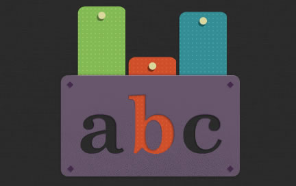
Our example is based on a little interactive widget that I made with the fine folks at Bearded. It’s the digital version of a puzzle that allows you to slide wooden blocks into place to fill letters. When you click on a block it slides down, and if you click it again it slides back up. (It’s obviously meant for a kids’ site of some kind. The “abc” part probably gave that away.)
Our basic structure
Since this is a demo page, we've got exactly what we need and nothing more:
<div id="wrap">
                <img src="img/abcmask.png" class="mask">
                <div id="blocks">
                        <div class="col col1" ></div>
                        <div class="col col2"></div>
                        <div class="col col3"></div>
                </div>
</div>
We have two layers of content that we'll be working with. Starting from the back, we first have the three divs that represent the movable wooden blocks of our puzzle. These are contained within their parent div, #blocks, to make positioning easier later. On top, we have an image that will be acting as our mask. It's not a true mask but a .png with some well placed transparency so that we'll be able to see though the letter shapes.
To position the two layers of our animation we position them both absolutely at 0 pixels top and left. Our image gets assigned a z-index to keep it on top, and a slightly lower top position of 118 pixels so it sits at the bottom of our widget.
#blocks {
        width:300px;
        height:300px;
        position:absolute;
        top:0;
        left:0;
        overflow:hidden;
}
/* our "mask" image positions over top of the animated blocks */
.mask {
        position:absolute;
        top:118px;
        left:0;
        z-index:500;
}
Read more:http://www.netmagazine.com/tutorials/get-more-out-your-css-transitions-jquery
You might also like

Recommend Items
Tags
accordion accordion menu animation navigation animation navigation menu carousel checkbox inputs css3 css3 menu css3 navigation date picker dialog drag drop drop down menu drop down navigation menu elastic navigation form form validation gallery glide navigation horizontal navigation menu hover effect image gallery image hover image lightbox image scroller image slideshow multi-level navigation menus rating select dependent select list slide image slider menu stylish form table tabs text effect text scroller tooltips tree menu vertical navigation menu