 Subscribe
 Follow Us
jQuery diagonal rotation with CSS3 transitions
 12 years ago
 12630
12630 2020
2020

We start with minimal markup. Always make your markup as simple as possible; don’t duplicate elements unless absolutely necessary. Markup should be a semantic outline of your content. With that in mind, here’s all the markup we need:
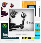
<ul class="portfolio">
        <li><img src="img/portfolio-1.jpg" alt="Image 1"></li>
        <li><img src="img/portfolio-2.jpg" alt="Image 2"></li>
        <li class="feature"><img src="img/portfolio-3.jpg" alt="Image 3"></li>
        <li><img src="img/portfolio-4.jpg" alt="Image 4"></li>
        <li><img src="img/portfolio-5.jpg" alt="Image 5"></li>
</ul>
There is one simple unordered list of images for the portfolio. A class of “feature” is applied to the list item housing the current highlighted image. That’s it for the HTML, let’s give this list some style.
Create only the large form of your images and use CSS to scale down. In this case all the images are 600 x 300.
Style
The CSS will do quite a bit of work for the markup. We can achieve all of our design and animation with only CSS and move into scripting from there. We’ll move through each element starting with the unordered list.
ul.portfolio{
        margin: 50px auto 0;
        -ms-transform:rotate(30deg);
        -webkit-transform:rotate(30deg);
        -moz-transform:rotate(30deg);
        width: 200px;
}
This will rotate the whole list 30 degrees clockwise and pull it down from the top of the document. This sets the base for the rotation. Now for the individual list items and images.
ul.portfolio li{
        border: 1px solid #999999;
        height: 100px;
        list-style:none;
        margin-left: 0;
        opacity: 0.5;
        -webkit-transition: all 0.5s ease-in;
        -moz-transition: all 0.5s ease-in;
        -o-transition: all 0.5s ease-in;
        width: 200px;
}

        ul.portfolio li img{
                height: 100px;
                -webkit-transition: all 0.5s ease-in;
                -moz-transition: all 0.5s ease-in;
                -o-transition: all 0.5s ease-in;
                width: 200px;
        }
The article source:http://www.netmagazine.com/tutorials/create-diagonal-rotation-css-transitions
You might also like

Tags
accordion accordion menu animation navigation animation navigation menu carousel checkbox inputs css3 css3 menu css3 navigation date picker dialog drag drop drop down menu drop down navigation menu elastic navigation form form validation gallery glide navigation horizontal navigation menu hover effect image gallery image hover image lightbox image scroller image slideshow multi-level navigation menus rating select dependent select list slide image slider menu stylish form table tabs text effect text scroller tooltips tree menu vertical navigation menu