 Subscribe
 Follow Us
Stylish progress bars effect with CSS3
 12 years ago
 14699
14699 3855
3855
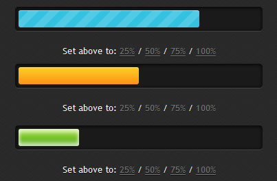
you’ll learn how to create stylish and animated progress bars using CSS3.
The HTML
The markup could not be simpler than that:
<div class="progress-bar blue stripes">
    <span style="width: 40%"></span>
</div>
-
.progress-bar– defines the general styles for our progress bar. -
.blue– in this case, the blue CSS class add a blue style for the progress bar. -
.stripes– animation type for the current progress bar. -
span– this will help you filling the progress bar. An inline setwidthwill help you specifying the “fill” state.
The CSS
General styles for the CSS3 progress bar and filled area:
.progress-bar {
        background-color: #1a1a1a;
        height: 25px;
        padding: 5px;
        width: 350px;
        margin: 50px 0;
        -moz-border-radius: 5px;
        -webkit-border-radius: 5px;
        border-radius: 5px;
        -moz-box-shadow: 0 1px 5px #000 inset, 0 1px 0 #444;
        -webkit-box-shadow: 0 1px 5px #000 inset, 0 1px 0 #444;
        box-shadow: 0 1px 5px #000 inset, 0 1px 0 #444;
}

.progress-bar span {
        display: inline-block;
        height: 100%;
        -moz-border-radius: 3px;
        -webkit-border-radius: 3px;
        border-radius: 3px;
        -moz-box-shadow: 0 1px 0 rgba(255, 255, 255, .5) inset;
        -webkit-box-shadow: 0 1px 0 rgba(255, 255, 255, .5) inset;
        box-shadow: 0 1px 0 rgba(255, 255, 255, .5) inset;
        -webkit-transition: width .4s ease-in-out;
        -moz-transition: width .4s ease-in-out;
        -ms-transition: width .4s ease-in-out;
        -o-transition: width .4s ease-in-out;
        transition: width .4s ease-in-out;
}
Let’s add some color/gradients:
.blue span {
        background-color: #34c2e3;
}

.orange span {
          background-color: #fecf23;
          background-image: -webkit-gradient(linear, left top, left bottom, from(#fecf23), to(#fd9215));
          background-image: -webkit-linear-gradient(top, #fecf23, #fd9215);
          background-image: -moz-linear-gradient(top, #fecf23, #fd9215);
          background-image: -ms-linear-gradient(top, #fecf23, #fd9215);
          background-image: -o-linear-gradient(top, #fecf23, #fd9215);
          background-image: linear-gradient(top, #fecf23, #fd9215);
}

.green span {
          background-color: #a5df41;
          background-image: -webkit-gradient(linear, left top, left bottom, from(#a5df41), to(#4ca916));
          background-image: -webkit-linear-gradient(top, #a5df41, #4ca916);
          background-image: -moz-linear-gradient(top, #a5df41, #4ca916);
          background-image: -ms-linear-gradient(top, #a5df41, #4ca916);
          background-image: -o-linear-gradient(top, #a5df41, #4ca916);
          background-image: linear-gradient(top, #a5df41, #4ca916);
}
Read more:http://www.red-team-design.com/stylish-css3-progress-bars
You might also like
Tags
accordion accordion menu animation navigation animation navigation menu carousel checkbox inputs css3 css3 menu css3 navigation date picker dialog drag drop drop down menu drop down navigation menu elastic navigation form form validation gallery glide navigation horizontal navigation menu hover effect image gallery image hover image lightbox image scroller image slideshow multi-level navigation menus rating select dependent select list slide image slider menu stylish form table tabs text effect text scroller tooltips tree menu vertical navigation menu