 Subscribe
 Follow Us
jQuery tooltip animated progress bar
 12 years ago
 19128
19128 3649
3649
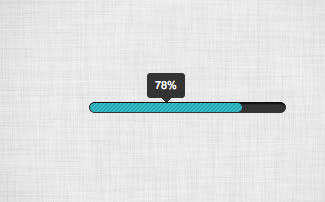
Here’s a very basic example of how to code up an animated progress bar with tooltip using the Tipsy tooltip plugin.
The Code
Below we have the two lines of code which read the attribute ‘title’ and animate the progress bar. We then activate the tooltip plugin using the tipsy plugin.
$("document").ready(function (){

// animate the progress bar onload
var percent = $('.progress_bar').attr('title');
$('.progress_bar').animate({width: percent},1000);

// activate tooltip
	 $('.tip').tipsy({gravity: 's',fade: true});

});
The HTML
Very simple. Just one line of code with two div elements. Both the tooltip and the animation javascript read the ‘title’ attribute.
<div class="progress_container"><div class="progress_bar tip" title="78%"></div></div>
The CSS
body{
	padding:50px;
	font-size:11px;
	font-family:Arial, Helvetica, sans-serif;}

.progress_container{
	padding:1px;
	width:195px;
	height:9px;
	overflow:hidden;
	background:url(progress_container.png);
	}

.progress_bar{
	height:9px;
	width:0px;
	-moz-border-radius:5px;
	-webkit-border-radius:5px;
	border-radius:5px;
	background:url(progress_bar.png);
	}

/*-----------------------------------------------------------------------------------*/
/*Tipsy Tooltip style
/*-----------------------------------------------------------------------------------*/

  .tipsy { padding: 5px; font-size: 11px; position: absolute; z-index: 100000; }
  .tipsy-inner { padding: 6px 8px 6px 8px; background-color: black; color: white; max-width: 200px; text-align: center; }
  .tipsy-inner { border-radius: 3px; -moz-border-radius:3px; -webkit-border-radius:3px; }
  .tipsy-arrow { position: absolute; background: url('tipsy.gif') no-repeat top left; width: 9px; height: 5px; }
  .tipsy-n .tipsy-arrow { top: 0; left: 50%; margin-left: -4px; }
  .tipsy-nw .tipsy-arrow { top: 0; left: 10px; }
  .tipsy-ne .tipsy-arrow { top: 0; right: 10px; }
  .tipsy-s .tipsy-arrow { bottom: 0; left: 50%; margin-left: -4px; background-position: bottom left; }
  .tipsy-sw .tipsy-arrow { bottom: 0; left: 10px; background-position: bottom left; }
  .tipsy-se .tipsy-arrow { bottom: 0; right: 10px; background-position: bottom left; }
  .tipsy-e .tipsy-arrow { top: 50%; margin-top: -4px; right: 0; width: 5px; height: 9px; background-position: top right; }
  .tipsy-w .tipsy-arrow { top: 50%; margin-top: -4px; left: 0; width: 5px; height: 9px; }
The article source:http://papermashup.com/build-a-simple-animated-progress-bar-with-tooltip/
You might also like

Tags
accordion accordion menu animation navigation animation navigation menu carousel checkbox inputs css3 css3 menu css3 navigation date picker dialog drag drop drop down menu drop down navigation menu elastic navigation form form validation gallery glide navigation horizontal navigation menu hover effect image gallery image hover image lightbox image scroller image slideshow multi-level navigation menus rating select dependent select list slide image slider menu stylish form table tabs text effect text scroller tooltips tree menu vertical navigation menu