 Subscribe
 Follow Us
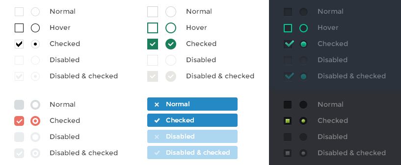
Customized checkbox and radio with jquery - iCheck
 11 years ago
 12938
12938 3377
3377
Features
- Identical inputs across different browsers and devices — both desktop and mobile
- Touch devices support — iOS, Android, BlackBerry, Windows Phone
-
Keyboard accessible inputs —
Tab,Spacebar,Arrow up/downand other shortcuts - Customization freedom — use any HTML and CSS to style inputs (try 6 Retina-ready skins)
- jQuery and Zepto JavaScript libraries support
- Lightweight size — 1 kb gzipped
- 25 options to customize checkboxes and radio buttons
- 8 callbacks to handle changes
- 7 methods to make changes programmatically
- Saves changes to original inputs, works carefully with any selectors
How it works
iCheck works with checkboxes and radio buttons like a constructor. It wraps each input with a div, which you may customize yourself or use one of the available skins. You may also place inside that div some HTML code or text using insert option.
For this HTML:
<label>
  <input type="checkbox" name="quux[1]" disabled>
  Foo
</label>

<label for="baz[1]">Bar</label>
<input type="radio" name="quux[2]" id="baz[1]" checked>

<label for="baz[2]">Bar</label>
<input type="radio" name="quux[2]" id="baz[2]">
With default options you'll get nearly this:
<label>
  <div class="icheckbox disabled"><input type="checkbox" name="quux[1]" disabled></div>
  Foo
</label>

<label for="baz[1]">Bar</label>
<div class="iradio checked"><input type="radio" name="quux[2]" id="baz[1]" checked></div>

<label for="baz[2]">Bar</label>
<div class="iradio"><input type="radio" name="quux[2]" id="baz[2]"></div>
By default, iCheck doesn't provide any CSS styles for wrapper divs (if you don't use skins).
Options
These options are default:
{
  // 'checkbox' or 'radio' to style only checkboxes or radio buttons, both by default
  handle: '',

  // base class added to customized checkboxes
  checkboxClass: 'icheckbox',

  // base class added to customized radio buttons
  radioClass: 'iradio',

  // class added on checked state (input.checked = true)
  checkedClass: 'checked',

    // if not empty, used instead of 'checkedClass' option (input type specific)
    checkedCheckboxClass: '',
    checkedRadioClass: '',

  // if not empty, added as class name on unchecked state (input.checked = false)
  uncheckedClass: '',

    // if not empty, used instead of 'uncheckedClass' option (input type specific)
    uncheckedCheckboxClass: '',
    uncheckedRadioClass: '',

  // class added on disabled state (input.disabled = true)
  disabledClass: 'disabled',

    // if not empty, used instead of 'disabledClass' option (input type specific)
    disabledCheckboxClass: '',
    disabledRadioClass: '',

  // if not empty, added as class name on enabled state (input.disabled = false)
  enabledClass: '',

    // if not empty, used instead of 'enabledClass' option (input type specific)
    enabledCheckboxClass: '',
    enabledRadioClass: '',

  // class added on hover state (pointer is moved onto an input)
  hoverClass: 'hover',

  // class added on focus state (input has gained focus)
  focusClass: 'focus',

  // class added on active state (mouse button is pressed on an input)
  activeClass: 'active',

  // adds hoverClass to customized input on label hover and labelHoverClass to label on input hover
  labelHover: true,

    // class added to label if labelHover set to true
    labelHoverClass: 'hover',

  // increase clickable area by given % (negative number to decrease)
  increaseArea: '',

  // true to set 'pointer' CSS cursor over enabled inputs and 'default' over disabled
  cursor: false,

  // set true to inherit original input's class name
  inheritClass: false,

  // if set to true, input's id is prefixed with 'iCheck-' and attached
  inheritID: false,

  // add HTML code or text inside customized input
  insert: ''
}
There's no need to copy and paste all of them, you can just mention the ones you need:
$('input').iCheck({
  labelHover: false,
  cursor: true
});
You can choose any class names and slyle them as you want.
Initialize
iCheck supports any selectors, but handles only checkboxes and radio buttons:
// customize all inputs (will search for checkboxes and radio buttons)
$('input').iCheck();

// handle inputs only inside $('.block')
$('.block input').iCheck();

// handle only checkboxes inside $('.test')
$('.test input').iCheck({
  handle: 'checkbox'
});

// handle .vote class elements (will search inside the element, if it's not an input)
$('.vote').iCheck();

// you can also change options after inputs are customized
$('input.some').iCheck({
  // different options
});
jQuery v1.7+ or Zepto library should be included in your HTML.
Callbacks
iCheck provides plenty callbacks, which may be used to handle changes.
| Callback name | When used |
|---|---|
| ifClicked | user clicked on a customized input or an assigned label |
| ifChanged | input's "checked" or "disabled" state is changed |
| ifChecked | input's state is changed to "checked" |
| ifUnchecked | "checked" state is removed |
| ifDisabled | input's state is changed to "disabled" |
| ifEnabled | "disabled" state is removed |
| ifCreated | input is just customized |
| ifDestroyed | customization is just removed |
Use on() method to bind them:
$('input').on('ifChecked', function(event){
  alert(event.type + ' callback');
});
ifCreated callback should be binded before plugin init.
Methods
These methods can be used to make changes programmatically.
// change input's state to 'checked'
$('input').iCheck('check');

// remove 'checked' state
$('input').iCheck('uncheck');

// toggle 'checked' state
$('input').iCheck('toggle');

// change input's state to 'disabled'
$('input').iCheck('disable');

// remove 'disabled' state
$('input').iCheck('enable');

// apply input changes, which were done outside the plugin
$('input').iCheck('update');

// remove all traces of iCheck
$('input').iCheck('destroy');
Comparison
iCheck is created to avoid routine of reinventing the wheel when working with checkboxes and radio buttons. It provides an expected identical result for the huge number of browsers, devices and their versions. Callbacks and methods can be used to easily handle and make changes at customized inputs.
There are some CSS3 ways available to style checkboxes and radio buttons, like this one. You have to know about some of the disadvantages of similar methods:
-
inputs are keyboard inaccessible, since
display: noneorvisibility: hiddenused to hide them - poor browser support
- multiple bugs on mobile devices
- tricky, harder to maintain CSS code
- JavaScript is still needed to fix specific issues
While CSS3 method is quite limited solution, iCheck is made to be an everyday replacement covering most of the tasks.
Browser support
iCheck is verified to work in Internet Explorer 6+, Firefox 2+, Opera 9+, Google Chrome and Safari browsers. Should also work in many others.
Mobile browsers (like Opera mini, Chrome mobile, Safari mobile and others) are also supported. Tested on iOS (iPad, iPhone, iPod), Android, BlackBerry and Windows Phone devices.
License
iCheck plugin is released under the MIT License. Feel free to use it in personal and commercial projects.
You might also like

Tags
accordion accordion menu animation navigation animation navigation menu carousel checkbox inputs css3 css3 menu css3 navigation date picker dialog drag drop drop down menu drop down navigation menu elastic navigation form form validation gallery glide navigation horizontal navigation menu hover effect image gallery image hover image lightbox image scroller image slideshow multi-level navigation menus rating select dependent select list slide image slider menu stylish form table tabs text effect text scroller tooltips tree menu vertical navigation menu