 Subscribe
 Follow Us
DropDown CSS Menu
 14 years ago
  7472
7472  1595
1595
 n/a
n/a
The structure of our menu is based on a simple un-ordered list.
HTML
<ul id="nav">
 <li><a href="#">Home</a></li>
 <li><a href="#">Services</a>
<ul>
 <li><a href="#">Webdesign</a></li>
 <li><a href="#">Development</a></li>
 <li><a href="#">Illustration</a></li>
 <li><a href="#">Search engine</a></li>
 <li><a href="#">WordPress</a></li>
</ul>
</li>
 <li><a href="#">Blog</a>
<ul>
 <li><a href="#">Themes</a></li>
 <li><a href="#">Plugins</a></li>
</ul>
</li>
 <li><a href="#">Contact</a></li>
</ul>
The ul element is the begin and end of the un-ordered list, and the li elements are the menu-items In some of the li elements, you see another un-ordered list and these will be our drop-down submenu’s.
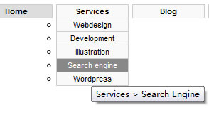
Make the menu Accessible
Accessibility is important. Not everyone is on the same computer with that same settings as you. Maybe they’ve disabled CSS, or any other thing that makes this menu not work.
We will add some titles to our menu items, so that when people roll over an item or visit the menu in a screenreader, they see the title popping up telling them what that item is about. Here is our more accessible structure.
<ul id="nav">
 <li><a title="Home" href="#">Home</a></li>
 <li><a title="Services" href="#">Services</a>
<ul>
 <li><a title="Services > Webdesign" href="#">Webdesign</a></li>
 <li><a title="Services > Developement" href="#">Development</a></li>
 <li><a title="Services > Illustration" href="#">Illustration</a></li>
 <li><a title="Services > Search Engine" href="#">Search engine</a></li>
 <li><a title="Services > WordPress" href="#">WordPress</a></li>
</ul>
</li>
 <li><a title="Blog" href="#">Blog</a>
<ul>
 <li><a title="Blog > Themes" href="#">Themes</a></li>
 <li><a title="Blog > Plugins" href="#">Plugins</a></li>
</ul>
</li>
 <li><a title="Contact" href="#">Contact</a></li>
</ul>
CSS for your menu
The style language CSS will add functionality to the menu and we will combine that later on with the bahavior file I mentioned earlier. I will start to give you the elements we need to style. If we forget one part of these, our menu might not have the functionality we require. More explanation follows below when we add the ‘core’ codes.
CSS
ul#nav {}    /* the structure of our head-menu */
li {} /* the structure of the first items */
ul#nav li a {} /* the links inside our first items */
ul#nav li a:hover {} /* the roll-over styles for the links in our first items */
ul#nav li ul {} /* first items > submenu structure */
ul li  {} /* the structure of our submenu items */
li > ul } /* extra styles for Internet Explorer (behavior file) */
li:hover ul, li.over ul {} /* to make things work in Internet Explorer (call for the behavior file) */
The codes that I will provide below are really necessary for the menu, it is the core of our menu. Delete any of these codes and your menu might not work.
CSS
ul#nav {
list-style: none;
padding: 0;
margin: 0;
}
Everything clear here. List-style should be none if you would like to have no bullets or arrows in front of every item on the list. Padding and margin to zero: we can change that later and now we have full control of spacing.
CSS
li {
float: left;
position: relative;
width: 100px;
}
Next in line are the list items. Float all our items to the left, position set to relative to make sure the submenu is displayed relatively to the first items.
CSS
ul#nav li a {
display: block;
}
A user should be able to click on the whole menu item in order to get to the source. Therefore we need to transform the click-able area of the link the same width/height as the item itself. We do that with display:block;.
CSS
li ul {
display: none;
position: absolute;
width:100px;
top: 0;
left: 0;
margin-left:-1px;
}
Display:none; for the submenu because the submenu shouldn’t display when we aren’t hovering the menu item. The submenu is positioned absolute, 0 pixels from the top, 0 pixels from the left and therefore he’s aligned just below our first-level menu.
CSS
li>ul {
top: auto;
left: auto;
}
To reset the top and left attributes used in the ul#nav li ul{} we use this set of codes. It’s Internet Explorer causing the problem here. In li ul we have set those attributes to zero, but Firefox and other modern browsers need auto to do the job.
CSS
li:hover ul, li.over ul {
display: block;
}
This is the part where the behavior file comes in. When we hover with our mouse over the first-level menu items, the display:block; makes sure the second-level menu pops up.
Next we will go through the behavior part.
Behavior file to add li:hover support
In the modern browsers, we simply add a :hover pseudo selector to a li element because that is supported. Unfortunately, we still have Internet Explorer 6 around and that’s a problem. IE6 doesn’t support :hover selectors on anything other then links. I have found a trick to add the extra functionality.
The work-around is a behavior file called “whatever:hover”.
We can add this behavior file to our CSS with the following codes:
body { behavior:url(csshover.htc); }
Current Item
Here is a little extra that might tweak up your CSS menu.
Sometimes it is a nice add-on to a CSS menu to change the style of one item a bit when you are on that source. For example, if you are on the Homepage, the Homepage menu item has a little difference in style and when we are on a Services page, it has a little difference in style. You get the point?
We do this by adding a new class to a menu item. When we want to style our Homepage item differently, here’s how we do that.
Change:
<li><a href="" title="Homepage">Homepage</a></li>
To:
<li class="current"><a href="" title="Homepage">Homepage</a></li>
With the CSS:
ul#nav li.current{ /* your styles */ }
You might also like

Tags
accordion accordion menu animation navigation animation navigation menu carousel checkbox inputs css3 css3 menu css3 navigation date picker dialog drag drop drop down menu drop down navigation menu elastic navigation form form validation gallery glide navigation horizontal navigation menu hover effect image gallery image hover image lightbox image scroller image slideshow multi-level navigation menus rating select dependent select list slide image slider menu stylish form table tabs text effect text scroller tooltips tree menu vertical navigation menu