 Subscribe
 Follow Us
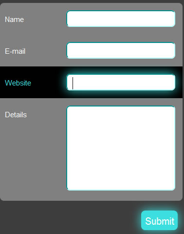
Neon Blink Effect for your Forms using CSS3 and jQuery
 14 years ago
  8837
8837  1888
1888
 n/a
n/a
Step 1: Before We Start Coding Away
Make sure you download the latest release of jQuery (version 1.4.2 at the time of writing), if you feel the need for a local copy, otherwise one always has the option of using the Google API(if working online), in this case the AJAX libraries. To include the latest release under the “1″ branch, add the following line of code in the head tag above all the other scripts which make use of jQuery.
<script type="text/javascript" src="http://ajax.googleapis.com/ajax/libs/jquery/1/jquery.min.js"></script>
This line fetches the latest version under the “1″ branch. To be more specific, that is if you want the latest version under “1.4″ branch, just change the “1″ to “1.4″. In my code, I’ve made use of a local copy of jQuery 1.4.2, which I’ve provided in the source files.
The naming of the files is as follows:
- xHTML file: index.html
- CSS file: style.css
- Javascript file: highlight.js
Put all the files in the same folder, along with the local copy of jQuery (if any), if you are following the exact code I’ve written. Let’s begin!
Step 2: Creating the Form Layout in xHTML
The next step would be to create the form layout in xHTML. Following are the contents of index.html.
<!DOCTYPE html PUBLIC "-//W3C//DTD XHTML 1.0 Transitional//EN" "http://www.w3.org/TR/xhtml1/DTD/xhtml1-transitional.dtd">
<html xmlns="http://www.w3.org/1999/xhtml" class="no-js">

<head>
<meta content="text/html; charset=utf-8" http-equiv="Content-Type" />
<title>Form Tutorial</title>
<link rel="stylesheet" type="text/css" href="style.css">

<script type="text/javascript" src="jquery-1.4.2.min.js"></script>
<script type="text/javascript" src="highlight.js"></script>

</head>

<body>

 <div id="page-wrap">
  <form id="myform" method="post" action="#">
   <div>
   <div class="field">
    <label for="personname" >Name</label>
    <input class="inputfield textfield" name="personname" type="text" />
   </div>
   <div class="field">
    <label for="email" >E-mail</label>
    <input class="inputfield textfield" name="email" type="text" />
   </div>
   <div class="field">
    <label for="website" >Website</label>
    <input class="inputfield textfield" name="website" type="text" />
   </div>
   <div class="field area">
    <label for="details" >Details</label>
    <textarea class="inputfield textarea1" name="details" ></textarea>
   </div>
   </div>
   <!--div class="clear"></div-->
   <input class="submitbutton" type="submit" value="Submit" />

  </form>
 </div>

</body>

</html>
Let’s understand the code above. The xhtml body consists of a page-wrap inside which we wrap our <form>, so that it can be centered in the CSS styling, as shown below. Each label, input and textarea is wrapped inside a
inputfield with the textarea having an additional class of textarea1, so that we can adjust the height of the textarea in the CSS, and for the same purpose, we have also given an additional class area to its parent div.
Step 3: Basic CSS Styling
Now we provide some basic CSS styling to the bare xHTML page as follows. Put the following piece of code in style.css.
*{
 margin:0;
 padding:0;
}
textarea, input{
 outline:none;
}
body{
 background:#3D3D3D;
}
#page-wrap{
 width:350px;
 min-height:500px;
 height:auto;
 margin:0 auto;
 position:relative;
 padding-top:50px;
 font:15px Arial;
}

#myform{
 width:375px;
 -moz-border-radius: 8px; /* FF1+ */
   -webkit-border-radius: 8px; /* Saf3+, Chrome */
 border-radius: 8px; /* Opera 10.5, IE 9 */
 margin:0 auto;
 position:relative;
}
#myform label{
 top:10px;
 position:relative;
 color:white;
}
.field{
 background:gray;
 padding:15px 15px 0 10px;
 height:50px;
 width:350px;
}
#myform div:first-child{
 -moz-border-radius-topleft: 8px;
 -moz-border-radius-topright: 8px;
 -webkit-border-top-left-radius: 8px;
 -webkit-border-top-right-radius: 8px;
 border-top-left-radius: 8px;
 border-top-right-radius: 8px;
}
#myform div:last-child{
 -moz-border-radius-bottomleft: 8px;
 -moz-border-radius-bottomright: 8px;
 -webkit-border-bottom-left-radius: 8px;
 -webkit-border-bottom-right-radius: 8px;
 border-bottom-left-radius: 8px;
 border-bottom-right-radius: 8px;
}
.area{
 padding:15px 15px 0 10px;
 min-height:195px;
}
.inputfield{
 padding:0 10px 0 10px;
 float:right;
 width:200px;
 font:15px Arial;
 border:2px aqua inset;

 -moz-border-radius: 8px; /* FF1+ */
 -webkit-border-radius: 8px; /* Saf3+, Chrome */
 border-radius: 8px; /* Opera 10.5, IE 9 */
}

.textfield{
 height:25px;
 padding-top:5px;
}
.textarea1{
 padding-top:10px;
 padding-bottom:10px;
 height:150px;
 max-height:200px;
 max-width:250px;
}
Here, the CSS3 border-radius property is very essential in the inputfield class since the box-shadow property, which we are going to add later on, has to follow the border-radius property, according to the specification. Elsewhere, the use of border-radius is just to improve the look and feel of the form, and the usage is optional.
Now, let’s style the Submit button, such that it blends with the rest of the form. Add the following piece of code to your CSS file.
.submitbutton{
 border: 0px;
 float:right;
 width:75px;
 height:40px;
 font:20px Arial;
 position:relative;
 top:20px;
 right:10px;

 -moz-border-radius: 8px;
 -webkit-border-radius: 8px;
 border-radius: 8px;
 -moz-box-shadow: 0px 0px 30px #3cdfdf;
 -webkit-box-shadow: 0px 0px 30px #3cdfdf;
 box-shadow: 0px 0px 30px #3cdfdf;

 background-image: -moz-linear-gradient(top, white, #3cdfdf); /* FF3.6 */
 background-image: -webkit-gradient(linear,left top,left bottom,color-stop(0, white),color-stop(1, #3cdfdf)); /* Saf4+, Chrome */
 filter:  progid:DXImageTransform.Microsoft.gradient(startColorStr='white', EndColorStr='#3cdfdf'); /* IE6,IE7 */
 -ms-filter: "progid:DXImageTransform.Microsoft.gradient(startColorStr='white', EndColorStr='#3cdfdf')"; /* IE8 */
}
.submitbutton:hover{
  background: #3cdfdf;
  color:white;
}
The CSS3 elements used above are border-radius, box-shadow and gradient properties. We have added linear gradients to the background image of the Submit button, using White and #3cdfdf (aqua-blue) for which we use -moz-linear-gradient property for Firefox 3.6+ and the -webkit-gradient property for Chrome 4+ and Safari 4+, as shown above. For Internet Explorer, we have made use of filter (IE 6,7) and -ms-filter (IE 8+) properties. Unfortunately, there are no available alternatives for Opera.
On hover, we just change the entire background-color to #3cdfdf (aqua-blue) and the text color to White.
Step 4: Spicing it up with CSS3 -webkit-animation
Now it’s time to dive into the newer elements of CSS3, the -webkit-animation feature. Add the following lines of code to the CSS file.
@-webkit-keyframes pulsate {
 0%   {  -webkit-box-shadow: 0px 0px 0px #3cdfdf;  border:2px aqua inset  }
 25%  {  -webkit-box-shadow: 0px 0px 35px #3cdfdf; border:2px aqua inset  }
 50%  {  -webkit-box-shadow: 0px 0px 0px white;    border:2px white inset }
 75%  {  -webkit-box-shadow: 0px 0px 35px white;   border:2px white inset }
 100% {  -webkit-box-shadow: 0px 0px 0px #3cdfdf;  border:2px aqua inset  }
}
.inputfield:focus{
 -webkit-animation-name: pulsate;
 -webkit-animation-duration: 1.5s;
 -webkit-animation-iteration-count: infinite;

 -moz-box-shadow: 0px 0px 30px  #3cdfdf;
 box-shadow: 0px 0px 30px #3cdfdf;
}
Keyframes are defined using the CSS “@-rule” and the syntax is:
@-webkit-keyframes animation-name
{
from{ before-state }
to{ after-state }
}
To insert multiple frames, just use percentage(%) as shown in the above code. “x%” implies x% of the total time elapsed. The total time is the one which we will specify in -webkit-animation-duration when we use the animation.
In the above code, we use two colors, #3cdfdf and white, to create an animation named pulsate. Here, a definite pattern has been defined, using box-shadow, for alternating pulse effect and the border property to go along with it, but you can play around with the values, and use any CSS property to create your own animation effortlessly. To use the animation, all you have to do is add the following three lines (see code above for example usage):
-webkit-animation-name: animation-name;
-webkit-animation-duration: animation-duration;
-webkit-animation-iteration-count: number_of_times;
We have made use of -moz-box-shadow for Firefox 3.5+ and box-shadow for browsers which support it, like Opera 10.5+.
Step 5: Adding jQuery
This is merely an optional part to give it a nice finishing touch. Just add the following lines of code in highlight.js.
$(document).ready(function(){
 var globalParent=null;
 var mouse_is_inside=false;

 /*The snippet below is activated when an inputfield is focused*/
 $('.inputfield').focus(function(){
  globalParent=$(this).parent('div');
  globalParent.click();
 });

 /*This following part will be activated when the inputfield loses focus*/
 $('.inputfield').blur(function(){
  globalParent.click();
 });

 /*Following part will be activated when the user clicks anywhere inside
 the container div of the inputfield*/
 $('.field').click(function(){
  if(!($(this).is('.dummy'))){
   $('.dummy').css('background-color','gray');
   $('.dummy label').css('color','white');
   $('.dummy').removeClass('dummy');
   $(this).css('background-color','black');
   $(this).children('label').css('color','#3cdfdf');
   $(this).addClass('dummy');
  }
 });

 /*The following code checks time and again whether the mouse is inside the form or not*/
 $('form').hover(function(){
         mouse_is_inside=true;
     },
     function(){
         mouse_is_inside=false;
   }
  );

 /*If user clicks anywhere outside the form, all highlighting is removed*/
  $('body').click(function(){
        if(!mouse_is_inside)
        {
         $('.field').css('background-color','gray');
         $('.field label').css('color','white');
         $('.dummy').removeClass('dummy');
        }
    });
});
The parts of the code have been documented as to which part corresponds to which functionality.
This is a simple jQuery code, which selects the container div of the focused inputfield and changes its background-color to Black, and also changes the corresponding label color to #3cdfdf (aqua-blue). Even if one clicks anywhere inside the container div, its background-color changes to Black and all the other siblings will have their background-color changed to Gray, i.e., not more than one div will be highlighted at the same time. As soon as the inputfield loses its focus, the background-color is reverted back to Gray, and the label color to white. Here, we need to use jQuery in order to select the Parent of an element, which is not possible using only CSS (at the time of writing).
You might also like

Tags
accordion accordion menu animation navigation animation navigation menu carousel checkbox inputs css3 css3 menu css3 navigation date picker dialog drag drop drop down menu drop down navigation menu elastic navigation form form validation gallery glide navigation horizontal navigation menu hover effect image gallery image hover image lightbox image scroller image slideshow multi-level navigation menus rating select dependent select list slide image slider menu stylish form table tabs text effect text scroller tooltips tree menu vertical navigation menu