 Subscribe
 Follow Us
Nice Menu : CSS Animation & jQuery Animate
 14 years ago
  13463
13463  1890
1890
 n/a
n/a
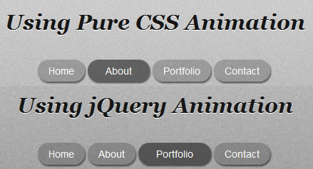
Expressjs has a nice button menu. Yes it absolutely nice since it has opacity and box shadow on each button, automatically widen when mouseover and again opacity to transparent when mousedown. I’d like to explain how they works with pure CSS version and jQuery version.
The Technique
There are two techniques we want to do, opacity and widen the button. Opacity is an effortless technique since it was supported by CSS while widening the button is only CSS technique by increasing the button’s current padding with some pixels number. So, when the user mouseover the button we will add its padding to make it wide and decrease the button’s opacity when user click it.
Pure CSS
Now based on the technique above we’ll create these button using pure CSS. First we create the button list using unordered list and then we set its style. Set the list’s display with inline, fill its background color with black and opacity with 20% (CSS value : 0.2), add box-shadow and set its border-radius into 15px to make it rounded. For opacity on background color we will use rgba().
<ul id="menu-css">
 <li><a href="#">Home</a></li>
 <li><a href="#">About</a></li>
 <li><a href="#">Portfolio</a></li>
 <li><a href="#">Contact</a></li>
</ul>
#menu-css li {
 display: inline;
 list-style: none;
}

#menu-css li a {

 /* Border Radius */
 -webkit-border-radius: 15px;
 -moz-border-radius: 15px;
 border-radius: 15px;

 /* Border Shadow */
 -webkit-box-shadow: 1px 2px 2px rgba(0,0,0,0.6);
 -moz-box-shadow: 1px 2px 2px rgba(0,0,0,0.6);
 box-shadow: 1px 2px 2px rgba(0,0,0,0.6);

 color: #ffffff;
 background: rgba(0,0,0,0.2);
 display: inline-block;
 padding: 5px 15px;
 outline: none;
 text-decoration: none;
}
When user mouseover the button we’ll adding its padding and increase its opacity into 50% (CSS value : 0.5) and when user click it we decrease its opacity into 10% (CSS value : 0.1).
#menu-css li a:hover {
 background: rgba(0,0,0,0.5);
 padding: 5px 25px;
}

#menu-css li a:active {
 background: rgba(0,0,0,0.1);
 -webkit-box-shadow: 1px 1px 1px rgba(0,0,0,0.4);
 -moz-box-shadow: 1px 1px 1px rgba(0,0,0,0.4);
 box-shadow: 1px 1px 1px rgba(0,0,0,0.4);
}
CSS Animation
Until above step we’ve a list of nice buttons but since they don’t have animation with them, the opacity transition and widening effects will not seen. So we’ll add the animation effect into each button, in this example each button represented by anchor element (<a>) it means we’ll put the animation on anchor style.
#menu-css li a {

 /* Animation (Webkit, Gecko & Mozilla) */
 -webkit-transition-duration: 0.20s;
 -webkit-transition-timing-function: ease-out;
 -moz-transition-duration: 0.20s;
 -moz-transition-timing-function: ease-out;
}
-webkit for Webkit-based browser and -moz for Mozilla-based browser. The trasition-duration represent how long the transition should last and transition-timing-function represent how the animation will proceed over time. On the CSS above we just create the animation in 0.20 seconds with ease-out function.
These step will add animation into any style changes and make them animate. For example the anchor has property width with value 20px and the anchor has different style when user hover it (ie : width: 40px), the width changes from 20px to 40px will be animated.
#menu-css li {
 display: inline;
 list-style: none;
}

#menu-css li a {

 /* Border Radius */
 -webkit-border-radius: 15px;
 -moz-border-radius: 15px;
 border-radius: 15px;

 /* Border Shadow */
 -webkit-box-shadow: 1px 2px 2px rgba(0,0,0,0.6);
 -moz-box-shadow: 1px 2px 2px rgba(0,0,0,0.6);
 box-shadow: 1px 2px 2px rgba(0,0,0,0.6);

 /* Animation (Webkit, Gecko & Mozilla) */
 -webkit-transition-duration: 0.20s;
 -webkit-transition-timing-function: ease-out;
 -moz-transition-duration: 0.20s;
 -moz-transition-timing-function: ease-out;

 color: #ffffff;
 background: rgba(0,0,0,0.2);
 display: inline-block;
 padding: 5px 15px;
 outline: none;
 text-decoration: none;
}

 #menu-css li a:hover {
  background: rgba(0,0,0,0.5);
  padding: 5px 25px;
 }

 #menu-css li a:active {
  background: rgba(0,0,0,0.1);
  -webkit-box-shadow: 1px 1px 1px rgba(0,0,0,0.4);
  -moz-box-shadow: 1px 1px 1px rgba(0,0,0,0.4);
  box-shadow: 1px 1px 1px rgba(0,0,0,0.4);
 }
Browser Issue
Since -webkit-transition has supported by latest Webkit-based browser including Safari and Chrome, Our pure CSS menu with animation above will works perfectly. Unfortunately -moz-transition will be introduced on Firefox 3.7 (Gecko 1.9.3) so the animation will not works on latest Firefox.
jQuery Animate
For a while Browser issue was disrupt our pure CSS menu, but of course we won’t stop to make it works. Using jQuery we can replace the CSS animation with $.animate() function. Surely with $.animate() function we just need to specify the pixels number for increasing the button’s padding.
For button opacity we can’t use opacity property in $.animate() function because it will make our button and text transparent. Since we just need to make the button (background) transparent we need $.animate() property that support rgba, we can use Mehdi Kabab’s plugin which is modification (to support rgba) from John Resig’s background color plugin.
If the user mouseover the button, we set its default padding and animate it by increasing its padding and opacity and when mouseout we revert to the default CSS value. When user click (mousedown) the button we decrease the opacity into 10% and revert to 50% when mouseup the button.
$(document).ready(function() {

 $('#menu-jquery li a').hover(

  function() {

   $(this).css('padding', '5px 15px')
   .stop()
   .animate({'paddingLeft' : '25px',
      'paddingRight' : '25px',
      'backgroundColor':'rgba(0,0,0,0.5)'},
      'fast');
  },

  function() {

   $(this).css('padding', '5px 25px')
   .stop()
   .animate({'paddingLeft' : '15px',
      'paddingRight'  : '15px',
      'backgroundColor' :'rgba(0,0,0,0.2)'},
      'fast');

 }).mousedown(function() {

  $(this).stop().animate({'backgroundColor': 'rgba(0,0,0,0.1)'}, 'fast');

 }).mouseup(function() {

  $(this).stop().animate({'backgroundColor': 'rgba(0,0,0,0.5)'}, 'fast');
 });
});
Conclusion
CSS3 offers us many advantages but sometimes we can’t take that advantages due to browser support, thankfully for jQuery offers us the alternative.
You might also like


Tags
accordion accordion menu animation navigation animation navigation menu carousel checkbox inputs css3 css3 menu css3 navigation date picker dialog drag drop drop down menu drop down navigation menu elastic navigation form form validation gallery glide navigation horizontal navigation menu hover effect image gallery image hover image lightbox image scroller image slideshow multi-level navigation menus rating select dependent select list slide image slider menu stylish form table tabs text effect text scroller tooltips tree menu vertical navigation menu