 Subscribe
 Follow Us
Organic Tabs(jQuery)
 14 years ago
  11653
11653  2134
2134
 n/a
n/a
Have you ever seen a tabbed content area in a sidebar that was a little “jerky”? The jerkiness can be caused by a bunch of things, like the content in the tabbed areas are of different heights, or maybe the way the switch happens the current one is hidden for a brief second before the new one shows up and the content below it jumps up and back down quickly. For lack of a better term, I’m calling tabs that behave more smoothly organic tabs .
The HTML
First we will have a wrapper element that will contain the entire tabbed content area. This nicely contains everything, as well as provides a nice target for the jQuery plugin. Inside we will have one unordered list for the tabs (navigation) themselves. These tabs have href attributes equal to the ID’s of the unordered lists below that they relate to. The content of the tabs is another wrapper div with a class of “list-wrap”. Each of the “panels” is an unordered list. They key here is really the “list-wrap”, which will ultimately provide us a good target for setting and animating the height of the content.
<div id="example-one">
<ul class="nav">
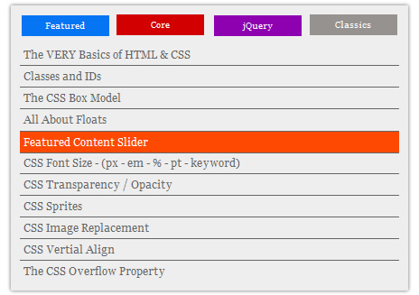
<li class="nav-one"><a href="#featured" class="current">Featured</a></li>
<li class="nav-two"><a href="#core">Core</a></li>
<li class="nav-three"><a href="#jquerytuts">jQuery</a></li>
<li class="nav-four last"><a href="#classics">Classics</a></li>
</ul>
<div class="list-wrap">
<ul id="featured">
<li>Stuff in here!</li>
</ul>
<ul id="core" class="hide">
<li>Stuff in here!</li>
</ul>
<ul id="jquerytuts" class="hide">
<li>Stuff in here!</li>
</ul>
<ul id="classics" class="hide">
<li>Stuff in here!</li>
</ul>
</div> <!-- END List Wrap -->
</div> <!-- END Organic Tabs (Example One) -->
The CSS
There isn’t much trickery here, just setting things up to look right. Very little of this is “required” for the plugin/technique to work, so feel free to rock your own styling here. My first demo is just a horizontal row of tabs, each of which has it’s own special rollover color.
/* Specific to example one */

#example-one { background: #eee; padding: 10px; margin: 0 0 15px 0; -moz-box-shadow: 0 0 5px #666; -webkit-box-shadow: 0 0 5px #666; }

#example-one .nav { overflow: hidden; margin: 0 0 10px 0; }
#example-one .nav li { width: 97px; float: left; margin: 0 10px 0 0; }
#example-one .nav li.last { margin-right: 0; }
#example-one .nav li a { display: block; padding: 5px; background: #959290; color: white; font-size: 10px; text-align: center; border: 0; }
#example-one .nav li a:hover { background-color: #111; }

#example-one ul { list-style: none; }
#example-one ul li a { display: block; border-bottom: 1px solid #666; padding: 4px; color: #666; }
#example-one ul li a:hover, #example-one ul li a:focus { background: #fe4902; color: white; }
#example-one ul li:last-child a { border: none; }

#example-one li.nav-one a.current, ul.featured li a:hover { background-color: #0575f4; color: white; }
#example-one li.nav-two a.current, ul.core li a:hover { background-color: #d30000; color: white; }
#example-one li.nav-three a.current, ul.jquerytuts li a:hover { background-color: #8d01b0; color: white; }
#example-one li.nav-four a.current, ul.classics li a:hover { background-color: #FE4902; color: white; }
There is one generically useful technique we are employing though. We need to hide all the content panels except the default one. There are many ways we could go about it. We could use display: none on them in the CSS. We could use the .hide() function in the JavaScript. Both of those ways have shortcomings. Hiding in the CSS means accessibility problems. Hiding in the JavaScript means the panels could potentially be briefly shown when the page loads and then disappear awkwardly. Instead, we can use a combination of both.
/* Generic Utility */
.hide { position: absolute; top: -9999px; left: -9999px; }
Then check in the jQuery plugin code below, we’ll reset these values back to “normal” and hide them with JavaScript, so they are ready to be displayed when needed (not kicked way off the page).
The jQuery
This is the plan in plain English for our plugin:
- When the plugin in called on an element…
- Move the hidden content back to their normal locations
- When a “tab” is clicked…
- If it’s not already the current tab…
- … and nothing is currently being animated…
- Set the outer wrapper to a set height of the current content
- Set highlighting of tab to correct tab
- Fade out current content
- Fade in current content
- Animate height of outer wrapper to height of new content
(function($) {

    $.organicTabs = function(el, options) {

        var base = this;
        base.$el = $(el);
        base.$nav = base.$el.find(".nav");

        base.init = function() {

            base.options = $.extend({},$.organicTabs.defaultOptions, options);

            // Accessible hiding fix
            $(".hide").css({
                "position": "relative",
                "top": 0,
                "left": 0,
                "display": "none"
            });

            base.$nav.delegate("li > a", "click", function() {

                // Figure out current list via CSS class
                var curList = base.$el.find("a.current").attr("href").substring(1),

                // List moving to
                    $newList = $(this),

                // Figure out ID of new list
                    listID = $newList.attr("href").substring(1),

                // Set outer wrapper height to (static) height of current inner list
                    $allListWrap = base.$el.find(".list-wrap"),
                    curListHeight = $allListWrap.height();
                $allListWrap.height(curListHeight);

                if ((listID != curList) && ( base.$el.find(":animated").length == 0)) {

                    // Fade out current list
                    base.$el.find("#"+curList).fadeOut(base.options.speed, function() {

                        // Fade in new list on callback
                        base.$el.find("#"+listID).fadeIn(base.options.speed);

                        // Adjust outer wrapper to fit new list snuggly
                        var newHeight = base.$el.find("#"+listID).height();
                        $allListWrap.animate({
                            height: newHeight
                        });

                        // Remove highlighting - Add to just-clicked tab
                        base.$el.find(".nav li a").removeClass("current");
                        $newList.addClass("current");

                    });

                }

                // Don't behave like a regular link
                // Stop propegation and bubbling
                return false;
            });

        };
        base.init();
    };

    $.organicTabs.defaultOptions = {
        "speed": 300
    };

    $.fn.organicTabs = function(options) {
        return this.each(function() {
            (new $.organicTabs(this, options));
        });
    };

})(jQuery);
Using the plugin
Like any other plugin, you’ll need to load the jQuery library first, then the plugin file, then call the plugin.
<script type='text/javascript' src='http://ajax.googleapis.com/ajax/libs/jquery/1.4/jquery.min.js'></script>
<script type="text/javascript" src="js/organictabs.jquery.js"></script>
<script type='text/javascript'>
    $(function() {

        $("#example-one").organicTabs();

        $("#example-two").organicTabs({
            "speed": 200
        });

    });
</script>
You can call the plugin without any parameters, or pass in “speed” to adjust the fade out / fade in animations.
You might also like
Tags
accordion accordion menu animation navigation animation navigation menu carousel checkbox inputs css3 css3 menu css3 navigation date picker dialog drag drop drop down menu drop down navigation menu elastic navigation form form validation gallery glide navigation horizontal navigation menu hover effect image gallery image hover image lightbox image scroller image slideshow multi-level navigation menus rating select dependent select list slide image slider menu stylish form table tabs text effect text scroller tooltips tree menu vertical navigation menu