 Subscribe
 Follow Us
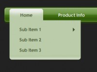
mcDropdown jQuery a complex hierarchical tree of options
 13 years ago
  6625
6625  1828
1828
 n/a
n/a
Click the icon to the right of the text box in order to see the widget in action. If you place the widget at the bottom of the viewport, you will notice that the widget automatically scrolls the page so that the entire menu appears on the screen. This is designed to reduce user frustration by making sure the user can actually use the control. No scrolling will take place if the widget can already display itself onscreen.
Another key usability feature the mcDropdown widget offers is keyboard entry. If you place the cursor inside the text box you can now use the keyboard to select an item. If an item is already selected, you will notice that placing focus on the input element causes the last child item to be automatically pre-selected. This allows for quickly changing the selected item if an incorrect value was entered.
We designed the keyboard entry so that only options found in the unordered list element can be selected. To accomplish this task, each keystroke is monitored and only allow valid characters are actually registered by the widget.
Also, as the user types a list of all possible matches will appear in the autocomplete list. This list is narrowed to only include exact matches. There's no need for a user to type the complete item name either, once the item the user wants is selected, they can either press [TAB], [ENTER], [RIGHT ARROW] or the [:] (which is the defined label delimiter) to select the list item. The user will then either be presented with any child items or they will move to the next position in the form.
Options
There are a number of options available for customizing the look and feel of the mcDropdown widget.
{
    minRows: 8                   // specify the minimum rows before creating a new column
  , maxRows: 25                  // specify the maximum rows in a column
  , targetColumnSize: 2          // specify the default target column size (it will attempt
                                   // to create this many columns by default, unless
                                 // the min/max row rules are not being met)
  , openFx: "slideDown"          // the fx to use for showing the root menu
  , openSpeed: 250               // the speed of the openFx
  , closeFx: "slideUp"           // the fx to use for hiding the root menu
  , closeSpeed: 250              // the speed of the closeFx
  , hoverOverDelay: 200          // the delay before opening a submenu
  , hoverOutDelay: 0             // the delay before closing a submenu
  , showFx: "show"               // the fx to use when showing a submenu
  , showSpeed: 0                 // the speed of the showFx
  , hideFx: "hide"               // the fx to use when closing a submenu
  , hideSpeed: 0                 // the speed of the hideFx
  , dropShadow: true             // determine whether drop shadows should be shown on
                                 // the submenus
  , autoHeight: true             // always uses the lineHeight options (much faster than
                                 // calculating height)
  , lineHeight: 19               // the base height of each list item (li) this is
                                 // normally calculated automatically, but in some cases
                                 // the value can not be determined and you will need to
                                 // set it manually
  , screenPadding: 10            // the padding to use around the border of the screen
                                 // (this is used to make sure items stay on the screen)
  , allowParentSelect: false     // determines if parent items are allowed to be selected
                                 // (by default only end nodes can be selected)
  , delim: ":"                   // the delimited to use when showing the display string
                                 // (must be single character)
  , showACOnEmptyFocus: false    // show the autocomplete box on focus when input is empty
  , valueAttr: "rel"             // the attribute that contains the value to use in the hidden field
  , click: null                  // callback that occurs when the user clicks on a menu item
  , select: null                 // callback that occurs when a value is selected
  , init: null                   // callback that occurs when the control is fully initialized
}
Started
The first thing we need to do is to load the required JavaScript libraries and the CSS stylesheet used by the widget:
<script type="text/javascript" src="./lib/jquery-1.2.6.min.js"></script>
<script type="text/javascript" src="./lib/jquery.mcdropdown.js"></script>
<script type="text/javascript" src="./lib/jquery.bgiframe.js"></script>

<!---// load the mcDropdown CSS stylesheet //--->
<link type="text/css" href="./css/jquery.mcdropdown.css" rel="stylesheet" media="all" />
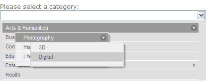
Before you can invoke an instance of the mcDropdown widget, you must have an unordered list element—which is used as your menu. If you have ever used the "suckerfish" technique, then setting up the list element is very straight forward. One of the key features of this widget is its ability to display hierarchical data structures that are very deep. However, for this example we will keep the HTML simple and straightforward. The default CSS stylesheet Giva provides expect that all unordered lists being used as menus will have a class of "mcdropdown_menu." If you choose to use a different class name, make sure to update the CSS file accordingly.
<ul id="categorymenu" class="mcdropdown_menu">
<li rel="1">
Arts & Humanities
<ul>
<li rel="2">
Photography
<ul>
<li rel="3">
3D
</li>
<li rel="4">
Digital
</li>
</ul>
</li>
<li rel="5">
History
</li>
<li rel="6">
Literature
</li>
</ul>
</li>
<li rel="7">
Business & Economy
</li>
<li rel="8">
Computers & Internet
</li>
<li rel="9">
Education
</li>
<li rel="11">
Entertainment
<ul>
<li rel="12">
Movies
</li>
<li rel="13">
TV Shows
</li>
<li rel="14">
Music
</li>
<li rel="15">
Humor
</li>
</ul>
</li>
<li rel="10">
Health
</li>
</ul>
Notice how each of the <li> elements contains the "rel" attribute? This is used to define the unique "value" for each item. This allows you to display whatever text you want to the user, but store a value that corresponds to a unique identifier. When a user selects an item from the menu, it is this value that is placed in a hidden <input /> element and therefore passed back to the server when the form is submitted. If you wish to use a different attribute to store your value, you can use the valueAttr option to change this to any attribute you want.
Now that the list element has been created, you need to create a DOM element that will become the widget:
<input type="text" name="category" id="category" value="" />
You can invoke the mcDropdown() plug-in on any block display element (like a <div>,) but by binding it to a text input element you will enable the keyboard entry feature.
The next step is to actually create an instance of the mcDropdown widget. You want to make sure to initialize the widget after all the necessary DOM elements are available, which makes the document.ready event a great place to initialize the widget.
<script type="text/javascript">
$(document).ready(function (){
    $("#category").mcDropdown("#categorymenu");
});
</script>
You might also like


Tags
accordion accordion menu animation navigation animation navigation menu carousel checkbox inputs css3 css3 menu css3 navigation date picker dialog drag drop drop down menu drop down navigation menu elastic navigation form form validation gallery glide navigation horizontal navigation menu hover effect image gallery image hover image lightbox image scroller image slideshow multi-level navigation menus rating select dependent select list slide image slider menu stylish form table tabs text effect text scroller tooltips tree menu vertical navigation menu