 Subscribe
 Follow Us
Sliding Checkbox Actions Menu with jQuery
 13 years ago
  7953
7953  1890
1890
 n/a
n/a
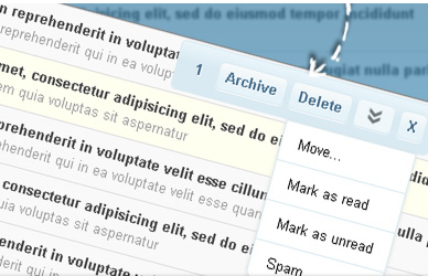
We will create an actions menu with jQuery that appears when checkboxes are selected. This can be a very helpful UI property since we don’t force the user to scroll to the place where the actions are – they just appear whenever the user needs them.
Additionally, the user can drag the actions box to the place that is more practical for him, and the box will always follow when the user scrolls the page. It will also show a count of how many checkboxes were selected.
We will use a table as an example. Usually, actions are placed at the top and the bottom of a table, and that’s OK if the table is not too big. But since we cannot control the size of the user’s viewport, it is not guaranteed that the actions are close to the users focus. With this solution we make it very easy for the user to perform certain actions on selected items.
The Markup
For the markup we will simply create a table with an ID and some checkboxes in the cells:
<table id="mytable">
 <tr>
  <td class="check">
   <input id="check_1" name="check_1" type="checkbox" value="1" />
  </td>
  <td>Some Content</td>
 </tr>
 <tr>
  <td class="check">
   <input id="check_2" name="check_2" type="checkbox" value="2" />
  </td>
  <td>Some Content</td>
 </tr>
</table>
For the actions menu we will have the following markup:
<div id="actionsBox" class="actionsBox">
 <div id="actionsBoxMenu" class="menu">
  <span id="cntBoxMenu"></span>
  <a class="button box_action">Archive</a>
  <a class="button box_action">Delete</a>
  <a id="toggleBoxMenu" class="open"></a>
  <a id="closeBoxMenu" class="button">X</a>
 </div>
 <div class="submenu" style="display:none;">
  <a class="first box_action">Move...</a>
  <a class="box_action">Mark as read</a>
  <a class="box_action">Mark as unread</a>
  <a class="last box_action">Spam</a>
 </div>
</div>
The div with the class submenu will appear when we click on the a with the ID toggleBoxMenu.
The CSS
In the following we will take a look at the style for the actions box. We will be using a lot of CSS 3 properties, so if you want this to work in ancient browsers, you will have to adapt this tiny menu by using images.
We will want to hide the whole menu initially. So, the actionsBox div will have the following style:
.actionsBox{
    font-size:13px;
    font-family:Helvetica,Arial,Verdana;
    font-style:normal;
    left:50%;
    position:absolute;
    top:-50px;
    opacity:0;
    cursor:move;
}
The main menu with the buttons will be styled as follows:
.actionsBox .menu{
    color:#47708F;
    width:240px;
    line-height:30px;
    text-shadow:1px 1px 0px #fff;
    padding:7px;
    -moz-border-radius:5px;
    -webkit-border-radius:5px;
    border-radius:5px;
    font-weight:bold;
    border:1px solid #D9EAF2;
    background:#e8f4fa;
    background:
        -webkit-gradient(
        linear,
        left bottom,
        left top,
        color-stop(0.58, rgb(217,234,242)),
        color-stop(0.93, rgb(232,244,250))
        );
    background:
        -moz-linear-gradient(
        center bottom,
        rgb(217,234,242) 58%,
        rgb(232,244,250) 93%
        );
    -moz-box-shadow:1px 1px 3px #999;
    -webkit-box-shadow:1px 1px 3px #999;
    box-shadow:1px 1px 3px #999;
}
We are making heavily use of CSS3 here: the gradient, the rounded border, the box and text shadow will all create a beautiful effect that will make the use of images needless.
The buttons, which will be link elements, will have the following style:
.actionsBox .menu .button{
    padding:4px 7px;
    border:1px solid #D9EAF2;
    cursor:pointer;
    background:#e8f4fa;
    background:
        -webkit-gradient(
        linear,
        left bottom,
        left top,
        color-stop(0.38, rgb(230,243,249)),
        color-stop(0.88, rgb(245,249,250))
        );
    background:
        -moz-linear-gradient(
        center bottom,
        rgb(230,243,249) 38%,
        rgb(245,249,250) 88%
        );
    -moz-border-radius:5px;
    -webkit-border-radius:5px;
    border-radius:5px;
    -moz-box-shadow:0px 1px 0px #f9f9f9;
    -webkit-box-shadow:0px 1px 0px #f9f9f9;
    box-shadow:0px 1px 0px #f9f9f9;
}
With the very light box shadow, we are creating a slightly engraved effect. When we hover, we want the element to get a white background:
.actionsBox .menu .button:hover{
    background:#fff;
}
The span in the menu is for displaying the number of selected checkboxes:
.actionsBox .menu span{
    padding:0px 10px;
}
The sub menu will not be displayed initially. We will give it a rounded border at its bottom:
.actionsBox .submenu{
    display:none;
    width:120px;
    margin-left:100px;
    top:46px;
    right:10px;
    background:#fff;
    border:1px solid #D9EAF2;
    border-top:none;
    -moz-border-radius:0px 0px 10px 10px;
    -webkit-border-bottom-left-radius:10px;
    -webkit-border-bottom-right-radius:10px;
    border-bottom-left-radius:10px;
    border-bottom-right-radius:10px;
    -moz-box-shadow:0px 1px 4px #ddd;
    -webkit-box-shadow:0px 1px 4px #ddd;
    box-shadow:0px 1px 4px #ddd;
}
.actionsBox .submenu a{
    display:block;
    cursor:pointer;
    padding:10px 15px;
    border-top:1px solid #D9EAF2;
}
The last item will also have a rounded border at the bottom:
.actionsBox .submenu a.last{
    -moz-border-radius:0px 0px 10px 10px;
    -webkit-border-bottom-left-radius:10px;
    -webkit-border-bottom-right-radius:10px;
    border-bottom-left-radius:10px;
    border-bottom-right-radius:10px;
}
And the first item will not have a border at the top:
.actionsBox .submenu a.first{
    border-top:none;
}
.actionsBox .submenu a:hover{
    background-color:#f9f9f9;
}
The open/close item will have the following style:
.actionsBox .menu a.open,
.actionsBox .menu a.closed{
    border:1px solid #D9EAF2;
    padding:4px 17px;
    -moz-border-radius:5px;
    -webkit-border-radius:5px;
    border-radius:5px;
    -moz-box-shadow:0px 1px 0px #f9f9f9;
    -webkit-box-shadow:0px 1px 0px #f9f9f9;
    box-shadow:0px 1px 0px #f9f9f9;
    cursor:pointer;
    opacity:0.6;
    margin-right:5px;
}
.actionsBox .menu a.open{
    background:#fff url(../open.png) no-repeat center center;
}
.actionsBox .menu a.closed{
    background:#fff url(../closed.png) no-repeat center center;
}
.actionsBox .menu a.open:hover,
.actionsBox .menu a.closed:hover{
    opacity:1.0;
}
And that’s the style. Of course, you will have to adapt this if you are going to use this in your web application. In IE you can see that the style stays very simple.
Now, let’s add the jQuery magic!
The JavaScript
First, let’s include the jQuery script and also the jQuery UI script because we are going to make our little menu draggable.
So, the main idea is to have our menu appear whenever the user checks a checkbox. We also want it to disappear when there are no checkboxes selected and we want to make the menu draggable. Additionally, the menu should follow the user when he scrolls the page.
We will also change the class of the table row to “selected” whenever we select a checkbox. (You can check out the style for the table and that class in the ZIP file.)
We add the following function:
$(function() {
 /* tells us if we dragged the box */
 var dragged = false;

 /* timeout for moving the box when scrolling the window */
 var moveBoxTimeout;

 /* make the actionsBox draggable */
 $('#actionsBox').draggable({
  start: function(event, ui) {
   dragged = true;
  },
  stop: function(event, ui) {
   var $actionsBox = $('#actionsBox');
   /*
   calculate the current distance from the
   window's top until the element;
   this value is going to be used later on,
   to move the box after we scroll
    */
   $actionsBox.data('distanceTop',parseFloat($actionsBox.css('top'),10) - $(document).scrollTop());
  }
 });

 /*
 when clicking on an input (checkbox),
 change the class of the table row,
 and show the actions box
  */
 $('#mytable input[type="checkbox"]').bind('click',function(e) {
  var $this = $(this);
  if($this.is(':checked'))
   $this.parents('tr:first').addClass('selected');
  else
   $this.parents('tr:first').removeClass('selected');
  showActionsBox();
 });

 function showActionsBox(){
  /* number of checked inputs */
  var BoxesChecked = $('#mytable input:checked').length;
  /* update the number of checked inputs */
  $('#cntBoxMenu').html(BoxesChecked);
  /*
  if there is at least one selected, show the BoxActions Menu
  otherwise hide it
   */
  var $actionsBox = $('#actionsBox');
  if(BoxesChecked > 0){
   /*
   if we didn't drag, then the box stays where it is;
   we know that the position is the document's current top
   plus the previous distance that the box had relative
   to the window's top (distanceTop)
    */
   if(!dragged)
    $actionsBox.stop(true).animate({
     'top': parseInt(15 + $(document).scrollTop()) + 'px',
     'opacity':'1'
    },500);
   else
    $actionsBox.stop(true).animate({
     'top': parseInt($(document).scrollTop() + $actionsBox.data('distanceTop')) + 'px',
     'opacity':'1'
    },500);
  }
  else{
   $actionsBox.stop(true).animate({
    'top': parseInt($(document).scrollTop() - 50) + 'px',
    'opacity':'0'
   },500,function(){
    $(this).css('left','50%');
    dragged = false;
    /* if the submenu was open we hide it again */
    var $toggleBoxMenu = $('#toggleBoxMenu');
    if($toggleBoxMenu.hasClass('closed')){
     $toggleBoxMenu.click();
    }
   });
  }
 }

 /*
 when scrolling, move the box to the right place
  */
 $(window).scroll(function(){
  clearTimeout(moveBoxTimeout);
  moveBoxTimeout = setTimeout(showActionsBox,500);
 });

 /* open sub box menu for other actions */
 $('#toggleBoxMenu').toggle(
 function(e){
  $(this).addClass('closed').removeClass('open');
  $('#actionsBox .submenu').stop(true,true).slideDown();
 },
 function(e){
  $(this).addClass('open').removeClass('closed');
  $('#actionsBox .submenu').stop(true,true).slideUp();
 }
);

 /*
 close the actions box menu:
 hides it, and then removes the element from the DOM,
 meaning that it will no longer appear
  */
 $('#closeBoxMenu').bind('click',function(e){
  $('#actionsBox').animate({
   'top':'-50px',
   'opacity':'0'
  },1000,function(){
   $(this).remove();
  });
 });

 /*
 as an example, for all the actions (className:box_action)
 alert the values of the checked inputs
  */
 $('#actionsBox .box_action').bind('click',function(e){
  var ids = '';
  $('#mytable input:checked').each(function(e,i){
   var $this = $(this);
   ids += 'id : ' + $this.attr('id') + ' , value : ' + $this.val() + '\n';
  });
  alert('checked inputs:\n'+ids);
 });
});
The close button will make the actions box disappear completely. You can change that behavior by adapting the function. You might want that the user gets his menu back after he clicks on more checkboxes.
The last function is an example of how to get the values of the checked items. You can adapt this to suit your needs and to process the checked values further.
And that’s it! I hope you liked it and find it useful!
You might also like
Tags
accordion accordion menu animation navigation animation navigation menu carousel checkbox inputs css3 css3 menu css3 navigation date picker dialog drag drop drop down menu drop down navigation menu elastic navigation form form validation gallery glide navigation horizontal navigation menu hover effect image gallery image hover image lightbox image scroller image slideshow multi-level navigation menus rating select dependent select list slide image slider menu stylish form table tabs text effect text scroller tooltips tree menu vertical navigation menu