 Subscribe
 Follow Us
a jQuery content feature like MailChimp
 13 years ago
  10852
10852  2061
2061
 n/a
n/a

The Code
Getting started with this plugin is really simple, you first need to include the cycle.js plugin.This div structure allows you to assign different background images to each slide.
You can easily change the effect of the image transitions by replacing fx:’scrollVert’ with ‘fade’ for a simple transifion between frames, or ‘scrollHorz’ for the images to slide in horizontally.
Setup of the cycle plugin is simple with the settings below. you can adjust the speed, the initial timeout for when the page loads that the first frame is seen for and the delay between transitions.
$(document).ready( function($) {

  $('#slider').cycle({
    fx: 'scrollVert',
    speed: 1000,
    pause: 1,
    timeout: 7000,
    delay: 500,
    prev: '#slider_next',
    next: '#slider_prev'
  });

});
The HTML
<div id="slider">
  <!-- slider -->
  <div id="iphone" class="slider">
    <a href="http://papermashup.com" title="iPhone 4 coming soon" class="slider_content">iPhone 4 coming soon</a>
  </div>
  <!-- slider -->
  <div id="macbook" class="slider">
    <a href="http://papermashup.com" title="Macbook Get One" class="slider_content">Macbook Get One</a>
  </div>
  <!-- slider -->
  <div id="ipad" class="slider">
    <a href="http://papermashup.com" title="The new iPad" class="slider_content">The new iPad</a>
  </div>
</div>
<div id="slider_controls">
  <ul>
    <li><a href="#" id="slider_prev">Previous</a></li>
    <li><a href="#" id="slider_next">Next</a></li>
  </ul>
</div>
The CSS
#slider {
 width: 100%;
 overflow: hidden;
 height: 301px;
}
.slider {
 height: 301px;
 width: 100%!important;
}
.slider_content {
 width: 1020px;
 height: 301px;
 margin: 0 auto;
 display: block;
 text-indent: -9999px;
}
#ipad {
 background: url('images/ipad-bg.jpg') repeat-x 50% 0;
        width: 100%;
        height: 301px;
}
#ipad .slider_content {
 background: transparent url('images/ipad.jpg') no-repeat top left;
}
#iphone {
 background: #000000 url('images/bg.jpg') repeat-x 50% 0;
        width: 100%;
        height: 301px;
}
#iphone .slider_content {
 background: transparent url('images/iphone.jpg') no-repeat top left;
}
#macbook {
 background: #000000 url('images/macbook-bg.jpg') repeat-x 50% 0;
        width: 100%;
        height: 301px;
}
#macbook .slider_content {
 background: transparent url('images/macbook.jpg') no-repeat top left;
}

#slider_controls {
 width: 958px;
 position: relative;
 margin: 0 auto;
 height: 1px;
}
#slider_controls ul {
 background: transparent url('images/nav.png') no-repeat bottom center;
 display:block;
 height:32px;
 position:absolute;
 right:0;
 text-indent:-9999px;
 top:-31px;
 width:164px;
 z-index:9998;
}
#slider_controls li {
 float: left;
 width: 82px;
 height: 32px;
}
#slider_controls li a {
 display: block;
 height: 32px;
}
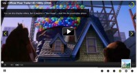
This slider is both elegant, simple to maintain and easy to code as well as being lightweight on the browser.
You might also like


Tags
accordion accordion menu animation navigation animation navigation menu carousel checkbox inputs css3 css3 menu css3 navigation date picker dialog drag drop drop down menu drop down navigation menu elastic navigation form form validation gallery glide navigation horizontal navigation menu hover effect image gallery image hover image lightbox image scroller image slideshow multi-level navigation menus rating select dependent select list slide image slider menu stylish form table tabs text effect text scroller tooltips tree menu vertical navigation menu