 Subscribe
 Follow Us
Nice And Simple Toolbar For Your Website With CSS3 And jQuery
 13 years ago
  13235
13235  2455
2455
 n/a
n/a
This is a fixed panel, on the bottom of the page, to improve interaction with our users.
So a panel with social icons and their tooltip bubbles on the left side and a quick menu on the right. Some features we want for our bar:
- Hide/Show toolbar clicking on specific buttons
- Adaptive width during the resizing of the window
- Tooltip Bubble when the mouse is moved over an icon
- Quick Menu Panel on the right side
- Cross Browser Compatibility
The Basic Structure
We’ll update the HTML code of index.php and the CSS code of style.css of the News Aggregator.
We build a fixed panel (div with id toolbar) with two floating sides where we will add in a second step the list with the icons and their tip bubbles (left), a quick menu and the “hide button” (to hide the toolbar ).
We can also expect a “show button”, it is useful when the panel is hidden and we want to re-activate it. For this reason we add the div tag with id toolbarbut.
HTML and CSS code
Here the html basic structure.
<div id="toolbarbut">
  <!-- hide button -->
</div>

<div id="toolbar"> <!-- toolbar container -->

  <div class="leftside">
    <!-- all icons in floating left side -->
  </div>

  <div class="rightside"> <!-- all things in floating right side -->
    <!-- hide button -->
    <!-- quick menu list -->
  </div>

</div>
Update style.css using the following lines of code (take a look at the comments).
div#toolbar, div#toolbarbut {
  position: fixed; /* set fixed position for the bar */
  bottom: 0px;
  right: 0px;
  z-index: 9999; /* keep the bar on top  */
  height: 36px;
  background: url(images/bcktool.png);
  /* CSS3 */
  -moz-border-radius-topleft: 8px;
 -khtml-border-radius-topleft: 8px;
 -webkit-border-top-left-radius: 8px;
 -moz-border-radius-topright: 8px;
 -khtml-border-radius-topright: 8px;
 -webkit-border-top-right-radius: 8px;
 -moz-box-shadow: 0px 1px 10px #666, inset 1px 1px 0px #a4a4a4; /* inset creates a inner-shadow */
  -khtml-box-shadow: 0px 1px 10px #666;
  -webkit-box-shadow: 0px 1px 10px #666;
  /* CSS3 end */
 border-top: 1px solid #eee;
  border-left: 1px solid #eee;
  border-right: 1px solid #eee;
}

div#toolbar {
  width: 85%;
  min-width: 700px; /* to limit the width when there is an excessive window resize */
  margin: 0px auto; /* centered toolbar */
  left: 0px;
}

div#toolbar a:hover {
  border: none; /* fix 'hover' (a:hover {border-bottom: 1px dotted #666;}) border in the News Aggregator */
}

div#toolbarbut { /* div for the 'hide status' */
  width: 60px;
  height: 15px;
  margin-right: 3%;
  display: none;
}

.leftside {
  float: left;
}

.rightside {
  float: right;
}
It’s important to note that we have just added a nice shadow effect and rounded borders exclusively using CSS code.
Show/Hide Buttons
Now we can add the code for the “show button”.
<div id="toolbarbut"> <!-- hide button -->
<span class="showbar"><a href="#">show bar</a></span>
</div>
Below the properties for the relative CSS class.
span.showbar a { /* show button */
  padding: 5px;
  font-size: 10px;
  color: #989898;
}
We complete the right side later, but now we can add the “hide button” within the div with id rightside, as shown.
<div class="rightside">
  <span class="downarr"> <!-- hide button -->
  <a href="#"></a>
  </span>

  <!-- other stuff in floating right side -->

</div>
Properties for the relative CSS class.
/*-- Right Side --*/

span.downarr { /* hide button */
  float: right;
  border-left: 1px solid #a4a4a4;
}

span.downarr a {
  display: block;
  width: 36px;
  height: 26px;
  padding: 25px 0 0 10px;
  background: url(images/downarrow.png) no-repeat 5px 7px;
}
Show/Hide Effect with jQuery
First of all we need to download jQuery (copy it in the right folder) and activate it in head tag of index.php.
<head>
<!-- ... -->
<script type="text/javascript" src="js/jquery-1.3.2.min.js"></script>
</head>
We want to hide the panel clicking on “hide button”, when the toolbar isn’t visible there should be the “show button” that allows us to restore the panel.
We can use the following jQuery solution (add the code after the <body> tag).
<script type="text/javascript">

$(document).ready(function(){

  //hide toolbar and make visible the 'show' button
 $("span.downarr a").click(function() {
    $("#toolbar").slideToggle("fast");
    $("#toolbarbut").fadeIn("slow");
  });

  //show toolbar and hide the 'show' button
  $("span.showbar a").click(function() {
    $("#toolbar").slideToggle("fast");
    $("#toolbarbut").fadeOut();
  });

});

</script>
Now we can hide and show the bar whenever we want.
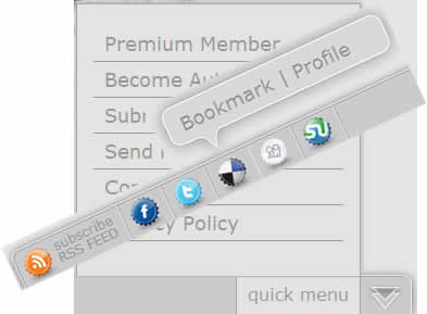
Left Side
In this space we add a list of Social Network Icons (we use “Set of social icons” by Tydlinka), with a particularity: we want to show tooltip when the mouse is moved over a list element.
HTML and CSS code for the Left Side
Update the index with the following XHTML code. We add a general unordered list (with id social) to create the sequence of the icons and a div tag (with class tip) nested within the li tag of the general list to realize the tooltip bubble.
<div class="leftside"> <!-- all things in floating left side -->
  <ul id="social">
    <li><a class="rss" href="#"></a><!-- icon -->
      <div id="tiprss" class="tip"><!-- tooltip -->
        <ul>
          <li><a href="#">580 Readers</a></li>
          <li><a href="#"><small>[Subscribe]</small></a></li>
        </ul>
      </div>
    </li>
    <li><a class="facebook" href="#"></a>
      <div id="tipfacebook" class="tip">
        <ul>
          <li><a href="#">Share Page</a></li>
          <li><a href="#">| Profile</a></li>
        </ul>
      </div>
    </li>
    <li><a class="twitter" href="#"></a>
      <div id="tiptwitter" class="tip">
        <ul>
          <li><a href="#">ReTweet</a></li>
          <li><a href="#">| Profile</a></li>
        </ul>
      </div>
    </li>
    <li><a class="delicious" href="#"></a>
      <div id="tipdelicious" class="tip">
        <ul>
          <li><a href="#">Bookmark</a></li>
          <li><a href="#">| Profile</a></li>
        </ul>
      </div>
    </li>
    <li><a class="digg" href="#"></a>
      <div id="tipdigg" class="tip">
        <ul>
          <li><a href="#">Digg</a></li>
          <li><a href="#">| Profile</a></li>
        </ul>
      </div>
    </li>
    <li><a class="stumble" href="#"></a>
      <div id="tipstumble" class="tip">
        <ul>
          <li><a href="#">Stumble</a></li>
          <li><a href="#">| Profile</a></li>
        </ul>
      </div>
    </li>
  </ul>
  </div>
And now the CSS code. We use position: absolute; to set-up a custom position for the tip bubble.
/*-- Left Side --*/

ul#social li {
  display: inline;
}

a.rss {
  display: inline-block;
  width: 104px;
  height: 35px;
  margin-left: 5px;
  background: url(images/rss.png) no-repeat;
}

a.facebook, a.twitter, a.digg, a.delicious, a.stumble {
  display: inline-block;
  width: 40px;
  height: 35px;
  margin-top: 1px;
}

a.rss:hover, a.facebook:hover, a.twitter:hover, a.digg:hover, a.delicious:hover, a.stumble:hover {
  background-position: 1px 1px; /* simple css hover effect */
}

a.facebook {
  background: url(images/facebook.png) no-repeat;
}

a.twitter {
  background: url(images/twitter.png) no-repeat;
}

a.delicious {
  background: url(images/delicious.png) no-repeat;
}

a.digg {
  background: url(images/digg.png) no-repeat;
}

a.stumble {
  background: url(images/stumble.png) no-repeat;
}

.tip {
  position: absolute; /* important */
  top: -75px;
  width: 250px;
  height: 78px;
  background: url(images/tip.png) no-repeat;
  float: left;
  display: none;
}

/* custom distances for the icons */
#tipfacebook {
  left: 75px;
}

#tiptwitter {
  left: 120px;
}

#tipdelicious {
  left: 165px;
}

#tipdigg {
  left: 210px;
}

#tipstumble {
  left: 255px;
}

.tip ul {
  padding: 22px 0 0 25px;
}

.tip ul li {
  display: inline;
  padding-left: 3px;
}

.tip ul li a {
  font-size: 18px;
  color: #989898;
}

.tip ul li a:hover {
  color: #666;
}

.tip ul li small {
  font-size: 10px;
}
Use jQuery to Set-up the Hover Effect for Tooltip Bubbles
It’s time to add a nice effect for our bubbles. As usual, with some lines of code, jQuery allows us to create a nice menu for sharing our pages on the Social Networking and Bookmarking websites.
//show tooltip when the mouse is moved over a list element
  $("ul#social li").hover(function() {
  $(this).find("div").fadeIn("fast").show(); //add 'show()'' for IE
    $(this).mouseleave(function () { //hide tooltip when the mouse moves off of the element
        $(this).find("div").hide();
    });
  });
Right Side
Now near the “hide button” we add a useful quick menu.
HTML and CSS code for the Right Side
Here the complete code. We use a span for the menu title and a new div (with id quickmenu) for the new panel.
<div class="rightside"> <!-- all things in floating right side -->
  <span class="downarr"> <!-- hide button -->
  <a href="#"></a>
  </span>
  <span class="menu_title">
    <a class="menutit" href="#">quick menu</a> <!-- quick menu title -->
  </span>
  <div class="quickmenu">
    <ul> <!-- quick menu list -->
      <li><a href="#">Premium Member</a></li>
      <li><a href="#">Become Author</a></li>
      <li><a href="#">Submit News</a></li>
      <li><a href="#">Send Feedback</a></li>
      <li><a href="#">Contact Us</a></li>
      <li><a href="#">Privacy Policy</a></li>
    </ul>
  </div>
  </div>
And now the style!
/*-- Right Side --*/

span.downarr { /* hide button */
  float: right;
  border-left: 1px solid #a4a4a4;
}

span.downarr a {
  display: block;
  width: 36px;
  height: 26px;
  padding: 25px 0 0 10px;
  background: url(images/downarrow.png) no-repeat 5px 7px;
}

span.menu_title {
  background: #e4e4e4;
  border-left: 1px solid #a4a4a4;
  padding: 10px;
}

span.menu_title a {
  font-size: 16px;
  line-height: 34px;
  color: #9a9a9a;
}

.quickmenu {
  position: absolute; /* important */
  top: -251px;
  right: 46px;
  width: 260px;
  height: 250px;
  background: #e4e4e4;
 border-top: 1px solid #a4a4a4;
  border-left: 1px solid #a4a4a4;
  border-right: 1px solid #a4a4a4;
  /* CSS3 */
  -moz-box-shadow: 2px -3px 5px #c5c5c5, -3px 0px 5px #cdcdcd;
  -khtml-shadow: 2px -3px 5px #c5c5c5, -3px 0px 5px #cdcdcd;
  -webkit-box-shadow: 2px -3px 5px #c5c5c5, -3px 0px 5px #cdcdcd;
  /* CSS3 end */
  display: none; /* important */
}

.quickmenu ul {
  padding-top: 20px;
}

.quickmenu ul li {
  border-bottom: 1px solid #989898;
  padding: 5px 10px;
  margin: 0 15px 0 15px;
}

.quickmenu ul li a {
  font-size: 18px;
  color: #989898;
  display: block;
}

.quickmenu ul li a:hover {
  color: #666;
}
Show/Hide QuickMenu Panel on Click Event
Below you can see the jQuery code used to make visible or hidden the menu panel clicking on menu title (tag a with class menutit). We also add a little fix to avoid the jump to link anchor (#).
//show quick menu on click
 $("span.menu_title a").click(function() {
  if($(".quickmenu").is(':hidden')){ //if quick menu isn't visible
   $(".quickmenu").fadeIn("fast"); //show menu on click
  }
  else if ($(".quickmenu").is(':visible')) { //if quick menu is visible
      $(".quickmenu").fadeOut("fast"); //hide menu on click
    }
 });

 //hide menu on casual click on the page
 $(document).click(function() {
   $(".quickmenu").fadeOut("fast");
 });
 $('.quickmenu').click(function(event) {
  event.stopPropagation(); //use .stopPropagation() method to avoid the closing of quick menu panel clicking on its elements
 });

 //don't jump to #id link anchor
  $(".facebook, .twitter, .delicious, .digg, .rss, .stumble, .menutit, span.downarr a, span.showbar a").click(function() {
   return false;
 });
You might also like

Tags
accordion accordion menu animation navigation animation navigation menu carousel checkbox inputs css3 css3 menu css3 navigation date picker dialog drag drop drop down menu drop down navigation menu elastic navigation form form validation gallery glide navigation horizontal navigation menu hover effect image gallery image hover image lightbox image scroller image slideshow multi-level navigation menus rating select dependent select list slide image slider menu stylish form table tabs text effect text scroller tooltips tree menu vertical navigation menu