 Subscribe
 Follow Us
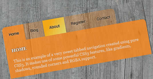
Sweet tabbed navigation using CSS3
 13 years ago
  13013
13013  3171
3171
 n/a
n/a
This example takes on the following CSS(3) properties:
rgbaopacitytext-shadowpseudo selectorsrounded cornersgradientsbox-shadow
HTML
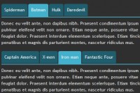
Before we do anything fancy with CSS, we'll need a decent backbone in the form of HTML. As you can expect, the menu excists from an ul with items (links to pages). We'll also add a main content division, but this tutorial has the focus on the menu.
<div id="menu">
   <ul>
      <li><a href="#" title="Home">Home</a></li>
      <li><a href="#" title="Blog" class="active">Blog</a></li>
      <li><a href="#" title="About">About</a></li>
      <li><a href="#" title="Register">Register</a></li>
      <li><a href="#" title="Contact">Contact</a></li>
   </ul>
</div>
<div id="main">
   <h3>Main content header</h3>
   <p>Main content</p>
</div>
Nothing really fancy or hard going on here, so I suggest we take our first steps into the CSS.
Simple CSS
First, we'll need some basic styling to the HTML we just created. We want to display the navigation inline and see no bullets what so ever. This is the code we need:
#menu { margin:40px 0 0 150px; }
#menu ul { list-style:none; }
#menu ul li { display:inline; float:left; margin-bottom:20px; }
Our outcome (see below) might look a little bit dull, these are the foundations we're going to work with in order to achieve what we want.
RGBA, opacity and Text-shadow
Now, we're going to use some of the CSS3 features to make this simple navigation look beautiful. We'll select the anchor tags within the menu, and apply some styling to it. CSS3 supports RGBA() to select a colour. The fourth parameter sets the opacity of the element. We'll also use text-shadow to give the text an "outer glow" effect.
/* background color set to RGBA, with opacity on 0.3 and also using text-shadow */
#menu ul li a { padding:20px; background: rgba(255,138,30,0.3); text-decoration: none; font: bold 14px Helvetica, Sans-Serif; letter-spacing: -1px; color: #402e16;
    text-shadow: #eee 0px 0px 2px; }
Pseudo Selectors and Rounded Corners
Now that we have our navigation, we'll take it to the next level. The first anchor tag will have a rounded top-left corner, while the last one will have a rounded top-right corner. This will enhance the effect of tabs a little bit more.
With the use of pseudo selectors, we can easily find the first and last anchor element in the list, without the need of extra classes. Check out the following code:
/* :first-child pseudo selector with rounded top left corner */
#menu ul li:first-child a { -moz-border-radius-topleft: 12px; -webkit-border-top-left-radius:12px; }

/* :last-child pseudo selector with rounded top right corner */
#menu ul li:last-child a { -moz-border-radius-topright: 12px; -webkit-border-top-right-radius:12px; }
Gradient and Box-shadow
Now that we have our menu fully complete, we want to place the cherry on the cake by styling the .active and :hover state of the menu. The first one is created to indicate the user is currently viewing that tab (added by the class in the HTML). The second one is the hover state.
The .active state isn't very spectecular: It'll have the same RGBA colour as the normal state, but with less opacity (0.8). The :hover state will be a little bit more complex.
With CSS3, you'll have the ability to create gradients. In this example, I'll go with a simple linear, two coloured gradient, but the possibilities are endless. You can use this great CSS3 gradients tool (just like I did) to help you a little bit out creating the CSS gradients. We'll also add a slight grey shadow on top, to enhance the 3d tab effect.
/* hover state shows a linear gradient and opacity it brought down to 0.9 and also shows a very slight grey shadow on top */
#menu ul li a:hover { -moz-box-shadow: 0 -5px 10px #777; -webkit-box-shadow: 0 -5px 10px #777;
   background: -webkit-gradient(
      linear, right bottom, left top, color-stop(0, rgb(237,227,112)), color-stop(0.72, rgb(255,173,10))) !important;
   background: -moz-linear-gradient(
      right bottom, rgb(237,227,112) 0%, rgb(255,173,10) 72%) !important;
   background-color:rgb(255,173,10) !important;
   -moz-opacity:.90; filter:alpha(opacity=90); opacity:.90; }

/* another RGBA background, now with an opacity of 0.8 */
#menu ul li a.active { background: rgba(255,138,30,0.8) !important; }
More CSS
Since we finished our CSS3 powered menu, we can style our main part a little bit. I don't need to explain any of the code here, since all effects applied are used in the menu too!
/* main contents with RGBA background (same colour as active tab) and three rounded corners */
#main { clear:both; background: rgba(255,138,30,0.8); width:500px; margin-left:150px;
   -moz-border-radius-topright: 12px; -moz-border-radius-bottomright: 12px; -moz-border-radius-bottomleft: 12px;
   -webkit-border-top-right-radius:12px; -webkit-border-bottom-right-radius:12px; -webkit-border-bottom-left-radius:12px;}

/* header with a text-shadow */
#main h3 { text-transform:uppercase; padding:20px 0 0 20px; color:#eee; text-shadow: #000 0px 0px 2px; }
#main p { padding-bottom:20px; color:#ddd; }
added a little jQuery script to virtually switch between pages, but of course this needs to be done server-side and show the actual page.
You might also like
Tags
accordion accordion menu animation navigation animation navigation menu carousel checkbox inputs css3 css3 menu css3 navigation date picker dialog drag drop drop down menu drop down navigation menu elastic navigation form form validation gallery glide navigation horizontal navigation menu hover effect image gallery image hover image lightbox image scroller image slideshow multi-level navigation menus rating select dependent select list slide image slider menu stylish form table tabs text effect text scroller tooltips tree menu vertical navigation menu