 Subscribe
 Follow Us
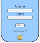
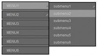
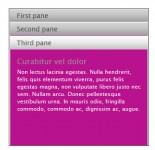
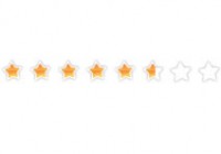
Custom radio and checkbox inputs using CSS3
 13 years ago
 10719
10719 1938
1938
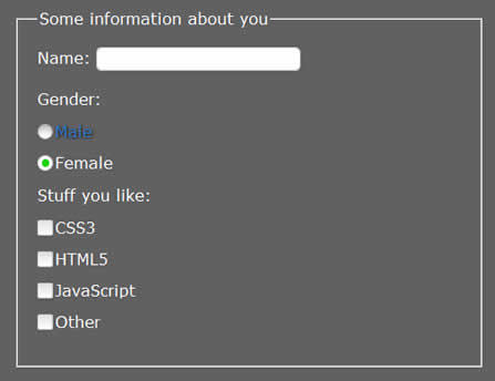
As you can see from the demo each radio and checkbox is replaced with a custom one. The difference here from my initial attempt, and to get around the fact you can’t apply generated content to form elements consistently, is to apply the generated content to the label rather than the input itself, and using some clever selectors I can determine the state of the radio/checkbox is in and adjust the custom replaced one accordingly. I also set the original input opacity to 0 so it won’t show through our custom one.
<p>
    <input type="radio" value="male" id="male" name="gender" />
    <label for="male">Male</label>
</p>
The HTML isn’t bloated and needs no extra mark-up
p:not(#foo) > input + label
{
    background: url(gr_custom-inputs.png) 0 -1px no-repeat;
    height: 16px;
    padding: 0 0 0 18px;
}
Now all the radios have been replaced by our custom versions we need to be able to tell if the radio is checked so we can adjust our custom state.
p:not(#foo) > input[type=radio]:checked + label {
    background-position: 0 -241px;
}
Again this is the same as the previous selector with one difference, we add the :checked pseudo-class available in the CSS3 selectors module to determine the radios state in CSS and change it upon the user checking the radio.
Of course the control doesn’t end there we also utilise the :hover, :focus, :active & :disabled pseudo-classes to change the radio on hover, when it has focus (for keyboard support), when the input is active (click and hold your mouse cursor to see this state change) and when it’s disabled. Mixing this with the :checked pseudo-class lets us control all possible states of the radio input and gives us great control and flexibility that doesn’t require a mouse nor JavaScript to control the states.
p:not(#foo) > input[type=radio]:hover + label,
p:not(#foo) > input[type=radio]:focus + label,
p:not(#foo) > input[type=radio] + label:hover {
    background-position: 0 -181px;
}
p:not(#foo) > input[type=radio]:hover:checked + label,
p:not(#foo) > input[type=radio]:focus:checked + label,
p:not(#foo) > input[type=radio]:checked + label:hover  {
    background-position: 0 -261px;
 }
p:not(#foo) > input[type=radio]:disabled + label,
p:not(#foo) > input[type=radio]:hover:disabled + label,
p:not(#foo) > input[type=radio]:focus:disabled + label,
p:not(#foo) > input[type=radio]:disabled + label:hover,
p:not(#foo) > input[type=radio]:disabled + label:hover:active {
    background-position: 0 -221px;
}
p:not(#foo) > input[type=radio]:disabled:checked + label,
p:not(#foo) > input[type=radio]:hover:disabled:checked + label,
p:not(#foo) > input[type=radio]:focus:disabled:checked + label,
p:not(#foo) > input[type=radio]:disabled:checked + label:hover,
p:not(#foo) > input[type=radio]:disabled:checked + label:hover:active {
     background-position: 0 -301px;
}
p:not(#foo) > input[type=radio]:active + label,
p:not(#foo) > input[type=radio] + label:hover:active {
    background-position: 0 -201px;
}
p:not(#foo) > input[type=radio]:active:checked + label,
p:not(#foo) > input[type=radio]:checked + label:hover:active {
     background-position: 0 -281px;
}
Another addition I have made to the CSS is also changing the input states when the user hovers, clicks or focuses on the label it will now change the input to reflect those actions.
IE8 is almost there
IE8 can do everything, except it doesn’t support the :checked pseudo-class and therefore makes this technique useless. So I use the not() pseudo-class, which IE8 doesn’t support, to work around this unfortunate lack of ability. Let’s hope IE9 adds the CSS3 selector module1. This of course degrades nicely in non-supporting browsers and fallback to the browser default form elements.
1 IE9 does support the CSS3 selector module so this technique has across the board support for all major browsers.
Accessible and friendly
CSS generated content is no longer used it’s now a background image on the label rather than doing it on the generated content see update (I would appreciate any accessibility experts or screen reader users to please comment to correct or agree with me). Users, who have trouble operating a mouse or, like me, prefer navigating forms with the keyboard as it’s faster, aren’t left out. Tabbing through the inputs changes the states, pressing spacebar to check a radio or checkbox also changes the state. I also change the label colour and give it a text-shadow to give a nicer indication that the current input has focus.
The disabled and checked attributes work as intended with this solution and don’t require any trickery to achieve that.
<p>
    <input type="radio" disabled value="male" id="male" name="gender" />
    <label for="male">Male</label>
</p>
<p>
    <input type="radio" checked value="Female" id="female" name="gender" />
    <label for="female">Female</label>
</p>
As you can see from the above mark-up adding the disabled or checked attributes (disabled=”disabled” & checked=”checked” also work) will allow us to target those states using the :checked and :disabled pseudo-classes. As well as change the style if we use JavaScript to disable any inputs based on users actions.
Browser support and notes
As of writing the following browsers have been tested and known to work with the demo:
- Firefox 1.5+
- Opera 9.6+
- Safari 3.2+*
- iPhone/iPod Safari**
- Chrome 4+
- IE9+
Will run this demo through browsershots and update it accordingly if the browser support works in any lower versions mentioned
* This would work in Safari 3.2 except due to a bug. The checked pseudo-class will work just fine if it has the checked attribute on the input but won’t change the input state if the user checks the input with their mouse or keyboard (the actual input will check but the CSS state won’t update the custom input image).
* This now works in Safari 3.2 but, and a big but, the behaviour is quite bizarre. Clicking a radio or checkbox will change the custom state but clicking it again to uncheck won’t show until you have hovered away from or taken focus away from the input. If you have Safari 3.2 installed try the new demo to get a better understanding of what’s happening.
Since the input is actually sitting on top of the background image we no longer need to apply pointer events to the label.
p:not(#foo) > input + label
{
    pointer-events: none;
}
You might also like
Tags
accordion accordion menu animation navigation animation navigation menu carousel checkbox inputs css3 css3 menu css3 navigation date picker dialog drag drop drop down menu drop down navigation menu elastic navigation form form validation gallery glide navigation horizontal navigation menu hover effect image gallery image hover image lightbox image scroller image slideshow multi-level navigation menus rating select dependent select list slide image slider menu stylish form table tabs text effect text scroller tooltips tree menu vertical navigation menu