 Subscribe
 Follow Us
Smooth Vertical or Horizontal Page Scrolling with jQuery
 13 years ago
 14260
14260 1950
1950
we will create a simple smooth scrolling effect with jQuery. We will create a horizontal and a vertical website layout to show the effect.
The Markup
The markup for our example page is going to be very plain. We will have three sections with a heading and a paragraph and am unordered list for the navigation:
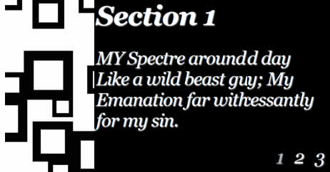
<div class="section black" id="section1">
 <h2>Section 1</h2>
 <p>
  MY Spectre around me night and day
  Like a wild beast guards my way;
  My Emanation far within
  Weeps incessantly for my sin.
 </p>
 <ul class="nav">
  <li>1</li>
  <li><a href="#section2">2</a></li>
  <li><a href="#section3">3</a></li>
 </ul>
</div>
<div class="section white" id="section2">
 <h2>Section 2</h2>
 <p>
  A fathomless and boundless deep,
  There we wander, there we weep;
  On the hungry craving wind
  My Spectre follows thee behind.

 </p>
 <ul class="nav">
  <li><a href="#section1">1</a></li>
  <li>2</li>
  <li><a href="#section3">3</a></li>
 </ul>
</div>
<div class="section black" id="section3">
 <h2>Section 3</h2>
 <p>
  He scents thy footsteps in the snow
  Wheresoever thou dost go,
  Thro' the wintry hail and rain.
  When wilt thou return again?

 </p>
 <ul class="nav">
  <li><a href="#section1">1</a></li>
  <li><a href="#section2">2</a></li>
  <li>3</li>
 </ul>
</div>
The HTML is going to be the same for both examples.
Let’s take a look at the style.
The CSS
Since we have two examples, we will start with the horizontal page style.
The main idea is to make the sections very wide and 100% in height. We will add a background image to the bottom right of each section:
*{
    margin:0;
    padding:0;
}
body{
    background:#000;
    font-family:Georgia;
    font-size: 34px;
    font-style: italic;
    letter-spacing:-1px;
    width:12000px;
    position:absolute;
    top:0px;
    left:0px;
    bottom:0px;
}
.section{
    margin:0px;
    bottom:0px;
    width:4000px;
    float:left;
    height:100%;
    text-shadow:1px 1px 2px #f0f0f0;
}
.section h2{
    margin:50px 0px 30px 50px;
}
.section p{
    margin:20px 0px 0px 50px;
    width:600px;
}
.black{
    color:#fff;
    background:#000 url(../images/black.jpg) no-repeat top right;
}
.white{
    color:#000;
    background:#fff url(../images/white.jpg) no-repeat top right;
}
.section ul{
    list-style:none;
    margin:20px 0px 0px 550px;
}
.black ul li{
    float:left;
    padding:5px;
    margin:5px;
    color:#aaa;
}
.black ul li a{
    display:block;
    color:#f0f0f0;
}
.black ul li a:hover{
    text-decoration:none;
    color:#fff;
}
.white ul li{
    float:left;
    padding:5px;
    margin:5px;
    color:#aaa;
}
.white ul li a{
    display:block;
    color:#222;
}
.white ul li a:hover{
    text-decoration:none;
    color:#000;
}
We need to give the body a valid height, because we want to be able to define the height 100% to the section. With positioning the body absolutely and saying top:0px and bottom:0px we stretch the body and give it a height.
The style for the vertical page layout is going to look as follows:
*{
    margin:0;
    padding:0;
}
body{
    background:#000;
    font-family:Georgia;
    font-size: 34px;
    font-style: italic;
    letter-spacing:-1px;
}
.section{
    margin:0px;
    height:4000px;
    width:100%;
    float:left;
    text-shadow:1px 1px 2px #f0f0f0;
}
.section h2{
    margin:50px 0px 30px 50px;
}
.section p{
    margin:20px 0px 0px 50px;
    width:600px;
}
.black{
    color:#fff;
    background:#000 url(../images/black_vert.jpg) repeat-x bottom left;
}
.white{
    color:#000;
    background:#fff url(../images/white_vert.jpg) repeat-x bottom left;
}
.section ul{
    list-style:none;
    margin:20px 0px 0px 550px;
}
.black ul li{
    float:left;
    padding:5px;
    margin:5px;
    color:#aaa;
}
.black ul li a{
    display:block;
    color:#f0f0f0;
}
.black ul li a:hover{
    text-decoration:none;
    color:#fff;
}
.white ul li{
    float:left;
    padding:5px;
    margin:5px;
    color:#aaa;
}
.white ul li a{
    display:block;
    color:#222;
}
.white ul li a:hover{
    text-decoration:none;
    color:#000;
}
Nothing special here, just that we give a big height to the sections. The background image is positioned to the bottom left then.
Let’s add the JavaScript
The JavaScript
The function for the horizontal scrolling effect is the following:
$(function() {
 $('ul.nav a').bind('click',function(event){
  var $anchor = $(this);
  /*
  if you want to use one of the easing effects:
  $('html, body').stop().animate({
   scrollLeft: $($anchor.attr('href')).offset().left
  }, 1500,'easeInOutExpo');
   */
  $('html, body').stop().animate({
   scrollLeft: $($anchor.attr('href')).offset().left
  }, 1000);
  event.preventDefault();
 });
});
And the function for the vertical scrolling effect is the following:
$(function() {
 $('ul.nav a').bind('click',function(event){
  var $anchor = $(this);

  $('html, body').stop().animate({
   scrollTop: $($anchor.attr('href')).offset().top
  }, 1500,'easeInOutExpo');
  /*
  if you don't want to use the easing effects:
  $('html, body').stop().animate({
   scrollTop: $($anchor.attr('href')).offset().top
  }, 1000);
  */
  event.preventDefault();
 });
});
You can animate to the respective element by using one of the easing effects. You can see the effect in the vertical demo.
You might also like

Tags
accordion accordion menu animation navigation animation navigation menu carousel checkbox inputs css3 css3 menu css3 navigation date picker dialog drag drop drop down menu drop down navigation menu elastic navigation form form validation gallery glide navigation horizontal navigation menu hover effect image gallery image hover image lightbox image scroller image slideshow multi-level navigation menus rating select dependent select list slide image slider menu stylish form table tabs text effect text scroller tooltips tree menu vertical navigation menu