 Subscribe
 Follow Us
Image-free Tooltip Pointers jQuery - A Use for Polygonal CSS
 13 years ago
 9007
9007 2406
2406
The Design Approach
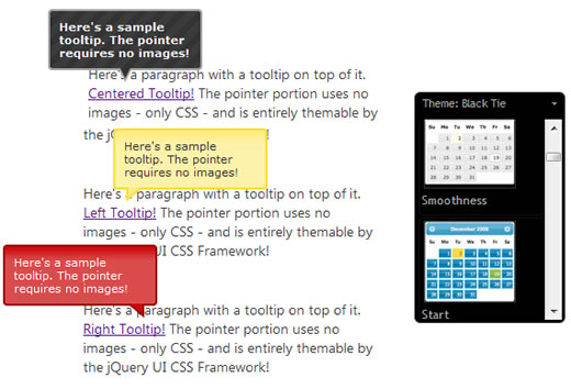
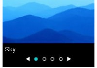
The jQuery UI planning wiki page has several examples for the tooltips we intend to build into the library. For this article though, we're just focusing the following simple tooltip design: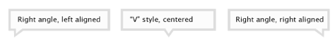
The challenge in executing this for jQuery UI is that we'll need to pull it off without relying on images for the triangle shapes, because the jQuery UI CSS Framework enables markup to be entirely re-themable, using an infinite combination of backgrounds, borders, corner radius, and more. Using custom images for the pointer triangles would never match the flexibility and scalability of CSS alone. Since polygonal CSS can create non-rectangular shapes without images, perhaps it can provide the means to achieve our goal.
Polygonal CSS works by setting an element's width to something small and then setting thick borders on less than 4 sides. To make a triangle shape, 2 of those borders have to have transparent color, essentially masking out the one visible border at an angle in attempt to connect corners.
The concept is easiest explained through a code sample. The following CSS will style a div into a red triangle:
div {
 width:0;
 height:0;
 border-left: 20px solid transparent;
 border-right: 20px solid transparent;
 border-top: 30px solid red;
 border-bottom: 0;
}
Making Use of the CSS
Our tooltip will need two of these HTML triangles stacked on top of each other to acheive a container/border effect that matches the body of the tooltip. We've done this by using two div embedded div elements. The HTML for the entire tooltip looks like this:
<div class="fg-tooltip ui-widget ui-widget-content ui-corner-all">
 Tooltip content goes here...
 <div class="fg-tooltip-pointer-down ui-widget-content">
  <div class="fg-tooltip-pointer-down-inner"></div>
 </div>
</div>
As you can see, we're using some classes from the jQuery UI CSS Framework for the visual skin, but the important portions here are the "fg-" classes: fg-tooltip-pointer-down and fg-tooltip-pointer-down-inner. These two classes are used on the speech bubble triangle portion of the tooltip and its child div element. The following CSS will turn this markup into our tooltip design.
/*Tooltip and Pointer CSS*/
.fg-tooltip {
 padding: .8em;
 width: 12em;
 border-width: 2px !important;
 position: absolute;
}
.fg-tooltip .fg-tooltip-pointer-down, .fg-tooltip .fg-tooltip-pointer-down-inner {
 position: absolute;
 width:0;
 height:0;
 border-bottom-width: 0;
 background: none;
}
.fg-tooltip .fg-tooltip-pointer-down {
 border-left: 7px solid transparent;
 border-right: 7px solid transparent;
 border-top-width: 14px;
 bottom: -14px;
 right: auto;
 left: 50%;
 margin-left: -7px;
}
.fg-tooltip .fg-tooltip-pointer-down-inner {
 border-left: 5px solid transparent;
 border-right: 5px solid transparent;
 border-top: 10px solid #fff;
 bottom: auto;
 top: -14px;
 left: -5px;
}
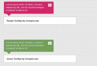
A Demonstration
To demonstrate the full effect, we've built a demo page which simply shows and hides the tooltip element when you hover on the links below. We've also extended the CSS a little further to allow for 3 different triangle types, depending on which alignment you specify, to match our original design specs.
Abandoning images in favor of this approach allows a lot more opportunities to customize the appearance with stylesheets, and we've used the jQuery UI CSS Framework to demonstrate this flexibility. Each tooltip below is styled using a different container class from the CSS Framework (such as ui-widget-header and ui-state-error), demonstrating the unobtrusive nature of this approach.
You might also like
Tags
accordion accordion menu animation navigation animation navigation menu carousel checkbox inputs css3 css3 menu css3 navigation date picker dialog drag drop drop down menu drop down navigation menu elastic navigation form form validation gallery glide navigation horizontal navigation menu hover effect image gallery image hover image lightbox image scroller image slideshow multi-level navigation menus rating select dependent select list slide image slider menu stylish form table tabs text effect text scroller tooltips tree menu vertical navigation menu