 Subscribe
 Follow Us
Sexy Image Hover Effects using CSS3
 13 years ago
 23906
23906 6077
6077
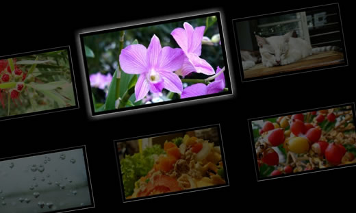
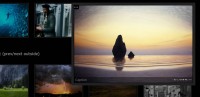
In this example I am going to show to How to create a sexy css effect on image hover.This kinda effect you have seen before in Flash or in javascript as well.But why use Flash or js when CSS can do the same work.So lets do it …
Now let go through the code.
HTML
<div class='img' id='img-1'>
 <div class='mask'></div>
 <img src='images/01.jpg' />
</div>
<div class='img' id='img-2'>
 <div class='mask'></div>
 <img src='images/07.jpg' />
</div>
<div class='img' id='img-3'>
 <div class='mask' id='mask-1'></div>
 <div class='mask' id='mask-2'></div>
 <img src='images/05.jpg' />
</div>
<div class='img' id='img-4'>
 <div class='mask'></div>
 <img src='images/04.jpg' />
</div>
<div class='img' id='img-5'>
 <div class='mask'></div>
 <mg src='images/06.jpg' />
</div>
<div class='img' id='img-6'>
 <div class='mask'></div>
 <img src='images/08.jpg' />
</div>
CSS
.img{
 float:left;
 -webkit-transition-duration: 0.5s;
 }
.img img{
 padding:10px;
 border:1px solid #fff;
}
.img:hover{
 -webkit-transform:scale(0.8);
 -webkit-box-shadow:0px 0px 30px #ccc;
}
.img .mask{
 width: 100%;
 background-color: rgb(0, 0, 0);
 position: absolute;
 height: 100%;
 opacity:0.6;
 cursor:pointer;
 -webkit-transition-duration: 0.5s;
}
#img-1:hover .mask{
 height:0%;
}
#img-2:hover .mask{
 height:0%;
 margin-top:130px;
}
#img-3 #mask-1 {
 width:50%;
}
#img-3 #mask-2{
 width:50%;
 margin-left:211px;
}
#img-3:hover #mask-1{
 width:0%;
}
#img-3:hover #mask-2{
 margin-left:430px;
 width:0%;
}
#img-4:hover .mask{
 margin-left:219px;
 margin-top:135px;
 height:0%;
 width:0%;
}
#img-5:hover .mask{
 margin-left:219px;
 margin-top:135px;
 height:0%;
 width:0%;
 -webkit-transform: rotateX(360deg);
}
#img-6:hover .mask{
 margin-left:219px;
 margin-top:135px;
 height:0%;
 width:0%;
 -webkit-transform: rotateZ(750deg);
}
You might also like


Tags
accordion accordion menu animation navigation animation navigation menu carousel checkbox inputs css3 css3 menu css3 navigation date picker dialog drag drop drop down menu drop down navigation menu elastic navigation form form validation gallery glide navigation horizontal navigation menu hover effect image gallery image hover image lightbox image scroller image slideshow multi-level navigation menus rating select dependent select list slide image slider menu stylish form table tabs text effect text scroller tooltips tree menu vertical navigation menu