 Subscribe
 Follow Us
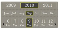
Date / Time Picker
 13 years ago
 33826
33826 7552
7552
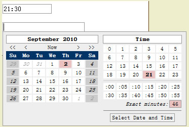
A date picker control. To open the calendar, click the icon at the right side of the input box. While open, you can use keyboard controls to navigate the datepicker:
- Right arrow: next day
- Left arrow: previous day
- Down arrow: next week
- Up arrow: previous week
- Page down: next month
- Page up: previous month
- Enter: select date
- Esc: cancel selection and close datepicker
Note that this control is not designed to work in IE6; although it will function correctly in most cases, the positioning of the calendar may be way off depending on how your page is styled.
Constructor:
var picker = new Control.DatePicker(element, options);
Parameters:
- element - The CSS id of the <input> element
- options - an object with name/value pairs of additional options
Additional Options:
- icon - the icon to display in the right side of the input box
- datePicker - a boolean value determining whether to display the date picker. Defaults to true.
- timePicker - a boolean value determining whether to display the time picker. Defaults to false.
- timePickerAdjacent - a boolean value determining whether to display the time picker next to the date picker (true) or under it (false, default).
- use24hrs - a boolean value determining whether to display the time in AM/PM or 24 hour notation. Defaults to false.
- locale - a locale string that determines which language and date format to use. Defaults to "en_US".
- onSelect - A function to call when the user selects a date. The date object is passed as a parameter.
- onHover - A function to call when the active date changes (when using keyboard navigation). The date object is passed as a parameter.
- Other options currently undocumented
Locales:
DatePicker currently includes support for es_*, de_*, and en_*, but additional locales are easy to add by the user. To add a new locale, after including datepicker.js, see the following example:
Control.DatePicker.Locale['es_ES'] = { dateTimeFormat: 'dd-MM-yyyy HH:mm', dateFormat: 'dd-MM-yyyy', firstWeekDay: 1, weekend: [0,6], language: 'es'};
To add a new language, after including datepicker.js, see the following example:
Control.DatePicker.Language['es'] = { months: ['Enero', 'Febrero', 'Marzo', 'Abril', 'Mayo', 'Junio', 'Julio', 'Augosto', 'Septiembre', 'Octubre', 'Novimbre', 'Diciembre'], days: ['Do', 'Lu', 'Ma', 'Mi', 'Ju', 'Vi', 'Sa'], strings: { 'Now': 'Ahora', 'Today': 'Hoy', 'Time': 'Hora', 'Exact minutes': 'Minuto exacto', 'Select Date and Time': 'Selecciona Dia y Hora', 'Open calendar': 'Abre calendario' } };
After including the previous code, you could then use the locale "es_ES".
To add new locales that use a combination of a default locale date format ("eu", "us", or "iso8601") and an existing language, you can use the following shortcut:
with (Control.DatePicker) Locale['en_GB'] = i18n.createLocale('eu', 'en');
This would create a new locale that uses Euro-style date formats, with an English interface.
Examples
Create a default datepicker:
new Control.DatePicker('my_datepicker', {icon: '/images/calendar.png'});
Create a date/time picker:
new Control.DatePicker('my_datepicker', {icon: '/images/calendar.png', timePicker: true, timePickerAdjacent: true});
Example of how to create a datepicker for every text input with a CSS class of "datepicker":
<script language="javascript">
  function createPickers() {
   $(document.body).select('input.datepicker').each(
   function(e) {
    new Control.DatePicker(e, { 'icon': '/images/calendar.png' });
 }
 );
 }
  Event.observe(window, 'load', createPickers);
</script>
You might also like
Tags
accordion accordion menu animation navigation animation navigation menu carousel checkbox inputs css3 css3 menu css3 navigation date picker dialog drag drop drop down menu drop down navigation menu elastic navigation form form validation gallery glide navigation horizontal navigation menu hover effect image gallery image hover image lightbox image scroller image slideshow multi-level navigation menus rating select dependent select list slide image slider menu stylish form table tabs text effect text scroller tooltips tree menu vertical navigation menu