 Subscribe
 Follow Us
A Tabbed Content Rotator Using jQuery
 13 years ago
 29951
29951 5753
5753
we are going to create a tabbed content rotator (not sure what to call it really) using everyone’s favorite Javascript framework, jQuery and an interface library called jQuery UI. This effect can be used effectively on your homepage to present customers with your products and services.
Build A Solid Structure – XHTML
We have our usual wrapper that wraps the rotator div which contains the tabs structured as a list and the content fragments that we’re going to rotate. We also reference jQuery and jQuery UI in the head section. The key point here are the class names ui-tabs-selected and ui-tabs-hide for the list and content fragments. Those class names are part responsible for rotating our content.
Updated: We just called ui.core.js and ui.tabs.js instead of using a customized code. Please check out the updates. Hope most of you will be able to use this one. Thanks.
<!DOCTYPE html PUBLIC "-//W3C//DTD XHTML 1.0 Strict//EN"
"http://www.w3.org/TR/xhtml1/DTD/xhtml1-strict.dtd">
<html xmlns="http://www.w3.org/1999/xhtml" xml:lang="en" lang="en">
<head>
<title>Tabbed Content Rotator Using JQuery</title>
<meta http-equiv="content-type" content="text/html;charset=utf-8" />
<meta http-equiv="Content-Style-Type" content="text/css" />
<script src="http://ajax.googleapis.com/ajax/libs/jquery/1.3.2/jquery.min.js" type="text/javascript"></script>
<script src="ui.core.js" type="text/javascript"></script>
<script src="ui.tabs.js" type="text/javascript"></script>
<body>
<div id="wrapper">
<div id="rotator">
<!-- Tabs -->
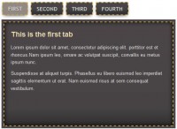
<ul class="ui-tabs-nav">
<li class="ui-tabs-nav-item ui-tabs-selected" id="nav-fragment-1"><a href="#fragment-1"><span>Maximize Profits</span></a></li>
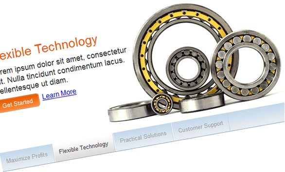
<li class="ui-tabs-nav-item" id="nav-fragment-2"><a href="#fragment-2"><span>Flexible Technology</span></a></li>
<li class="ui-tabs-nav-item" id="nav-fragment-3"><a href="#fragment-3"><span>Practical Solutions</span></a></li>
<li class="ui-tabs-nav-item" id="nav-fragment-4"><a href="#fragment-4"><span>Customer Support</span></a></li>
</ul>
<!-- First Content -->
<div id="fragment-1" class="ui-tabs-panel" style="">
<h2>Maximize Profits</h2>
<p>Lorem ipsum dolor sit amet, consectetur adipiscing elit. Nulla tincidunt condimentum lacus. Pellentesque ut diam.</p>
<p><a class="btn_get_started" href="#">Get Started</a> <a class="btn_learn_more" href="#">Learn More</a></p>
</div>
<!-- Second Content -->
<div id="fragment-2" class="ui-tabs-panel ui-tabs-hide" style="">
<h2>Flexible Technology</h2>
<p>Lorem ipsum dolor sit amet, consectetur adipiscing elit. Nulla tincidunt condimentum lacus. Pellentesque ut diam.</p>
<p><a class="btn_get_started" href="#">Get Started</a> <a class="btn_learn_more" href="#">Learn More</a></p>
</div>
<!-- Third Content -->
<div id="fragment-3" class="ui-tabs-panel ui-tabs-hide" style="">
<h2>Practical Solutions</h2>
<p>Lorem ipsum dolor sit amet, consectetur adipiscing elit. Nulla tincidunt condimentum lacus. Pellentesque ut diam.</p>
<p><a class="btn_get_started" href="#">Get Started</a> <a class="btn_learn_more" href="#">Learn More</a></p>
</div>
<!-- Fourth Content -->
<div id="fragment-4" class="ui-tabs-panel ui-tabs-hide" style="">
<h2>Customer Support</h2>
<p>Lorem ipsum dolor sit amet, consectetur adipiscing elit. Nulla tincidunt condimentum lacus. Pellentesque ut diam.</p>
<p><a class="btn_get_started" href="#">Get Started</a> <a class="btn_learn_more" href="#">Learn More</a></p>
</div>
</div><!-- end rotator -->
</div><!-- end wrapper -->
</body>
</html>
Wrapper and Rotator Styles
After establishing our structure, we now design our rotator with some CSS. Assign a width and a couple of borders to our wrapper then center it. We then make some room for the tabs by adding a bottom padding to our rotator div.
/* Rotator Styles */
#wrapper {
 width:960px;
 border-top:3px solid #92a5bc;
 border-bottom:1px solid #92a5bc;
 margin:0 auto;
}

#rotator {
 background:#FFF;
 color:#000;
 position:relative;
 padding-bottom:2.6em;
 margin:0;
 font-size:16px;
}
Tab Styles
Basically we position the tabs below the content fragments and we display them horizontally. You’re also going to notice that we stacked up a few selectors (the list and the elements inside it) because each of them will share the same properties and values and we always strive to write optimized CSS.
/* Tabs */
ul.ui-tabs-nav, li.ui-tabs-nav-item, li.ui-tabs-nav-item a:link, li.ui-tabs-nav-item a:visited {
 margin:0;
 padding:0;
 border:0;
 outline:0;
 line-height:1.3;
 text-decoration:none;
 font-size:100%;
 list-style:none;
 float:left;
 font-family:Arial, Helvetica, sans-serif;
}

ul.ui-tabs-nav {
 position:absolute;
 bottom:0px;
 left:0;
 z-index:1;
 width:100%;
 background:#FFF url(images/uitabsbg.gif) repeat-x bottom right;
 border-top:1px solid #FFF;
}
Non-Selected Tab Styles
Assign our tabs some font and border styles. We also tile the same background image from the ul.ui-tabs-nav
/* Non-Selected Tabs */
li.ui-tabs-nav-item a:link,
li.ui-tabs-nav-item a:visited {
 font-size:.8em;
 font-weight:normal;
 color:#999;
 background:#FFF url(images/uitabsbg.gif) repeat-x bottom left;
 border-left:1px solid #FFF;
 border-right:1px solid #c5ced9;
}
Hovered Tab Styles
We give our tabs some padding and give the hover state a background graphic.
/* Hovered Tab */
#rotator .ui-tabs-nav-item a:hover,
#rotator .ui-tabs-nav-item a:active {
 background:#FFF url(images/uiactivetabbg.gif) repeat-x bottom left;
 color:#333;
}

#rotator .ui-tabs-nav-item a span {
 float:left;
 padding:1em;
 cursor:pointer;
}
Active Tab Styles
We give all of the link states the same hover background graphic. Basically you can customize this graphic according to your design needs.
/* Active Tab */
#rotator .ui-tabs-selected a:link,
#rotator .ui-tabs-selected a:visited,
#rotator .ui-tabs-selected a:hover,
#rotator .ui-tabs-selected a:active {
 background:#fff url(images/uiactivetabbg.gif) repeat-x bottom left;
 color:#333;
}
Content Panel Styles
Now we’re going to style the content panel. This is the section that holds the content that is being rotated. The key point here is the padding which we’re going to use to enclose the text content and make some room for the background graphic associated with each rotated content. Then we use a class to hide the other panels.
/* Content Panels */
#rotator .ui-tabs-panel {
 font-family:Arial, Helvetica, sans-serif;
 clear:left;
 color:#000;
 padding:40px 540px 15px 15px;
 height:225px;
}

#rotator .ui-tabs-hide {
 display:none;
}
Content Styles
We’re just going to style our header, paragraph and links inside the content panel.
#rotator h2 {
 color:#E75D00;
 font-weight:normal;
 margin:0;
 font-size:1.8em;
 line-height:1.2em;
}

#rotator p {
 font-size:1.1em;
 margin:.5em 0;
 color:#333;
}

#rotator .btn_get_started {
 float:left;
 height:30px;
 width:99px;
 text-indent:-9999em;
 margin-right:7px;
 overflow:hidden;
 background:transparent url(images/getstarted.gif) no-repeat
}

#rotator .btn_learn_more {
 float:left;
 height:26px;
 font-size:.9em;
}
Background Images
Now we’re going to apply the background images. The first 2 panels have the images to the right part of the panel so we need to position the graphic to the right. Then we’re going to position the images to the left for the other 2 panels. Also take note that we need to set a new padding to make some room for the images that are positioned to the left. And that’s it for the CSS.
/* Background Images */
#rotator #fragment-1 {
 background:transparent url(images/coins.jpg) no-repeat top right;
}

#rotator #fragment-2 {
 background:transparent url(images/bearings.jpg) no-repeat top right;
}

#rotator #fragment-3 {
 background:transparent url(images/map.jpg) no-repeat top left;
 padding:40px 15px 15px 540px;
}

#rotator #fragment-4 {
 background:transparent url(images/support.jpg) no-repeat top left;
 padding:40px 15px 15px 540px;
}
Making the Contents Rotate
Now it’s time for some jQuery magic! If you’ll notice at the beginning when we first built our structure, we referenced two Javascript files in the head section. First reference is for jQuery and the second is for jQuery UI.
To make our content rotate we just need to invoke the function to rotate our tabs that is included in jQuery UI library. You just need to point the tabs function to the section where it holds the links, in this case we enter #rotator > ul inside our function.
<script type="text/javascript">
 $(document).ready(function(){
  $("#rotator").tabs({fx:{opacity: "toggle"}}).tabs("rotate", 4000);
 });
</script>
Voila! We are Done!
Content rotators are one of the neat ways you can showcase your products and services without taking up too much screen real estate. After you’re finished, you can experiment and try placing the tabs above or lining them up vertically. Try looking up some websites that use this kind of interface for inspiration. Simple variations to the interface can be a great way to learn more about CSS.
You might also like

Tags
accordion accordion menu animation navigation animation navigation menu carousel checkbox inputs css3 css3 menu css3 navigation date picker dialog drag drop drop down menu drop down navigation menu elastic navigation form form validation gallery glide navigation horizontal navigation menu hover effect image gallery image hover image lightbox image scroller image slideshow multi-level navigation menus rating select dependent select list slide image slider menu stylish form table tabs text effect text scroller tooltips tree menu vertical navigation menu