 Subscribe
 Follow Us
RocketBar – A jQuery And CSS3 Persistent Navigation Menu
 13 years ago
 9572
9572 1774
1774
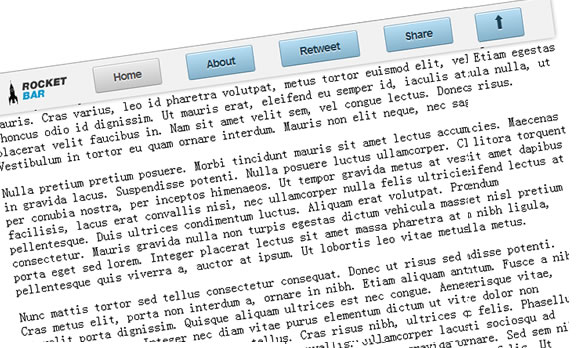
Everyday on the web there’s something that we all do, almost regardless of the site that we’re on – we scroll down. If we’re reading a blog post, looking through a product description or even just scouring through eBay listings..in every case we need to scroll back up to the top of the page if we want to use the site navigation again or perform a site search. RocketBar is a simple solution for this which shows you how you can easily provide your users a persistent form of site navigation without them needing to scroll back up
How Do I Create A RocketBar?
The bar consists of two main components – the first is the jQuery code that powers it, adding the floating class and attributes to the bar that make it appear ‘detached’ when the user scrolls up and down the page. The second element (which is completely optional) are the CSS3 buttons you find along the bar. We’re first going to take a look at the jQuery for the bar and then talk about the CSS3.
To begin, let’s define the HTML for our persistent navigation. This is simply a div container with a standard list which hosts a number of button elements used for our menu items. There are two styles available in the style.css file included with this project – the ‘default’ class (blue theme) is used for elements which have pages of their own (eg. Links, Blog, Store) and the standard CSS applied to buttons (brown theme) is used for the menu item of the page you are currently on.
HTML
<div id="floatingbar">
<ul>
<li><img alt="" src="images/rocketbar.png" border="0"></li>
<li><a href="http://www.addyosmani.com"><button>Home</button></a></li>
<li><a href=""><button class="default">About</button></a></li>
<li><a href=""><button class="default">Services</button></a></li>
<li><a href=""><button class="default">Pricing</button></a></li>
<li><a href=""><button class="default">Blog</button></a></li>
<li><a href=""><button class="default">Contact</button></a></li>
<li><a href="[removed]#"><button title="Scroll" id="dirbutton" class="default">          <img alt="" src="images/bottomarrow.png" border="0">      </button></a></li>
</ul>
</div>
JavaScript – Making use of $(window).scroll()
Using the useful $(window).scroll() function it’s possible to perform actions on the page when a user scrolls up or down it. To utilize this, RocketBar defines two points of interest in the current window – the first is the top of the page relative to the position of the bar (see $top1) and the second is the middle of the current window ($mid1). When a user scrolls past $top1, we add the class floater to it which causes it to appear detached. This makes use of classic CSS fixed positioning to maintain the bar in position.
If however the bar is not past the top of the page (ie. when a user is either at the top of the page or scrolls back up) the class is removed and the menu goes back to its default state. Similarly, if you pass the middle of the page ($mid1) the scroll-down button turns into a scroll-up button and the graphics change. This is all fairly simple.
var $top1= $('#floatingbar').offset().top + 20; //add additional necessary offset for Webkit
var $mid1 =  Math.floor($(window).height() / 2);

$(window).scroll(function()
{

  if ($(window).scrollTop()>$top1)
  {
   $('#floatingbar').addClass('floater');
  }
  else
  {
   $('#floatingbar').removeClass('floater');

   }

   if($(window).scrollTop() > $mid1)
    {
       $('#dirbutton').
                                   find('img').
                                   attr('src','images/toparrow.png');
    $('#dirbutton').data('mode','scrolldown');
       $('#dirbutton').show();
    }else
    {
    $('#dirbutton').
                                        find('img').
                                        attr('src','images/bottomarrow.png');
    $('#dirbutton').data('mode','scrollup');

    }
});
JavaScript Animated Scroll Up/Down code
As you can see above, one of the features of the RocketBar is a button that allows you to scroll to the top or bottom of the page with a single click, regardless of where you are. As this requires the use of an image that changes midway we make use of a simple jQuery image pre-load function to load up the images before a user starts using the main code routines. Here’s the code for both of these functions:
$.preloadImages = function()
{
       for(var i = 0; i").attr("src", arguments[i]);
       }
}

$.preloadImages("images/toparrow.png","images/bottomarrow.png");

$('#dirbutton').click(function()
{
   $mode = $(this).data('mode');

   switch($mode)
   {
     case 'scrolldown':
      $('html, body').animate({scrollTop:0}, 'slow');
   return false;
   break;
  case 'scrollup':
     $scrollpos = $('body').outerHeight();
     $('html, body').animate({scrollTop:$scrollpos}, 'slow');
  return false;
  break;
   }

});
CSS3 Buttons (For full code see style.css in the release)
The CSS3 buttons used in RocketBar are based on a variation of the Aristo theme, inspired by previous work from Ryan Miglavs. I wanted to use these buttons as an example of just how far aesthetically clean and crisp form elements can be these days using CSS3 without needing to use any graphics at all. For anyone wanting to design their own Aristo/MetaLabs style buttons from scratch, here’s a break-down of the various CSS features required for them. You start off with a solid-color button with rounded edges and a simple border (remember to use border-radius cases for both Webkit and FireFox).
Next work on the typography to your button – I often personally opt for use of letter-spacing and bold common fonts such as Arial and Georgia as these are pretty much present on any platform these days (Helvetica is preferred if you’re just using flat graphics). After this we focus on the letter-press effect – this is made possible using an intelligently positioned text-shadow element placed behind the primary button text.
Once this is done work on the background gradients for your button (-webkit-gradient and -moz-linear-gradient will allow you to blend from one specified color to another). Finally, there’s the inner-shadow feature at the top of the button. This white line is what adds that extra ‘crisp’ feel to these buttons and can be achieved using the inset option of the CSS box-shadow property.
There’s a lot more that goes into the hover and pressed-state cases but if you check out the style.css file in the release pack they should all be in there.
button {
 position: relative;
 margin: 0 .5em .5em .5em;
 padding: 0.5em 1.5em;
 font-size: 14px;
 font-weight: bold;
 font-family:Arial;
 color: #4f4f4f;
 text-shadow: 0 1px 1px #fff;
 background: #ddd;
 background: -webkit-gradient(linear, left top, left bottom, from(#ededed), to(#c4c4c4));
 background: -moz-linear-gradient(top, #ededed, #c4c4c4);
 border: 1px solid #acacac;
 border-top-color: #bdbdbd;
 letter-spacing:-1px;
 border-bottom-color: #949494;
 border-radius: .214em;
 -webkit-border-radius: .214em;
 -moz-border-radius: .214em;
 transition: all .2s ease-in-out;
 -webkit-transition: all .2s ease-in-out;
 -moz-transition: all .2s ease-in-out;
 -o-transition: all .2s ease-in-out;

 box-shadow: inset 0 1px 0 #fff;
     -webkit-box-shadow: inset 0 1px 0 #fff;
     -moz-box-shadow: inset 0 1px 0 #fff;
     -o-box-shadow: inset 0 1px 0 #fff;

 cursor: pointer;
 }
 button:hover,
 button:focus {

  box-shadow: 0 0 7px rgba(0,0,0,0.4), inset 0 1px 0 #fff;
      -webkit-box-shadow: 0 0 7px rgba(0,0,0,0.4), inset 0 1px 0 #fff;
      -moz-box-shadow: 0 0 7px rgba(0,0,0,0.4), inset 0 1px 0 #fff;
      -o-box-shadow: 0 0 7px rgba(0,0,0,0.4), inset 0 1px 0 #fff;
  }
 button:active {
  background: #ccc;
  background: -webkit-gradient(linear, left top, left bottom, from(#c3c3c3), to(#ebebeb));
  background: -moz-linear-gradient(top, #c3c3c3, #ebebeb);
  border-color: #a6a6a6;
  border-top-color: #939393;
  border-bottom-color: #bcbcbc;

  box-shadow: inset 0 -1px 0 #fff;
      -webkit-box-shadow: inset 0 -1px 0 #fff;
      -moz-box-shadow: inset 0 -1px 0 #fff;
      -o-box-shadow: inset 0 -1px 0 #fff;
  }
and that’s it!
You might also like

Tags
accordion accordion menu animation navigation animation navigation menu carousel checkbox inputs css3 css3 menu css3 navigation date picker dialog drag drop drop down menu drop down navigation menu elastic navigation form form validation gallery glide navigation horizontal navigation menu hover effect image gallery image hover image lightbox image scroller image slideshow multi-level navigation menus rating select dependent select list slide image slider menu stylish form table tabs text effect text scroller tooltips tree menu vertical navigation menu