 Subscribe
 Follow Us
CSS and jQuery Custom Checkbox and Radio Button Inputs Styled
 13 years ago
 47836
47836 8742
8742
Styling checkbox and radio button inputs to match a custom design is nearly impossible because neither reliably supports basic CSS, like background colors or images; it's even a challenge to get the margins to appear consistently across browsers. To remedy this we developed a concise jQuery plugin based on progressive enhancement that leverages an input element's built-in functionality and accessibility features and works in all modern browsers without added markup or mandatory CSS classes.
Markup
We start with basic HTML for each input that follows web standards conventions:
- assigned a unique id and value to each input
- paired the input with a label element
- included a "for" attribute on each label that references the preceding input's id
Each radio button input also needs a common name attribute to group it with a set.
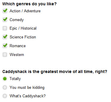
<form>
 <fieldset>
  <legend>Which genres do you like?</legend>

  <input type="checkbox" name="genre" id="check-1" value="action" />
  <label for="check-1">Action / Adventure</label>

  . . .
 </fieldset>
 <fieldset>
  <legend>Caddyshack is the greatest movie of all time, right?</legend>

  <input type="radio" name="opinions" id="radio-1" value="1" />
  <label for="radio-1">Totally</label>

  . . .
 </fieldset>
</form>
Pairing the inputs and labels correctly is essential to how this plugin works. As stated in the HTML spec, "When a LABEL element receives focus, it passes the focus on to its associated control." Browsers have standardized this behavior so that when you click a label, the click is passed on to the input — in other words, the label and input act as a single element when marked up this way. Because we don't have to interact with the input directly, we can hide it from view with CSS and apply styles to the label to make it look like a customized checkbox or radio button.
When the page loads, the plugin script finds each input/label pair and wraps it in a div. Each wrapper div is assigned a class to it based on the type of input it contains:
<div class="custom-checkbox">
 <input id="check-3" type="checkbox" value="epic" name="genre"/>
 <label class="" for="check-3">Epic / Historical</label>
</div>
Styles
First, we absolutely positioned the input and label pair so that we could layer the label over the input, like a mask. For this to work, we relatively positioned the wrapper div to contain the input and label:
/* wrapper divs */
.custom-checkbox, .custom-radio { position: relative; }

/* input, label positioning */
.custom-checkbox input,
.custom-radio input {
 position: absolute;
 left: 2px;
 top: 3px;
 margin: 0;
 z-index: 0;
}

.custom-checkbox label,
.custom-radio label {
 display: block;
 position: relative;
 z-index: 1;
 font-size: 1.3em;
 padding-right: 1em;
 line-height: 1;
 padding: .5em 0 .5em 30px;
 margin: 0 0 .3em;
 cursor: pointer;
}
Next, we styled each type of label (checkbox and radio button) with a background image — we used an image sprite for all states: default, hover, and checked:
.custom-checkbox label {
 background: url(images/checkbox.gif) no-repeat;
}

.custom-radio label {
 background: url(images/radiobutton.gif) no-repeat;
}
And added classes for hover and checked states that repositioned the background sprite accordingly. We also included a class for the "focus" state for keyboard users.
.custom-checkbox label, .custom-radio label {
 background-position: -10px -14px;
}

.custom-checkbox label.hover,
.custom-checkbox label.focus,
.custom-radio label.hover,
.custom-radio label.focus {
 background-position: -10px -114px;
}

.custom-checkbox label.checked,
.custom-radio label.checked {
 background-position: -10px -214px;
}

.custom-checkbox label.checkedHover,
.custom-checkbox label.checkedFocus {
 background-position: -10px -314px;
}

.custom-checkbox label.focus,
.custom-radio label.focus {
 outline: 1px dotted #ccc;
}
Script
Because the label-input association takes care of clicking the hidden input for us, we only had to write a really simple jQuery plugin that appends a class to each input on hover, on focus, and on click:
jQuery.fn.customInput = function(){
 $(this).each(function(i){
  if($(this).is('[type=checkbox],[type=radio]')){
   var input = $(this);

   // get the associated label using the input's id
   var label = $('label[for='+input.attr('id')+']');

   //get type, for classname suffix
   var inputType = (input.is('[type=checkbox]')) ? 'checkbox' : 'radio';

   // wrap the input + label in a div
   $('
').insertBefore(input).append(input, label);

   // find all inputs in this set using the shared name attribute
   var allInputs = $('input[name='+input.attr('name')+']');

   // necessary for browsers that don't support the :hover pseudo class on labels
   label.hover(
    function(){
     $(this).addClass('hover');
     if(inputType == 'checkbox' && input.is(':checked')){
      $(this).addClass('checkedHover');
     }
    },
    function(){ $(this).removeClass('hover checkedHover'); }
   );

   //bind custom event, trigger it, bind click,focus,blur events
   input.bind('updateState', function(){
    if (input.is(':checked')) {
     if (input.is(':radio')) {
      allInputs.each(function(){
       $('label[for='+$(this).attr('id')+']').removeClass('checked');
      });
     };
     label.addClass('checked');
    }
    else { label.removeClass('checked checkedHover checkedFocus'); }

   })
   .trigger('updateState')
   .click(function(){
    $(this).trigger('updateState');
   })
   .focus(function(){
    label.addClass('focus');
    if(inputType == 'checkbox' && input.is(':checked')){
     $(this).addClass('checkedFocus');
    }
   })
   .blur(function(){ label.removeClass('focus checkedFocus'); });
  }
 });
};
Usage
Simply call the customInput() method on any input element or group of elements (more on using jQuery):
$('input').customInput();
You might also like

Tags
accordion accordion menu animation navigation animation navigation menu carousel checkbox inputs css3 css3 menu css3 navigation date picker dialog drag drop drop down menu drop down navigation menu elastic navigation form form validation gallery glide navigation horizontal navigation menu hover effect image gallery image hover image lightbox image scroller image slideshow multi-level navigation menus rating select dependent select list slide image slider menu stylish form table tabs text effect text scroller tooltips tree menu vertical navigation menu