 Subscribe
 Follow Us
useful CSS3 folded corner
 13 years ago
 15743
15743 4175
4175
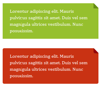
This is a simple CSS folded-corner effect without images or extra markup. It works well in all modern browsers and is best suited to designs with simple colour backgrounds.
this demo support: Firefox 3.5+, Chrome 4+, Safari 4+, Opera 10+, IE 8+
Nothing complicated. Any element will do and there’s no need for extra markup. It’s just a simple coloured box to start with. Browsers with no support for pseudo-elements, such as IE6 and IE7, will only be capable of displaying this.
Adding position:relative makes it possible to absolutely position the pseudo-element.
.note {
   position:relative;
   width:30%;
   padding:1em 1.5em;
   margin:2em auto;
   color:#fff;
   background:#97C02F;
}
The folded corner
The folded-corner is created from a pseudo-element that is positioned in the top corner of the box. The pseudo-element has no width or height but is given a thick border. Varying the size of the border will vary the size of the folded-corner.
In this example, the top and right borders are set to colours that match the background colour of the box’s parent. The left and bottom border are then given a slightly darker or lighter shade of the box’s background colour.
.note:before {
   content:"";
   position:absolute;
   top:0;
   right:0;
   border-width:0 16px 16px 0;
   border-style:solid;
   border-color:#658E15 #fff;
}
This is all that’s needed to create a simple folded-corner effect like that found on Yiibu.
Firefox 3.0 doesn’t allow for the positioning of pseudo-elements. You can throw in a couple of extra styles to help tidy things up in that browser.
.note:before {
   ...
   display:block;
   width:0;
}
Adding a subtle shadow
The appearance of a fold can be slightly enhanced by adding a box-shadow (for browsers that support it) to the pseudo-element. Setting overflow:hidden on the note itself will help hide parts of the shadow that would disrupt the folded-corner effect.
.note:before {
   ...
   -webkit-box-shadow:0 1px 1px rgba(0,0,0,0.3), -1px 1px 1px rgba(0,0,0,0.2);
   -moz-box-shadow:0 1px 1px rgba(0,0,0,0.3), -1px 1px 1px rgba(0,0,0,0.2);
   box-shadow:0 1px 1px rgba(0,0,0,0.3), -1px 1px 1px rgba(0,0,0,0.2);
}
Rounded corners
It’s also relatively simple to make this work with rounded corners if desired. Unfortunately, every modern browser has some form of border-radius bug – including those using the non-prefixed property – which means a slight work around is needed.
Webkit browsers are the only browsers that can come anywhere close to rounding the corner of the pseudo-element if it only has 2 borders. Opera 11 and Firefox 3.6 make a mess of it. Opera 11 makes the biggest mess.
Using 4 borders avoids the problems in Opera 11 and Firefox 3.6. But it will trigger a bug in Safari 5 that leaves the diagonal looking a little jaggy. We can get around this problem by setting at least one border colour to be transparent.
When a background colour is applied to the pseudo-element it will show through the transparent border. Ideally, this approach would form the basis of the entire effect because we could reduce the amount of code needed. But Opera 11 will not show the background colour through the transparent borders unless a border-radius has been set.
.note-rounded:before {
   content:"";
   position:absolute;
   top:0;
   right:0;
   border-width:8px;
   border-color:#fff #fff transparent transparent;
   background:#658E15;
   -webkit-border-bottom-left-radius:5px;
   -moz-border-radius:0 0 0 5px;
   border-radius:0 0 0 5px;
   display:block; width:0;
}
The CSS file on the demo page has more comments on the work arounds. Every browser has its own peculiarities when it comes to using border-radius or borders on elements with no width or height. This is the merely simplest solution I’ve found to deal with those browser inconsistencies.
The final code
This is all the CSS needed to create a simple folded-corner effect, with a subtle shadow, from a single HTML element. To include a variant with rounded corners, the “note” object can be extended with the modifications described previously.
.note {
   position:relative;
   width:30%;
   padding:1em 1.5em;
   margin:2em auto;
   color:#fff;
   background:#97C02F;
   overflow:hidden;
}

.note:before {
   content:"";
   position:absolute;
   top:0;
   right:0;
   border-width:0 16px 16px 0;
   border-style:solid;
   border-color:#fff #fff #658E15 #658E15;
   background:#658E15;
   -webkit-box-shadow:0 1px 1px rgba(0,0,0,0.3), -1px 1px 1px rgba(0,0,0,0.2);
   -moz-box-shadow:0 1px 1px rgba(0,0,0,0.3), -1px 1px 1px rgba(0,0,0,0.2);
   box-shadow:0 1px 1px rgba(0,0,0,0.3), -1px 1px 1px rgba(0,0,0,0.2);
   display:block; width:0; /* Firefox 3.0 damage limitation */
}

.note.rounded {
   -webkit-border-radius:5px;
   -moz-border-radius:5px;
   border-radius:5px;
}

.note.rounded:before {
   border-width:8px;
   border-color:#fff #fff transparent transparent;
   -webkit-border-bottom-left-radius:5px;
   -moz-border-radius:0 0 0 5px;
   border-radius:0 0 0 5px;
}
This technique works less well when the element receiving the folded-corner effect is sitting on top of a background image rather than a simple background colour. However, the same limitation exists for image-based methods of creating this effect.
You might also like

Tags
accordion accordion menu animation navigation animation navigation menu carousel checkbox inputs css3 css3 menu css3 navigation date picker dialog drag drop drop down menu drop down navigation menu elastic navigation form form validation gallery glide navigation horizontal navigation menu hover effect image gallery image hover image lightbox image scroller image slideshow multi-level navigation menus rating select dependent select list slide image slider menu stylish form table tabs text effect text scroller tooltips tree menu vertical navigation menu