 Subscribe
 Follow Us
jQuery Super Cool Bubble Navigation
 13 years ago
  25074
25074  6141
6141
 n/a
n/a
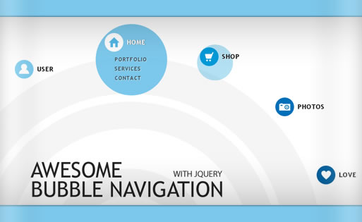
In this tutorial we are going to create a bubbly navigation with jQuery. The idea is to have some round navigation icons that release a bubble when hovering over them. We will use the jQuery Easing Plugin for a even nicer effect
The Markup
The HTML will consist of a main div that we will give the class navigation and the id nav. Inside of the main div we will have the navigation items:
<div class="navigation" id="nav">
 <div class="item user">
  <img src="images/bg_user.png" alt="" width="199" height="199" class="circle"/>
  <a href="#" class="icon"></a>
  <h2>User</h2>
  <ul>
   <li><a href="#">Profile</a></li>
   <li><a href="#">Properties</a></li>
   <li><a href="#">Privacy</a></li>
  </ul>
 </div>
 <div class="item home">
  <img src="images/bg_home.png" alt="" width="199" height="199" class="circle"/>
  <a href="#" class="icon"></a>
  <h2>Home</h2>
  <ul>
   <li><a href="#">Portfolio</a></li>
   <li><a href="#">Services</a></li>
   <li><a href="#">Contact</a></li>
  </ul>
 </div>
 ...
</div>
As an example, we just show the first two items here. As you can see, we give the inner divs two classes: item and the name of the adapted class for that navigation item, like “user” or “home”. This way, we can address all inner elements accordingly. In this case, we want to address the link element with the class “icon” according to those classes, as you will be able to see in the CSS.
Further elements inside of the item element are the image for the bubble, the icon as link element, the heading and the list of links.
The CSS
Let’s take a look at the styling. First, let’s define some general styles for the whole thing:
.navigation{
    margin: 0px auto;
    font-family: "Trebuchet MS", sans-serif;
    font-size: 24px;
    font-style: normal;
    font-weight: bold;
    letter-spacing: 1.4px;
}
Now, we will use absolute positioning for the item:
.navigation .item{
    position:absolute;
}
Since we gave the div two classes, we will now define the respective positions for each navigation item. You see, when applying two classes we add both property sets to the element.
.user{
    top:125px;
    left:110px;
}
.home{
   top:50px;
   left:360px;
}
.shop{
   top:90px;
   left:625px;
}
.camera{
   top:230px;
   left:835px;
}
.fav{
   top:420px;
   left:950px;
}
The link elements of the icons will have the following general style:
a.icon{
    width:52px;
    height:52px;
    position:absolute;
    top:0px;
    left:0px;
    cursor:pointer;
}
And we can again define each icon of the respective element:
.user a.icon{
    background:transparent url(../images/user.png) no-repeat 0px 0px;
}
.home a.icon{
    background:transparent url(../images/home.png) no-repeat 0px 0px;
}
.shop a.icon{
    background:transparent url(../images/shop.png) no-repeat 0px 0px;
}
.camera a.icon{
    background:transparent url(../images/camera.png) no-repeat 0px 0px;
}
.fav a.icon{
    background:transparent url(../images/fav.png) no-repeat 0px 0px;
}
Since we are using a sprite image for each icon, we can simply define the “hover” class as follows:
.navigation .item a.active{
    background-position:0px -52px;
}
The circle image will have the following style:
.item img.circle{
    position:absolute;
    top:0px;
    left:0px;
    width:52px;
    height:52px;
    opacity:0.1;
}
The content element, like the heading and the link list will be styled as follows:
.item h2{
    position:absolute;
    width:147px;
    height:52px;
    color:#222;
    font-size:18px;
    top:0px;
    left:52px;
    text-indent:10px;
    line-height:52px;
    text-shadow:1px 1px 1px #fff;
    text-transform:uppercase;
}
.item h2.active{
    color:#fff;
    text-shadow:1px 0px 1px #555;
}
.item ul{
    list-style:none;
    position:absolute;
    top:60px;
    left:25px;
    display:none;
}
.item ul li a{
    font-size:15px;
    text-decoration:none;
    letter-spacing:1.5px;
    text-transform:uppercase;
    color:#222;
    padding:3px;
    float:left;
    clear:both;
    width:100px;
    text-shadow:1px 1px 1px #fff;
}
.item ul li a:hover{
    background-color:#fff;
    color:#444;
    -moz-border-radius:5px;
    -webkit-border-radius:5px;
    border-radius:5px;
    -moz-box-shadow:1px 1px 4px #666;
    -webkit-box-shadow:1px 1px 4px #666;
    box-shadow:1px 1px 4px #666;
}
With the white text-shadow of the link element, we can create an engraved effect.
Ok, let’s add some JavaScript.
The JavaScript
The JavaScript is pretty straightforward. First, add this to your HTML code right before the closing body tag:
<script type="text/javascript" src="http://ajax.googleapis.com/ajax/libs/jquery/1/jquery.min.js"></script>
<script type="text/javascript" src="jquery.easing.1.3.js"></script>
The idea is to let the bubble image appear when we hover over a navigation item. We do that by animating the width, height, the top and the left. Since we want the bubble to appear slightly above the icon, we need to position it more to the left and more to the top. We “pull” it up and left by using negative positioning. We also make it fade in by changing its opacity to 1 (line 6-11). The “easeOutBack” comes from the jQuery Easing Plugin and create a nice easing effect (line 12).
When the animation finishes, we make the list element fade in (line 13).
We also get the first link element inside of the item div and the heading, and add the class “active” to them, which will change their appearance (line 16).
<script type="text/javascript">
 $(function() {
  $('#nav > div').hover(
  function () {
   var $this = $(this);
   $this.find('img').stop().animate({
    'width'     :'199px',
    'height'    :'199px',
    'top'       :'-25px',
    'left'      :'-25px',
    'opacity'   :'1.0'
   },500,'easeOutBack',function(){
    $(this).parent().find('ul').fadeIn(700);
   });

   $this.find('a:first,h2').addClass('active');
  },
  function () {
   var $this = $(this);
   $this.find('ul').fadeOut(500);
   $this.find('img').stop().animate({
    'width'     :'52px',
    'height'    :'52px',
    'top'       :'0px',
    'left'      :'0px',
    'opacity'   :'0.1'
   },5000,'easeOutBack');

   $this.find('a:first,h2').removeClass('active');
  }
 );
 });
</script>
On mouse out, i.e. when we leave the navigation item, we revert the actions and make the list and the bubble disappear again. We also remove the active class from the icon element and the heading. You might also like


Tags
accordion accordion menu animation navigation animation navigation menu carousel checkbox inputs css3 css3 menu css3 navigation date picker dialog drag drop drop down menu drop down navigation menu elastic navigation form form validation gallery glide navigation horizontal navigation menu hover effect image gallery image hover image lightbox image scroller image slideshow multi-level navigation menus rating select dependent select list slide image slider menu stylish form table tabs text effect text scroller tooltips tree menu vertical navigation menu