 Subscribe
 Follow Us
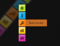
Lovely animation CSS3 and mootools button
 13 years ago
 9447
9447 1724
1724
The article source:http://www.rickyh.co.uk/fun-with-css3-and-mootools/
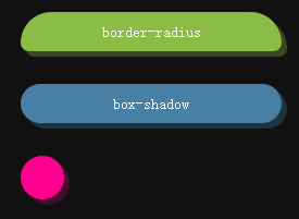
These examples came about when experimenting with the extend property in MooTools. By extending the styles class I could add CSS3 properties into the Core MooTools framework and do CSS3 animations.
The Extend Code
Bellow is the Mozilla code to extend MooTools with the Border-Radius and Box-Shadow:
var newStyles = new Hash({
     'MozBorderRadius': '@px @px @px @px',
     'MozBoxShadow': '@px @px @px rgb(@, @, @)'
});

$extend(Element.Styles, newStyles);
The WebKit code is slightly different. For some reason i couldn’t get the webkitBorderRadius to work without doing each corner individually. For more info on the differences read
var newStyles = new Hash({
     'webkitBorderBottomLeftRadius': '@px @px',
     'webkitBorderBottomRightRadius': '@px @px',
     'webkitBorderTopLeftRadius': '@px @px',
     'webkitBorderTopRightRadius': '@px @px',
     'webkitBoxShadow': 'rgb(@, @, @) @px @px @px'
});

$extend(Element.Styles, newStyles);
The CSS3 Animation
For the animations we can now simply use the same MooTools FX and we would use with CSS2. Below is an example for FireFox:
$("h31").set('morph', {
          duration: 300,
          transition: 'Sine:out'
     });

     $("h31").addEvents({
          'mouseover': function(){
        this.morph({
                    'MozBorderRadius': '8px 8px 30px 30px'
               });
    },
          'mouseout': function(){
               this.morph({
                    'MozBorderRadius': '30px 30px 8px 8px'
               });
    }
       });
And that’s it really. Very simple to set up and the animations are smooth and stylish. The example will work on any WebKit browser including Chrome and Safari and Mozilla browsers including FireFox.
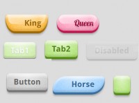
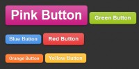
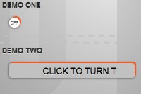
You might also like

Tags
accordion accordion menu animation navigation animation navigation menu carousel checkbox inputs css3 css3 menu css3 navigation date picker dialog drag drop drop down menu drop down navigation menu elastic navigation form form validation gallery glide navigation horizontal navigation menu hover effect image gallery image hover image lightbox image scroller image slideshow multi-level navigation menus rating select dependent select list slide image slider menu stylish form table tabs text effect text scroller tooltips tree menu vertical navigation menu