 Subscribe
 Follow Us
Pretty Simple Content Slider with jQuery and CSS3
 13 years ago
  19222
19222  4195
4195
 n/a
n/a

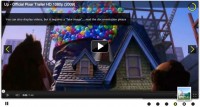
We will create an auto-playing content slider with jQuery and CSS3. The idea is to alter the background image and to slide in the heading and the description. By clicking on one of the menu items, the auto-play function is stopped and the respective content slides out.
The Markup
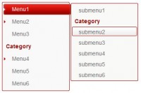
The HTML consists of a main div called rotator and an unordered list where we will define the menu element, the heading and the description element. The href will designate the regarding content that belongs to the menu item. Here is the markup with two example list elements and the empty list element that we will use to fill the content:
<div class="rotator">
 <ul id="rotmenu">
  <li>
   <a href="rot1">Portfolio</a>
   <div style="display:none;">
    <div class="info_image">1.jpg</div>
    <div class="info_heading">Our Works</div>
    <div class="info_description">
  At vero eos et accusamus et iusto odio
 dignissimos ducimus qui blanditiis praesentium
 voluptatum deleniti atque corrupti quos dolores et
 quas molestias excepturi sint occaecati cupiditate
 non provident...
     <a href="#" class="more">Read more</a>
    </div>
   </div>
  </li>
  <li>
   <a href="rot2">Services</a>
   <div style="display:none;">
    <div class="info_image">2.jpg</div>
    <div class="info_heading">We serve</div>
    <div class="info_description">
  At vero eos et accusamus et iusto odio
 dignissimos ducimus qui blanditiis praesentium
 voluptatum deleniti atque corrupti quos dolores et
 quas molestias excepturi sint occaecati cupiditate
 non provident...
     <a href="#" class="more">Read more</a>
    </div>
   </div>
  </li>
  ...
 </ul>
 <div id="rot1">
  <img src="" width="800" height="300" class="bg" alt=""/>
  <div class="heading">
   <h1></h1>
  </div>
  <div class="description">
   <p></p>
  </div>
 </div>
</div>
We use the information inside of the elements with a info_ class in order to fill our empty structure. The background image will have the source images/ and the image name.
The CSS
The main rotator div will have the following style:
.rotator{
    background-color:#222;
    width:800px;
    height:300px;
    margin:0px auto;
    position:relative;
    font-family:'Myriad Pro',Arial,Helvetica,sans-serif;
    color:#fff;
    text-transform:uppercase;
    letter-spacing:-1px;
    border:3px solid #f0f0f0;
    overflow:hidden;
    -moz-box-shadow:0px 0px 10px #222;
    -webkit-box-shadow:0px 0px 10px #222;
    box-shadow:0px 0px 10px #222;
}
Since we will give the inner elements some absolute positioning, we need to set the position of the main div to relative. The style of the image that we will insert with the help of jQuery is such an example:
img.bg{
    position:absolute;
    top:0px;
    left:0px;
}
The unordered list with all our elements needs to have a higher z-index then the rest of the elements, since we want it to be on top of everything else. If we would leave it to the default stacking, it would get hidden under the image
.rotator ul{
    list-style:none;
    position:absolute;
    right:0px;
    top:0px;
    margin-top:6px;
    z-index:999999;
}
.rotator ul li{
    display:block;
    float:left;
    clear:both;
    width:260px;
}
The link elements of the menu will have the following style:
.rotator ul li a{
    width:230px;
    height:52px;
    float:right;
    clear:both;
    padding-left:10px;
    text-decoration:none;
    display:block;
    line-height:52px;
    background-color:#222;
    margin:1px -20px 1px 0px;
    opacity:0.7;
    color:#f0f0f0;
    font-size:20px;
    border:2px solid #000;
    border-right:none;
    outline:none;
    text-shadow:-1px 1px 1px #000;
    -moz-border-radius:10px 0px 0px 20px;
    -webkit-border-top-left-radius:10px;
    -webkit-border-bottom-left-radius:20px;
    border-top-left-radius:10px;
    border-bottom-left-radius:20px;
}
.rotator ul li a:hover{
      text-shadow:0px 0px 2px #fff;
}
With the border radius property, we add an asymmetric touch to the menu items. The hover will create a glowing effect.
The content elements and the heading will have the following style:
.rotator .heading{
    position:absolute;
    top:0px;
    left:0px;
    width:500px;
}
.rotator .heading h1{
    text-shadow:-1px 1px 1px #555;
    font-weight:normal;
    font-size:46px;
    padding:20px;
}
.rotator .description{
    width:500px;
    height:80px;
    position:absolute;
    bottom:0px;
    left:0px;
    padding:20px;
    background-color:#222;
    -moz-border-radius:0px 10px 0px 0px;
    -webkit-border-top-right-radius:10px;
    border-top-right-radius:10px;
    opacity:0.7;
    border-top:2px solid #000;
    border-right:2px solid #000;
}
.rotator .description p{
    text-shadow:-1px 1px 1px #000;
    text-transform:none;
    letter-spacing:normal;
    line-height:26px;
}
a.more{
    color:orange;
    text-decoration:none;
    text-transform:uppercase;
    font-size:10px;
}
a.more:hover{
    color:#fff;
}
And now, let’s add some magic.
The JavaScript
First, we need to add the jQuery script and we will also use the jQuery Easing Plugin to create some neat easing effects:
<script type="text/javascript" src="jquery-1.4.2.min.js"></script>
<script type="text/javascript" src="jquery.easing.1.3.js"></script>
We will add this after all the content but before the body closing tag.
Then we add this:
$(function() {
 /* the index of the current list element */
 var current = 1;

 /* function to iterate through all the list elements */
 var iterate = function(){
  var i = parseInt(current+1);
  var lis = $('#rotmenu').children('li').size();
  if(i>lis) i = 1;
  display($('#rotmenu li:nth-child('+i+')'));
 }

 /* Initially display the first one */
 display($('#rotmenu li:first'));

 /* In intervals of 3 seconds jump to the next element */
 var slidetime = setInterval(iterate,3000);

 /* if the User clicks on one list item, the auto slider stops */
 $('#rotmenu li').bind('click',function(e){
  clearTimeout(slidetime);
  display($(this));
  e.preventDefault();
 });

 /* displays each element associated to the "elem" list element */
 function display(elem){
  var $this  = elem;
  var repeat  = false;
  if(current == parseInt($this.index() + 1))
   repeat = true;

  /* slide in the current one */
  if(!repeat)
   $this.parent()
     .find('li:nth-child('+current+') a')
     .stop(true,true)
     .animate({'marginRight':'-20px'},300,function(){
    $(this).animate({'opacity':'0.7'},700);
   });

  current = parseInt($this.index() + 1);

  var elem = $('a',$this);

  /* slide out the clicked or next one */
  elem.stop(true,true).animate({'marginRight':'0px','opacity':'1.0'},300);

  /* the heading and description will slide out, change the content and slide back in */
  var info_elem = elem.next();
  $('#rot1 .heading').animate({'left':'-420px'}, 500,'easeOutCirc',function(){
   $('h1',$(this)).html(info_elem.find('.info_heading').html());
   $(this).animate({'left':'0px'},400,'easeInOutQuad');
  });
  $('#rot1 .description').animate({'bottom':'-270px'},500,'easeOutCirc',function(){
   $('p',$(this)).html(info_elem.find('.info_description').html());
   $(this).animate({'bottom':'0px'},400,'easeInOutQuad');
  })

  /* the image will fade out and another will fade in */
  $('#rot1').prepend(
  $('<img alt="">',{
   style : 'opacity:0',
   className : 'bg'
  }).load(
  function(){
   $(this).animate({'opacity':'1'},600);
   $('#rot1 img:first').next().animate({'opacity':'0'},700,function(){
    $(this).remove();
   });
  }
 ).attr('src','images/'+info_elem.find('.info_image').html())
  .attr('width','800')
  .attr('height','300')
 );
 }
});
You might also like


Tags
accordion accordion menu animation navigation animation navigation menu carousel checkbox inputs css3 css3 menu css3 navigation date picker dialog drag drop drop down menu drop down navigation menu elastic navigation form form validation gallery glide navigation horizontal navigation menu hover effect image gallery image hover image lightbox image scroller image slideshow multi-level navigation menus rating select dependent select list slide image slider menu stylish form table tabs text effect text scroller tooltips tree menu vertical navigation menu