 Subscribe
 Follow Us
jQuery Advanced docking Side Menu
 13 years ago
  40313
40313  4779
4779
 n/a
n/a
How Visual Studio docking functionality can be done with jQuery and unordered lists. Basically, the main goal was to implement multiple docking and undocking functionality.Similar Side Menu Effects
The requirements
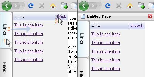
This is how docking should behave:
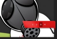
- When user hovers an item on vertical menu, its submenu should slide in from left to right (points 1 and 2 in the image below) and overlay the content
- When user move the mouse pointer outside the panel it should slide back
- If user clicks on "Dock" link (point 3 in the image below), panel should fix in the current position while content moves to the right of the panel in order to be seen
- If users "undock" the panel it should slide back
This way users can chose whether they want to perform an action and continue with work or they want to have available actions permanently visible.
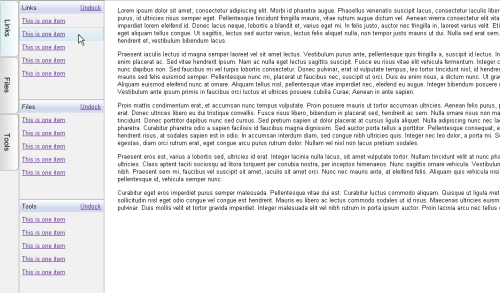
But that is not all. I wanted multiple panes to be able to dock in the same time. If one panel only is docked it should be 100% height. With each new panel docked, height should be recalculated so that all panels have the same height value (like in the image below). If there are docked panels and user wants to slide in another panel temporarily, it should overlay docked panels.
A "brief" explanation
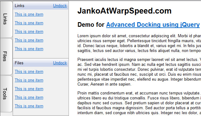
The idea was to have a navigation based on nested ULs. This is nothing new, but I wanted to create more than just CSS&UL based menus that can be used as toolboxes or action links as well. So the structure is very simple. The main UL with id="dock" will act as a vertical navigation bar that contains three links (in this example). Each link will have a nested UL that will represent a docking panel with some sample list items. Each first listitem will act as a header for docking panel, containing panel title and Dock/Undock exclusive links.
<ul id="dock">
    <li id="links">
        <ul class="free">
            <li class="header">
                <a href="#" class="dock">Dock</a>
                <a href="#" class="undock">Undock</a>Links
            </li>
            <li><a href="#">This is one item</a></li>
            <li><a href="#">This is one item</a></li>

            <li><a href="#">This is one item</a></li>
            <li><a href="#">This is one item</a></li>
            <li><a href="#">This is one item</a></li>
        </ul>
    </li>
    <li id="files">
        <ul class="free">
            <li class="header">
                <a href="#" class="dock">Dock</a>
                <a href="#" class="undock">Undock</a>Files
            </li>
            <li><a href="#">This is one item</a></li>
            <li><a href="#">This is one item</a></li>
            <li><a href="#">This is one item</a></li>
            <li><a href="#">This is one item</a></li>

            <li><a href="#">This is one item</a></li>
        </ul>
    </li>
    <!-- more submenus here -->
</ul>
<div id="content">
    <!-- content here -->
</div>
Let's see how CSS can help use to style this lists.
body{margin:0px; font-family:Arial, Sans-Serif; font-size:13px;}
/* dock */
#dock{margin:0px; padding:0px; list-style:none; position:fixed; top:0px; height:100%; z-index:100; background-color:#f0f0f0}
#dock > li {width:40px; height:120px; margin: 0 0 1px 0; background-color:#dcdcdc; background-repeat:no-repeat; background-position:left center;}
#dock #links {background-image:url(links.png);}
#dock #files {background-image:url(files.png);}
#dock #tools {background-image:url(tools.png);}
#dock > li:hover {background-position:-40px 0px;}
#content {margin: 10px 0 0 60px;}
The main #dock UL has fixed position in the top left corner of the window in order to be visible after scrolling. Each listitem in #dock unordered list presents one vertical link which hovering causes its child list (or simply - docking panel) to slide-in. I used CSS sprites to show hover states for each LI.
body{margin:0px; font-family:Arial, Sans-Serif; font-size:13px;}
/* dock */
#dock{margin:0px; padding:0px; list-style:none; position:fixed; top:0px; height:100%;
    z-index:100; background-color:#f0f0f0; left:0px;}
#dock > li {width:40px; height:120px; margin: 0 0 1px 0; background-color:#dcdcdc;
    background-repeat:no-repeat; background-position:left center;}
#dock #links {background-image:url(links.png);}
#dock #files {background-image:url(files.png);}
#dock #tools {background-image:url(tools.png);}
#dock > li:hover {background-position:-40px 0px;}
Also, we need to style docking panels. First three lines in this CSS script define styles of listitems on docking panel in normal and hover state. Fourth line sets visibility of nested UL's while hovering its parent LI's. Next line defines the docking panel itself. Each panel is positioned absolutely, and initially will be hidden (left: -180). Also each one of them will have z-index:-1 in order to be shown above docked UL's that have z-index:-2.
So far, so good. If wanted to create a simple CSS based navigation I could have done it with CSS only. But I want the panels to slide-in and slide-out on hover.
$("#dock li ul").height($(window).height());
$("#dock li").hover(function(){
    $(this).find("ul").animate({left:"40px"}, 200);
}, function(){
    $(this).find("ul.free").animate({left:"-180px"}, 200);
});
This jQuery scripts does exactly what I want. Te first line sets the height for each panel to be the same as window height. Now we have menus that work.
Docking/undocking functionality
Now when menu works, I can add docking functionality. The goal is to be able to dock as many panels as I want, and they all should be visible one below each other. To achieve this I need to count how many panels are docked and to recalculate their heights to fit inside the window. When panel is docked, its "free" CSS class will be replaced with "docked" class in order to have a clear distinction between docked and undocked items and to ease the manipulation.
The code below then recalculates heights for each docked panel and hides "dock" link and shows "undock" link. It will also check for number of docked items in order to move content to the right if at least one panel is docked.
$(document).ready(function(){
    var docked = 0;

    $("#dock li ul").height($(window).height());

    $("#dock .dock").click(function(){
        $(this).parent().parent().addClass("docked").removeClass("free");

        docked += 1;
        var dockH = ($(window).height()) / docked
        var dockT = 0;

        $("#dock li ul.docked").each(function(){
            $(this).height(dockH).css("top", dockT + "px");
            dockT += dockH;
        });
        $(this).parent().find(".undock").show();
        $(this).hide();

        if (docked > 0)
            $("#content").css("margin-left","250px");
        else
            $("#content").css("margin-left", "60px");
    });
});
Undocking functionality is very similar. It actually do an opposite actions in comparing to docking functionality :)
  $("#dock .undock").click(function(){
        $(this).parent().parent().addClass("free").removeClass("docked")
            .animate({left:"-180px"}, 200).height($(window).height()).css("top", "0px");

        docked = docked - 1;
        var dockH = ($(window).height()) / docked
        var dockT = 0;

        $("#dock li ul.docked").each(function(){
            $(this).height(dockH).css("top", dockT + "px");
            dockT += dockH;
        });
        $(this).parent().find(".dock").show();
        $(this).hide();

        if (docked > 0)
            $("#content").css("margin-left", "250px");
        else
            $("#content").css("margin-left", "60px");
    });
It can be optimized and polished or even used to create a plugin
You might also like

Tags
accordion accordion menu animation navigation animation navigation menu carousel checkbox inputs css3 css3 menu css3 navigation date picker dialog drag drop drop down menu drop down navigation menu elastic navigation form form validation gallery glide navigation horizontal navigation menu hover effect image gallery image hover image lightbox image scroller image slideshow multi-level navigation menus rating select dependent select list slide image slider menu stylish form table tabs text effect text scroller tooltips tree menu vertical navigation menu