 Subscribe
 Follow Us
Pure CSS3 Beatiful Drop Down Menu
 12 years ago
 23981
23981 5062
5062
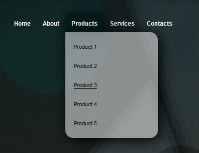
we will show you how to create a beautiful drop down menu using CSS3. We are going to create the menu without using Javascript, only CSS properties.
The html code
we will show you how to create a beautiful drop down menu using CSS3. We are going to create the menu without using Javascript, only CSS properties.
<ul id="nav">
<li><a href="#">Home</a></li>
<li><a href="#">About</a></li>
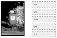
<li class="sub"><a href="#">Products</a>
<ul>
<li><a href="#">Product 1</a></li>
<li><a href="#">Product 2</a></li>
<li><a href="#">Product 3</a></li>
<li><a href="#">Product 4</a></li>
<li><a href="#">Product 5</a></li>
</ul>
</li>
<li class="sub"><a href="#">Services</a>
<ul>
<li><a href="#">Service 1</a></li>
<li><a href="#">Service 2</a></li>
<li><a href="#">Service 3</a></li>
<li><a href="#">Service 4</a></li>
<li><a href="#">Service 5</a></li>
</ul>
</li>
<li><a href="#">Contacts</a></li>
</ul>
We have used the sub class because we need to round only the upper corner of the menu items that contain an extra level.
The CSS code
The creation of CSS code consists of two main phases:
- structure code
- design code
The first step will allow us to create the layout structure of the menu and the drop-down effect. Before starting our code, we need to include into the CSS file a CSS reset. We have chosen the famous Eric Meyer’s CSS reset.
Now we can create the structure and the drop down effect with the following code:
#nav {
  margin: 50px;
  z-index: 10;
  display: block;
}
#nav li { float: left; }
#nav li:hover { position: relative }

#nav li a { display: block; }

#nav li ul {
  margin-top: -2px;
  display: none;
}
#nav li:hover ul {
  display:block;
  position:absolute;
}

#nav li ul li a {
  width: 150px;
}
The CSS code we’re going to integrate within the preceding code is as follows:
#nav li:hover > a {
    background: #021A1A;

    box-shadow: 5px 5px 25px #000;
    -moz-box-shadow: 5px 5px 25px #000;
    -webkit-box-shadow: 5px 5px 25px #000;

    border-radius: 10px;
    -moz-border-radius: 10px;
    -webkit-border-radius: 10px;
}
#nav li.sub:hover > a {
    border-radius: 10px 10px 0 0;
    -moz-border-radius: 10px 10px 0 0;
    -webkit-border-radius: 10px 10px 0 0;
}

#nav li a {
    color: #fff;
    font-weight: bold;
    text-decoration: none;
    padding: 12px;
}
#nav li a:hover { background-color: #021A1A; }

#nav li ul {
    background: #fff;
    margin-top: -2px;
}

#nav li ul {
    background: rgba(255,255,255,0.5);
    padding: 10px 5px;

    box-shadow: 5px 5px 25px #000;
    -moz-box-shadow: 5px 5px 25px #000;
    -webkit-box-shadow: 5px 5px 25px #000;

    border-radius: 0px 15px 15px 15px;
    -moz-border-radius: 0px 15px 15px 15px;
    -webkit-border-radius: 0px 5px 5px 5px;
}
#nav li ul li a, #nav li ul li a:hover {
    background: transparent;
    color: #000;
    width: 150px;
    font-size: 0.95em;
    font-weight: normal;
}
#nav li ul li a:hover { text-decoration: underline;
    box-shadow: none;
    -moz-box-shadow: none;
    -webkit-box-shadow: none;

    border-radius: 0;
    -moz-border-radius: 0;
    -webkit-border-radius: 0;
}
As you have seen, we have used many new properties from CSS3 as box-shadow, border-radius and rgba.
You can see the final CSS code below:
body {
    background: #000 url(citylights_medium.jpg) no-repeat;
    font: 12px Arial, Helvetica, sans-serif;
}

#nav {
    margin: 50px;
    z-index: 10;
    display: block;
}

#nav li { float: left; }
#nav li:hover { position: relative }

#nav li:hover > a {
    background: #021A1A;

    box-shadow: 5px 5px 25px #000;
    -moz-box-shadow: 5px 5px 25px #000;
    -webkit-box-shadow: 5px 5px 25px #000;

    border-radius: 10px;
    -moz-border-radius: 10px;
    -webkit-border-radius: 10px;
}

#nav li.sub:hover > a {
    border-radius: 10px 10px 0 0;
    -moz-border-radius: 10px 10px 0 0;
    -webkit-border-radius: 10px 10px 0 0;
}

#nav li a {
    color: #fff;
    font-weight: bold;
    text-decoration: none;
    padding: 12px;
    display: block;
}
#nav li a:hover { background-color: #021A1A; }

#nav li ul {
    background: #fff;
    margin-top: -2px;
    display: none;
}
#nav li:hover ul {
    display:block;
    position:absolute;
}

#nav li ul {
    background: rgba(255,255,255,0.5);
    padding: 10px 5px;

    box-shadow: 5px 5px 25px #000;
    -moz-box-shadow: 5px 5px 25px #000;
    -webkit-box-shadow: 5px 5px 25px #000;

    border-radius: 0px 15px 15px 15px;
    -moz-border-radius: 0px 15px 15px 15px;
    -webkit-border-radius: 0px 5px 5px 5px;
}
#nav li ul li a, #nav li ul li a:hover {
    background: transparent;
    color: #000;
    width: 150px;
    font-size: 0.95em;
    font-weight: normal;
}
#nav li ul li a:hover { text-decoration: underline;
    box-shadow: none;
    -moz-box-shadow: none;
    -webkit-box-shadow: none;

    border-radius: 0;
    -moz-border-radius: 0;
    -webkit-border-radius: 0;
}
The menu that we have created is compatible with all new versions of each browser (Firefox, Safari, Opera, Chrome, IE). It works also with IE8 and degrades rather well with IE7.
The article source:http://webexpedition18.com/articles/how-to-create-a-simple-drop-down-menu-with-css3/
You might also like


Tags
accordion accordion menu animation navigation animation navigation menu carousel checkbox inputs css3 css3 menu css3 navigation date picker dialog drag drop drop down menu drop down navigation menu elastic navigation form form validation gallery glide navigation horizontal navigation menu hover effect image gallery image hover image lightbox image scroller image slideshow multi-level navigation menus rating select dependent select list slide image slider menu stylish form table tabs text effect text scroller tooltips tree menu vertical navigation menu