Jquery and CSS3 Nice Google Plus Photo stack
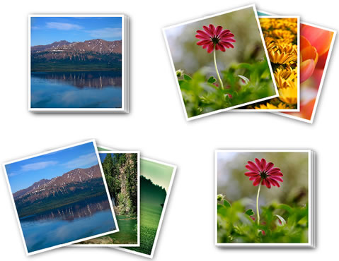
If you are using Google Plus then you must have noticed the photo stack effect when you view your own album or someone else album.
The HTML Part
The first step will be to create our html page to place the album photo stack. The image tag with id photo1,photo2 and photo3 will contain three different images that will be placed on one another to make it appear like a stack. The image in the tag <ul> will be used to demonstrate the ‘zoom’ effect if an album contains only one photo.
<body>

<div id="page_wrap">
  <div id="text"> Google Plus Album Photo</div>
  <div class="photo_stack">
<img id="photo1" src="photos/1.jpg" >
<img  id="photo2" src="photos/2.jpg" >
<img  id="photo3" class="current"  src="photos/3.jpg" > </div>
  <div class="single_photo">
    <ul id="pics">
      <li><a href="#pic1" title="Photo"><img src="photos/3.jpg" alt="picture"></a></li>
    </ul>
  </div>
</div>
</body>
CSS Part : Stacked Photos
The page_wrap is the parent div that holds the whole content .
#page_wrap {
	border: 1px solid #DDDDDD; // Add a grey border around the photos
	width: 700px;
	height:400px;
	margin-left: auto;//center the content
	margin-right: auto;
	margin-top:150px;

}

.image_stack img {// image properties for the photos in the stack
	border: none;
	text-decoration: none;
	position: absolute;
	margin-left:0px;
	width: 158px;
	height: 158px;
}

.image_stack {
	width: 400px;
	position: absolute;
	margin:60px 10px 10px ;
}
.image_stack img {// Image white frame/border
	position: absolute;
	border: 4px solid #FFF;
	box-shadow: 2px 2px 8px rgba(0, 0, 0, 0.5);
	-moz-box-shadow: 2px 2px 8px rgba(0, 0, 0, 0.5);
	-webkit-box-shadow: 2px 2px 8px rgba(0, 0, 0, 0.5);
	z-index: 9999;
	/* Firefox */
	-moz-transition: all 0.2s ease;
	/* WebKit  e.g chrome , safari*/
	-webkit-transition: all 0.2s ease;
	/* Opera */
	-o-transition: all 0.2s ease;
	/* Standard  */
	transition: all 0.2s ease;
}
The .image_stack #photo1 , .image_stack #photo2 and .image_stack #photo3 is used to position the three photos in such a way so that it looks like stack of photo pilled on one another .
.image_stack #photo1 {
	top: 8px;
	left: 108px;
}
.image_stack #photo2 {
	top: 6px;
	left: 104px;
}
.image_stack #photo3 {
	top: 4px;
	left: 100px;
}
The css class below is added via jquery when a user hover his mouse over the first image  to give the photos a scattered effect .This css3 properties allows an image to rotate to the degree specified .
<a href="photo-stack-image3.png"><img class="aligncenter size-full wp-image-848" title="photo stack Rotate with css3" src="photo-stack-image3.png" alt="" width="593" height="578" /></a>
.image_stack .rotate1 {//photo 1
	-webkit-transform: rotate(15deg);// for chrome or safari browser
	-moz-transform: rotate(15deg);//firefox browser
	transform: rotate(15deg);// Internet explorer
}
.image_stack .rotate2 {//photo 2
	-webkit-transform: rotate(0deg);
	-moz-transform: rotate(0deg);
	transform: rotate(0deg);
}
.image_stack .rotate3 {Photo 3
	-webkit-transform: rotate(-15deg);
	-moz-transform: rotate(-15deg);
	transform: rotate(-15deg);
	cursor: pointer;
}
Javascript Code
The Jquery code below contains two events: one is fired when a user hovers his cursor over the image stacks and the other one when the cursor is moved away from it.
Basically, when a user hovers his cursor over the first image at the top of the photo stacks, the ‘mouse over’’ event is triggered and a set of css class is added to each of the photos to make it rotate a little so that it gives the effect as below.
When a user removes the cursor photo stacks, the css classes previously added is now removed so that each photo takes its original position.
$(document).ready(function() {//when page is fully loaded
$(".image_stack").delegate('img', 'mouseenter', function() {
//detect if cursor is hovering on an image which has a div with class name 'current
		if ($(this).hasClass('current')) {
		//attach the css class rotate1 , rotate2 and rotate3 to each image in the stack to rotate the images to specific degrees
			var $parent = $(this).parent();
$parent.find('img#photo1').addClass('rotate1');
$parent.find('img#photo2').addClass('rotate2');
$parent.find('img#photo3').addClass('rotate3');
$parent.find('img#photo1').css("left","150px");//reposition the last and first photo
$parent.find('img#photo3').css("left","50px");

		}
	})
	.delegate('img', 'mouseleave', function() {//if user removes curser on image
//remote all class previously added to give the photos it's initial position
		$('img#photo1').removeClass('rotate1');
			$('img#photo2').removeClass('rotate2');
			$('img#photo3').removeClass('rotate3');
			$('img#photo1').css("left","");
$('img#photo3').css("left","");

	});;
});
CSS Part : Single Photos
The CSS style below is applicable to single images. In this case, jquery is not used to produce the ‘zoom’ effect ,Only pure CSS 3 is used. When you hover your cursor over an image, it zooms in ’slowly’. The transition css property is responsible for the ‘easing’ of the zooming effect.
ul#pics li {
background: none repeat scroll 0 0 #FFFFFF;
box-shadow: 1px 1px 1px #999999;
display: inline-block;
width: 153px;
height:157px;
 -webkit-transition: all .2s ease-in-out;
 -moz-transition: all .2s ease-in-out;
 -o-transition: all .2s ease-in-out;
 -ms-transition: all .2s ease-in-out;
 transition: all .2s ease-in-out;
}
ul#pics li img {//define size of image
	width: 150px;
	height:150px;
	display: block;
}
When a user hover his cursor over the image , the transform css3 property is used to make the image looks bigger and hence give the zooming effect .
ul#pics li:hover {
	-moz-transform: scale(1.1) rotate(0deg);
	-webkit-transform: scale(1.1) rotate(0deg);
	-o-transform: scale(1.1) rotate(0deg);
	-ms-transform: scale(1.1) rotate(0deg);
	transform: scale(1.1) rotate(0deg);
}
That’s all folks !The article source:http://youhack.me/2011/07/15/google-plus-photo-stack-animation-using-jquery-and-css3/
You might also like
Tags
accordion accordion menu animation navigation animation navigation menu carousel checkbox inputs css3 css3 menu css3 navigation date picker dialog drag drop drop down menu drop down navigation menu elastic navigation form form validation gallery glide navigation horizontal navigation menu hover effect image gallery image hover image lightbox image scroller image slideshow multi-level navigation menus rating select dependent select list slide image slider menu stylish form table tabs text effect text scroller tooltips tree menu vertical navigation menu

 Subscribe
 Follow Us
 12 years ago
 19652
19652 3565
3565
