 Subscribe
 Follow Us
Simple pure CSS3 animation multilevel menu
 12 years ago
 12050
12050 2971
2971
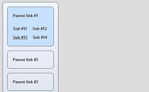
This is a new nice CSS3 menu with interesting behavior, where use css3 transition and animation. This is UL-LI-based multilevel menu.
Step 1. HTML
As usual, we start with the HTML. Here are full html code of our menu. As you can see – this is multilevel menu built on UL-LI elements. But, it is a little unusual. I don’t wrap submenus into own UL element, I am going to hide them, and display if necessary.
index.html
<!DOCTYPE html>
<html lang="en" >
    <head>
        <meta charset="utf-8" />
        <title>CSS3 multilevel menu with transition and animation | Script Tutorials</title>

        <link href="css/layout.css" type="text/css" rel="stylesheet">
        <link href="css/menu.css" type="text/css" rel="stylesheet">
    </head>
    <body>

        <header>
            <h2>CSS3 multilevel menu with transition and animation</h2>
            <a href="#" class="stuts">Back to original tutorial on <span>Script Tutorials</span></a>
        </header>

        <div class="container">

            <ul id="nav">
                <li>
                    <a href="#">Parent link #1</a>
                    <a href="#">Sub #11</a>
                    <a href="#">Sub #12</a>
                    <a href="#">Sub #13</a>
                    <a href="#">Sub #14</a>
                </li>
                <li>
                    <a href="#">Parent link #2</a>
                    <a href="#">Sub #21</a>
                    <a href="#">Sub #22</a>
                    <a href="#">Sub #23</a>
                    <a href="#">Sub #24</a>
                </li>
                <li>
                    <a href="#">Parent link #3</a>
                    <a href="#">Sub #31</a>
                    <a href="#">Sub #32</a>
                    <a href="#">Sub #33</a>
                    <a href="#">Sub #34</a>
                </li>
                <li>
                    <a href="#">Parent link #4</a>
                    <a href="#">Sub #41</a>
                    <a href="#">Sub #42</a>
                    <a href="#">Sub #43</a>
                    <a href="#">Sub #44</a>
                </li>
            </ul>

        </div>

    </body>
</html>
Step 2. CSS
Here are the CSS styles of our menu. Maybe you’ve noticed – that in our html – I have two CSS files: layout.css and menu.css. The first file (layout.css) contain the styles of our test page. We will not publish these styles in this article, but if you wish – you can find these styles in our package.
css/menu.css
ul#nav {
    border: 1px solid #454545;
    display: block;
    height: 400px;
    margin: 0;
    padding: 15px;
    width: 160px;

    -moz-border-radius: 9px;
    -ms-border-radius: 9px;
    -webkit-border-radius: 9px;
    -o-border-radius: 9px;
    border-radius: 9px;

    background: -moz-linear-gradient(#f1f7ff, #d9e1ec);
    background: -ms-linear-gradient(#f1f7ff, #d9e1ec);
    background: -webkit-gradient(linear, left top, left bottom, color-stop(0%, #f1f7ff), color-stop(100%, #d9e1ec));
    background: -webkit-linear-gradient(#f1f7ff, #d9e1ec);
    background: -o-linear-gradient(#f1f7ff, #d9e1ec);
    filter: progid:DXImageTransform.Microsoft.gradient(startColorstr='#f1f7ff', endColorstr='#d9e1ec');
    -ms-filter: "progid:DXImageTransform.Microsoft.gradient(startColorstr='#f1f7ff', endColorstr='#d9e1ec')";
    background: linear-gradient(#f1f7ff, #d9e1ec);
}

@-moz-keyframes custom_effect {
    0% {
        background:rgba(255, 255, 255, 0.0);
        height: 60px;
    }
    33% {
        background:rgba(255, 255, 255, 0.0);
        height: 160px;
    }
    66% {
        background:rgba(255, 255, 255, 1.0);
    }
    100% {
        background:rgba(190, 220, 255, 0.8);
        height: 135px;
    }
}
@-webkit-keyframes custom_effect {
    0% {
        background:rgba(255, 255, 255, 0.0);
        height: 60px;
    }
    33% {
        background:rgba(255, 255, 255, 0.0);
        height: 160px;
    }
    66% {
        background:rgba(255, 255, 255, 1.0);
    }
    100% {
        background:rgba(190, 220, 255, 0.8);
        height: 135px;
    }
}
ul#nav li {
    -moz-border-radius: 9px;
    -ms-border-radius: 9px;
    -webkit-border-radius: 9px;
    -o-border-radius: 9px;
    border-radius: 9px;

    background-color:transparent;
    border: 1px solid #454545;
    display: block;
    height: 60px;
    line-height: 60px;
    margin-bottom: 15px;
    overflow: hidden;
}
ul#nav li:hover {
    -moz-animation-name: custom_effect;
    -moz-animation-duration: 0.4s;
    -moz-animation-timing-function: ease;
    -moz-animation-iteration-count: 1;
    -moz-animation-direction: normal;
    -moz-animation-delay: 0;
    -moz-animation-play-state: running;
    -moz-animation-fill-mode: forwards;

    -webkit-animation-name: custom_effect;
    -webkit-animation-duration: 0.4s;
    -webkit-animation-timing-function: ease;
    -webkit-animation-iteration-count: 1;
    -webkit-animation-direction: normal;
    -webkit-animation-delay: 0;
    -webkit-animation-play-state: running;
    -webkit-animation-fill-mode: forwards;

    background:rgba(190, 220, 255, 0.8);
    height: 135px;
}
ul#nav a {
    border-style: none;
    border-width: 0;
    color: #181818;
    cursor: pointer;
    float: left;
    font-size: 13px;
    font-weight: bold;
    line-height: 30px;
    margin-top: 100px;
    padding-left: 18px;
    text-align: left;
    text-decoration: none;
    text-shadow: 0 1px 1px #FFFFFF;
    vertical-align: middle;

    -moz-transition: all 0.1s 0.4s;
    -ms-transition: all 0.1s 0.4s;
    -o-transition: all 0.1s 0.4s;
    -webkit-transition: all 0.1s 0.4s;
    transition: all 0.1s 0.4s;
}
ul#nav a:hover {
    text-decoration: underline;
}
ul#nav li a:first-child {
    display: block;
    float: none;
    line-height: 60px;
    margin-top: 0;
}
ul#nav li:hover a:first-child {
    line-height: 60px;
}
ul#nav li:hover a {
    margin-top: 0;
}
Hope you enjoyed with new menu,The article source:http://www.script-tutorials.com/css3-multilevel-menu-with-transition-and-animation/
You might also like

Tags
accordion accordion menu animation navigation animation navigation menu carousel checkbox inputs css3 css3 menu css3 navigation date picker dialog drag drop drop down menu drop down navigation menu elastic navigation form form validation gallery glide navigation horizontal navigation menu hover effect image gallery image hover image lightbox image scroller image slideshow multi-level navigation menus rating select dependent select list slide image slider menu stylish form table tabs text effect text scroller tooltips tree menu vertical navigation menu