 Subscribe
 Follow Us
Simple CSS3 Button Navigation
 13 years ago
 24880
24880 5319
5319

This is a quick CSS3/HTML version of the navigational buttons.
The HTML:
<ul class="button-list">
<li><a href='/' class='button'>Home</a></li>
<li><a href='/' class='button'>About</a></li>
<li><a href='/' class='button'>Portfolio</a></li>
<li><a href='/' class='button'>Blog</a></li>
<li class="search"><input type="text" class="search-input" name="search" value="Search" onclick="$(this).val('');" /><input type="submit" class="search-submit" /></li>
</ul>
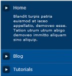
<h3>Vertical Menu:</h3>
<ul class="vertical-list">
<li><a href='/' class='button'>Home</a></li>
<li><a href='/' class='button'>Our Studio</a></li>
<li><a href='/' class='button'>Portfolio</a></li>
<li><a href='/' class='button'>Our Team</a></li>
<li><a href='/' class='button'>Get in Touch</a></li>
</ul>
The CSS:
/* Dark Button CSS */
.button {
    outline: 0;
    padding: 5px 12px;
    display: block;
    color: #9fa8b0;
    font-weight: bold;
    text-shadow: 1px 1px #1f272b;
    border: 1px solid #1c252b;
    border-radius: 3px;
    -moz-border-radius: 3px;
    -webkit-border-radius: 3px;
    background: #232B30; /* old browsers */
    background: -moz-linear-gradient(top, #3D4850 3%, #313d45 4%, #232B30 100%); /* firefox */
    background: -webkit-gradient(linear, left top, left bottom, color-stop(3%,#3D4850), color-stop(4%,#313d45), color-stop(100%,#232B30)); /* webkit */
    filter: progid:DXImageTransform.Microsoft.gradient( startColorstr='#3D4850', endColorstr='#232B30',GradientType=0 ); /* ie */
    box-shadow: 1px 1px 1px rgba(0,0,0,0.2); /* CSS3 */
    -moz-box-shadow: 1px 1px 1px rgba(0,0,0,0.2); /* Firefox */
    -webkit-box-shadow: 1px 1px 1px rgba(0,0,0,0.2); /* Safari, Chrome */
}
.button:hover {
    color: #fff;
    background: #4C5A64; /* old browsers */
    background: -moz-linear-gradient(top, #4C5A64 3%, #404F5A 4%, #2E3940 100%); /* firefox */
    background: -webkit-gradient(linear, left top, left bottom, color-stop(3%,#4C5A64), color-stop(4%,#404F5A), color-stop(100%,#2E3940)); /* webkit */
    filter: progid:DXImageTransform.Microsoft.gradient( startColorstr='#4C5A64', endColorstr='#2E3940',GradientType=0 ); /* ie */
}
.button:active {
    background-position: 0 top;
    position: relative;
    top: 1px;
    color: #fff;
    padding: 6px 12px 4px;
    background: #20282D; /* old browsers */
    background: -moz-linear-gradient(top, #20282D 3%, #252E34 51%, #222A30 100%); /* firefox */
    background: -webkit-gradient(linear, left top, left bottom, color-stop(3%,#20282D), color-stop(51%,#252E34), color-stop(100%,#222A30)); /* webkit */
    filter: progid:DXImageTransform.Microsoft.gradient( startColorstr='#20282D', endColorstr='#222A30',GradientType=0 ); /* ie */
    -moz-box-shadow: 1px 1px 1px rgba(255,255,255,0.1); /* Firefox */
    -webkit-box-shadow: 1px 1px 1px rgba(255,255,255,0.1); /* Safari, Chrome */
    box-shadow: 1px 1px 1px rgba(255,255,255,0.1); /* CSS3 */
}

/* Search CSS: */
.search-input {
    padding: 0 5px 0 22px;
    border: 1px solid #1c252b;
    height: 30px;
    color: #9fa8b0;
    font-size: 12px;
    line-height: 30px;
    font-weight: bold;
    text-shadow: 1px 1px #1f272b;
    border-radius: 25px;
    -moz-border-radius: 25px;
    -webkit-border-radius: 25px;
    background: #20282D; /* old browsers */
    background: -moz-linear-gradient(top, #20282D 3%, #252E34 51%, #222A30 100%); /* firefox */
    background: -webkit-gradient(linear, left top, left bottom, color-stop(3%,#20282D), color-stop(51%,#252E34), color-stop(100%,#222A30)); /* webkit */
    filter: progid:DXImageTransform.Microsoft.gradient( startColorstr='#20282D', endColorstr='#222A30',GradientType=0 ); /* ie */
    -moz-box-shadow: 1px 1px 1px rgba(255,255,255,0.1); /* Firefox */
    -webkit-box-shadow: 1px 1px 1px rgba(255,255,255,0.1); /* Safari, Chrome */
    box-shadow: 1px 1px 1px rgba(255,255,255,0.1); /* CSS3 */
}
.search-input:focus {outline: none;}
.search-submit {
    width: 13px;
    height: 13px;
    border: none;
    background: url(mag-glass.png) no-repeat;
    display: block;
    position: absolute;
    left: 26px;
    top: 10px;
    text-indent: -9999em;
}

/* Vertical List: */
.vertical-list {
    list-style: none;
    padding: 10px;
    width: 200px;
    border-radius: 5px;
    -moz-border-radius: 5px;
    -webkit-border-radius: 5px;
    background: #20282D; /* old browsers */
    background: -moz-linear-gradient(top, #20282D 3%, #252E34 51%, #222A30 100%); /* firefox */
    background: -webkit-gradient(linear, left top, left bottom, color-stop(3%,#20282D), color-stop(51%,#252E34), color-stop(100%,#222A30)); /* webkit */
    filter: progid:DXImageTransform.Microsoft.gradient( startColorstr='#20282D', endColorstr='#222A30',GradientType=0 ); /* ie */
    -moz-box-shadow: 1px 1px 1px rgba(255,255,255,0.1); /* Firefox */
    -webkit-box-shadow: 1px 1px 1px rgba(255,255,255,0.1); /* Safari, Chrome */
    box-shadow: 1px 1px 1px rgba(255,255,255,0.1); /* CSS3 */
}
.vertical-list .button {
    border-radius: 5px;
    -moz-border-radius: 5px;
    -webkit-border-radius: 5px;
    background: #515B62; /* old browsers */
    background: -moz-linear-gradient(top, #515B62 3%, #444E55 5%, #394147 100%); /* firefox */
    background: -webkit-gradient(linear, left top, left bottom, color-stop(3%,#515B62), color-stop(5%,#444E55), color-stop(100%,#394147)); /* webkit */
    filter: progid:DXImageTransform.Microsoft.gradient( startColorstr='#515B62', endColorstr='#394147',GradientType=0 ); /* ie */
}
.vertical-list .button:hover {
    background: #5F6B72; /* old browsers */
    background: -moz-linear-gradient(top, #5F6B72 3%, #56646C 4%, #4D5A62 50%, #434D54 100%); /* firefox */
    background: -webkit-gradient(linear, left top, left bottom, color-stop(3%,#5F6B72), color-stop(4%,#56646C), color-stop(50%,#4D5A62), color-stop(100%,#434D54)); /* webkit */
    filter: progid:DXImageTransform.Microsoft.gradient( startColorstr='#5F6B72', endColorstr='#434D54',GradientType=0 ); /* ie */
}
.vertical-list .button:active {
    padding: 5px 12px;
    top: 0;
    background: #515B62; /* old browsers */
    background: -moz-linear-gradient(top, #515B62 3%, #444E55 5%, #394147 100%); /* firefox */
    background: -webkit-gradient(linear, left top, left bottom, color-stop(3%,#515B62), color-stop(5%,#444E55), color-stop(100%,#394147)); /* webkit */
    filter: progid:DXImageTransform.Microsoft.gradient( startColorstr='#515B62', endColorstr='#394147',GradientType=0 ); /* ie */       -moz-box-shadow: 1px 1px 1px rgba(255,255,255,0.1); /* Firefox */
    -moz-box-shadow: 1px 1px 1px rgba(0,0,0,0.2); /* Firefox */
    -webkit-box-shadow: 1px 1px 1px rgba(0,0,0,0.2); /* Safari, Chrome */
    box-shadow: 1px 1px 1px rgba(0,0,0,0.2); /* CSS3 */
}
About the Demo
The only image used in the demo is for the textured background – all other gradients and effects are done with CSS3. As a result, compatibility is limited to a handful of browsers, including Firefox, Chrome, Safari and possibly IE8. It looks strange in IE7 and the gradients don’t work in Opera, so I’d use caution if you’re considering using these in a production environment.
It’s quite easy to reproduce this effect using images, which is why I decided to go for the slightly more challenging route of using CSS3. If you’re really good, you’ll want to have an image-based solution as a backup for browsers that don’t support fancy CSS3 effects yet. I’ll leave that up to you guys though. ;)
You might also like


Tags
accordion accordion menu animation navigation animation navigation menu carousel checkbox inputs css3 css3 menu css3 navigation date picker dialog drag drop drop down menu drop down navigation menu elastic navigation form form validation gallery glide navigation horizontal navigation menu hover effect image gallery image hover image lightbox image scroller image slideshow multi-level navigation menus rating select dependent select list slide image slider menu stylish form table tabs text effect text scroller tooltips tree menu vertical navigation menu