 Subscribe
 Follow Us
Pure CSS3 animated buttons
 11 years ago
 16725
16725 3936
3936
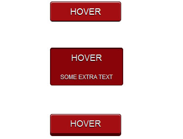
We are starting a new column called CSS3 Tricks. We will try to show you some neat tricks that you can use when designing your next website. In our first post we will show you how to create some simple animated buttons with CSS3 only. We will add some Photoshop like effects (shadow, bevel and emboss) and then animate the buttons without any help of javascript. I recommend that you download the source files first and check the live demo.
First we have to design our buttons. We will make some round borders and add some shadow effects. Create a document called index.html and insert the following code that will add the classes needed for the buttons:
<a href="#" class="animatedButton" onclick="return false;">
     <span class="animatedButtonText">HOVER</span>
</a>
We can now add the CSS3 code that will create a nice design for our button. Create a file called style.css and add the following code:
.animatedButton{
     font-family: Arial, sans-serif;
     text-decoration: none !important;
     background-color:#a30e12;
     padding-left: 40px;
     padding-right: 40px;
     height: 38px;
     line-height: 38px !important;
     display: inline-block;
     border: 1px solid #450003;

     text-shadow:0px 1px 1px #000;
     -webkit-box-shadow: inset 0px 1px 1px #fff, 0 1px 0px 0px #000;
     -moz-box-shadow: inset 0px 1px 1px #fff, 0 1px 0px 0px #000;
     box-shadow: inset 0px 1px 1px #fff, 0 1px 0px 0px #000;

     -webkit-border-radius: 5px;
     -moz-border-radius: 5px;
     border-radius: 5px;

     -webkit-transition: all 0.2s linear;
     -moz-transition: all 0.2s linear;
     -o-transition: all 0.2s linear;
}
First part of the settings simply defines the size of the button and some styling of the fonts. Text-shadow defines the shadow around the text. You can define x and y coordinates, blur effect and the color of the shadow. Box-shadow defines the shadow around the button itself. Note that we used two shadows. First one is the white inside line in the upper part of the button and the second one is the black outside line in the lower part of the button. Border-radius defines how round the corners of the button are.
Animation is defined in the last four lines (transition). We tell the css to use the animation on all parts of the css and that length of the transition is 0.2s. Now add the following class to style.css to define the properties of the text on the button:
.animatedButtonText{
     font-family: Arial, sans-serif;
     line-height: 38px !important;
     font-size: 18px;
     color: #fff;

     -webkit-transition: all 0.2s linear;
     -moz-transition: all 0.2s linear;
     -o-transition: all 0.2s linear;
     transition: all 0.2s linear;
}
Read more:http://premiumcoding.com/css3-tricks-animated-gradient/
You might also like
Tags
accordion accordion menu animation navigation animation navigation menu carousel checkbox inputs css3 css3 menu css3 navigation date picker dialog drag drop drop down menu drop down navigation menu elastic navigation form form validation gallery glide navigation horizontal navigation menu hover effect image gallery image hover image lightbox image scroller image slideshow multi-level navigation menus rating select dependent select list slide image slider menu stylish form table tabs text effect text scroller tooltips tree menu vertical navigation menu