 Subscribe
 Follow Us
Simple Flip Puzzle Effect like Apple with jQuery
 13 years ago
 11152
11152 1753
1753
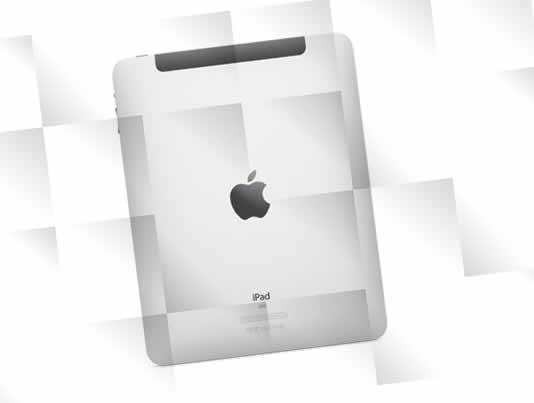
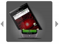
Gradient and Flipping Technique
I said that the advertisement makes use of puzzle paper effect. In order to create this effect, we give a lighting from certain angle to each block layer that we stacked above the div container. That effect can be implemented using -webkit-gradient property for webkit-based and moz-linear-gradient for firefox, added with opacity property to make the background image be seen. Moreover, the flipping technique can be done by using the jQuery plugin Flip!.
Random Block Gradient
Ok, now we are going to make 4 lighting effects on each block. To make the lighting seems at random, we use JavaScript to generate layer block that already has its own lighting and put it into div container. Take a look at this script.
HTML
<div id="container">
 <!-- Content will append in this -->
</div>
CSS
body {
  text-align: center;
  background: url('../images/background.png');
}

#container {
  margin-left: auto;
  margin-right: auto;
  margin-top: 5%;
  display: block;
  width: 600px;
  height: 400px;
 background:#fff url('../images/IPad.png') center center no-repeat;
  position: relative;
  overflow: hidden;
  -webkit-border-radius: 5px;
}

.block1 {
  background-image : -webkit-gradient(linear, 100% 0%, 0% 100%, from(#666666), to(#FFFFFF), color-stop(.35,#FFFFFF));
  background-image: -moz-linear-gradient(100% 0% 225deg,#666666, #FFFFFF, #FFFFFF 50%);
  opacity: .25;
  width: 100px;
  height: 100px;
  float: left;
}

.block2 {
  background-image : -webkit-gradient(linear, 100% 0%, 0% 80%, from(#666666), to(#FFFFFF), color-stop(.7,#FFFFFF));
  background-image : -moz-linear-gradient(100% 0% 225deg,#666666, #FFFFFF, #FFFFFF 100%);
  opacity: .25;
  width: 100px;
  height: 100px;
  float: left;
}

.block3 {
  background-image : -webkit-gradient(linear, 100% 0%, 50% 90%, from(#666666), to(#FFFFFF), color-stop(.7,#FFFFFF));
  background-image: -moz-linear-gradient(100% 0% 225deg,#666666, #FFFFFF, #FFFFFF 86%);
  opacity: .25;
  width: 100px;
  height: 100px;
  float: left;
}

.block4 {
  background-image : -webkit-gradient(linear, 10% 100%, 50% 0%, from(#666666), to(#FFFFFF), color-stop(.4,#FFFFFF));
  background-image : -moz-linear-gradient(0% 100% 36deg,#666666, #FFFFFF, #FFFFFF 80%);
  opacity: .25;
  width: 100px;
  height: 100px;
  float: left;
}

.black {
  background: #fff;
  opacity: 1;
}
JavaScript
$(document).ready(function() {


 var container   = $('#container');
 var containerHeight = parseInt(container.height())/100;
 var containerWidth = parseInt(container.width())/100;
 var blockCount   = (containerHeight * containerWidth);

 for(x = 1; x <= blockCount; x++) {

  randomNum   = Math.floor(Math.random()*4) + parseFloat(1);
  container.append('<div class="block' + randomNum + '"></div>');
 }

 $('#container div').addClass('black');

 var stack = {
  'delay': 150,
  'actions': [],
  'run': function() {
   if (stack.actions.length) {
    stack.actions.shift()();
    setTimeout(stack.run, stack.delay);
   }
  }
 };


 $('#container div').each(function(){
  var that = this;
  stack.actions.push(function(){
   $(that).flip({
    color: '#ffffff',
    speed: 70,
    direction:'lr',
    onEnd: function() {
    $(that).removeClass('black');
   }
   });
  });
 });
 stack.run();
});
Explanation
#container {
  margin-left: auto;
  margin-right: auto;
  margin-top: 5%;
  display: block;
  width: 600px;
  height: 400px;
 background:#fff url('../images/IPad.png') center center no-repeat;
  position: relative;
  overflow: hidden;
  -webkit-border-radius: 5px;
}
This is the div container that has background image. The Div becomes on lowest position that will be stacked with layer blocks that has a lighting.
.block1 {
  background-image : -webkit-gradient(linear, 100% 0%, 0% 100%, from(#666666), to(#FFFFFF), color-stop(.35,#FFFFFF));
  background-image: -moz-linear-gradient(100% 0% 225deg,#666666, #FFFFFF, #FFFFFF 50%);
  opacity: .25;
  width: 100px;
  height: 100px;
  float: left;
}
One of block layer that we add with lighting using webkit-gradient and moz-linear-gradient. We make 4 similar blocks with differents lighting.
 .black {
  background: #fff;
  opacity: 1;
 }
This class will be used on each block to cover the background image on the div container.
var container  = $('#container');
var containerHeight = parseInt(container.height())/100;
var containerWidth = parseInt(container.width())/100;
var blockCount  = (containerHeight * containerWidth);
Defining the width and height of div container and count how much blocks that will be put into it. In this case we make a div container with width 400 and height 500. The height and width of each block is 100, so there will be 20 blocks for div container. (400/100 x 500/100 = 20).
for(x = 1; x <= blockCount; x++) {
 randomNum = Math.floor(Math.random()*4) + parseFloat(1);
 container.append('<div class="block' + randomNum + '"></div>');
}
By using this technique we will make the layer blocks befit of the number of blocks that we have decided before. Because we have defined 4 block classes with block1, block2, block3 and block4, we add those classes to the layer block that we make randomly by using the technique above.
$('#container div').addClass('black');
By adding class black on each layer block, we have already cover the background image of div container. To show the background image as a puzzle, we have to delete the class black of each block. And to make a sense of sequence, we need to make a sequence function like this (sequence function by : Franck Maria) :
var stack = {
 'delay': 150,
 'actions': [],
 'run': function() {
  if (stack.actions.length) {
   stack.actions.shift()();
   setTimeout(stack.run, stack.delay);
  }
 }
};
After making the sequence function, we just need to show each layer block in flip just like the following:
$('#container div').each(function(){
 var that = this;
 stack.actions.push(function(){
  $(that).flip({
   color: '#ffffff',
   speed: 70,
   direction:'lr',
   onEnd: function() {
    $(that).removeClass('black');
   }
  });
 });
});
stack.run();
This is it.
You might also like

Tags
accordion accordion menu animation navigation animation navigation menu carousel checkbox inputs css3 css3 menu css3 navigation date picker dialog drag drop drop down menu drop down navigation menu elastic navigation form form validation gallery glide navigation horizontal navigation menu hover effect image gallery image hover image lightbox image scroller image slideshow multi-level navigation menus rating select dependent select list slide image slider menu stylish form table tabs text effect text scroller tooltips tree menu vertical navigation menu