 Subscribe
 Follow Us
Jemjabella Menu jQuery
 13 years ago
 11781
11781 1613
1613
The menu itself was marked up in a (semantically correct) unordered list, like so:
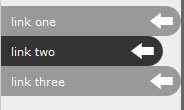
<ul id="navigation">
 <li><a href="#">link one</a></li>
 <li><a href="#">link two</a></li>
 <li><a href="#">link three</a></li>
</ul>
Each link in it’s own list item, it was then easy to style the links to achieve the desired effect. First, the default list bullets were removed with list-style: none;, and then each list item link was turned in to a “block level” element using display: block;. When the links are displayed as a block level element, more CSS properties can be used to customise the appearance; there is also the added advantage that the entire link item area becomes clickable. Our styling appears as such:
ul#navigation {
 margin: 0;
 padding: 0;
 list-style: none;
}
 ul#navigation li a {
  display: block;
 }
Once the base template is in place, it is possible to start thinking about how you want your links to look. I used a simple round end to give the links a trendy rounded corner effect, so that’s what this how-to is based on.
Decide on the height you want your links to be (25-30px looks good) and create an image in Photoshop (or your favourite graphics package) twice the height of the link and 50px wide (this is enough room to work with). That means if you want 30px high links, create a 50px x 60px image. Fill the image with a background colour (using the background colour of the div your navigation sits in saves us having to mess with transparency) and then using the rounded rectangle tool with a radius of approx 15px, create a wide rectangle with one rounded edge, one link-height high (same height as you wish your links to be). This should look something like so:

Then, create a second rectangle using the colour you wish your link hovers to be, but 10-15px in from the edge that your first rectangle sits against; this is what creates the “pop-in” effect when links are hovered over. This should look something like this:

Save the image in a suitable location. Going back to the CSS, we can now assign the new background to our links using background positioning and a set height to show only the amount of background we need, and a background colour to fill in the rest of the link not covered by the image. The complete CSS for this is as follows:
ul#navigation {
 margin: 10px 0;
 padding: 0;
 list-style: none;
}
 ul#navigation li a {
  display: block;
  background: #999 url(linkbg.gif) no-repeat top right;
  height: 30px;
  line-height: 30px;
 }
 ul#navigation li a:hover {
  background: #333 url(linkbg.gif) no-repeat bottom right;
 }
(where “linkbg.gif” is the filename of the saved background)
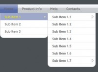
Our links now have a funky rounded corner “pop-in” effect which activates on hover. You can see the working version below.
You might also like

Tags
accordion accordion menu animation navigation animation navigation menu carousel checkbox inputs css3 css3 menu css3 navigation date picker dialog drag drop drop down menu drop down navigation menu elastic navigation form form validation gallery glide navigation horizontal navigation menu hover effect image gallery image hover image lightbox image scroller image slideshow multi-level navigation menus rating select dependent select list slide image slider menu stylish form table tabs text effect text scroller tooltips tree menu vertical navigation menu